All Resonance Platform Updates for June 2026
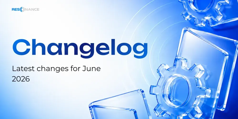
A complete overview of Resonance updates for June 2026, including cluster charts, screener, simulator, trading notes and learning.
Table of contents
- 01All Resonance Platform Updates for June 2026
- 02Learning Improvements
- 03Flexible Cluster Filter
- 04Easier Chart Onboarding and Smoother Lines
- 05Screener Filter
- 06New Simulator Examples and Return to Real Time
- 07Screener on Mobile
- 08Simulator Playback
- 09Notes: Statistics, Filters, and a More Convenient View
- 10Notes Statistics
- 11Profit and Loss Chart
- 12Top Tags, Tickers, and Categories
- 13Exchange Breakdown
- 14Filters
- 15Compact List View
- 16Notes Onboarding
- 17Saved Settings
- 18“Welcome Back” Screen with the Daily Overview
- 19News
- 20Market Movements Over the Last 24 Hours
- 21Your Coin Lists
- 22Top Notes
- 23Subscription and Simulator
- 24Learning Progress
- 25First-Steps Checklist
- 26Email Verification
- 27From a Coin to Its Chart
- 28“Go to Clusters” Finds the Existing Tab

All Resonance Platform Updates for June 2026
June 2026 brought a series of important improvements to Resonance, making the platform more convenient for market analysis, learning, practice, and everyday trading workflows.
This update focused on making the platform clearer, more convenient, and more stable. We improved the onboarding experience for the cluster chart, enhanced the screener and simulator, expanded the functionality of trading notes, and introduced a new daily overview screen with personalized market and learning information.
We also paid special attention to mobile performance, learning progress, and small interface improvements that make it easier to navigate the platform.
Below is the complete list of Resonance updates for June 2026.
Learning Improvements
Completed steps in the cluster onboarding process are now saved, so users do not have to start over after returning to the platform.
We also fixed situations where onboarding steps, the training module, or the first-steps checklist could behave incorrectly.
Flexible Cluster Filter
A convenient filter slider has been added to the cluster chart.
The filter range automatically adapts to the current values displayed on the chart. This makes it easier and more precise to filter clusters when working with different sections of market data.
Easier Chart Onboarding and Smoother Lines
We updated the onboarding experience directly on the cluster chart page.
Instead of relying mainly on text instructions, the onboarding now uses:
- images;
- GIF animations;
- slideshows;
- screenshots;
- clickable steps.
Users can return to a specific step whenever needed.
A first-steps checklist now appears when opening the cluster chart page. It provides a clear sequence of tasks to help users get familiar with the tool.
BAS lines are now displayed as a smooth curve, making the chart easier to read.
When the cluster chart, heatmap, or FTT is launched, the loading indicator is displayed correctly. If there is no data available, the platform now shows an appropriate notification.
Screener Filter
The filter by base category now returns more accurate results and no longer displays instruments that do not match the selected conditions.
New Simulator Examples and Return to Real Time
Two new educational examples have been added to the simulator:
- a scenario with partial profit-taking in several stages;
- a free mode for independent practice.
After reviewing theoretical material in the Aires chat, users can immediately move on to practice with a random simulation.
When navigating to the end of the available historical data on the chart, a “Return to real time” button now appears.

Screener on Mobile
The screener has been optimized for mobile devices.
In random simulation mode, Aires reminds users when only a small number of attempts remain.
When screening the market from a smartphone, charts are loaded as needed, making the page smoother and more responsive.
Simulator Playback
Several issues related to educational examples and simulator playback have been fixed.
Aires no longer displays an incorrect “0 simulations” balance while the data is still loading.
The “Bars” playback button now works reliably when switching between examples and no longer gets stuck.
Free and fully manual modes now reliably reach the final completion screen when playback is moved to the end of the scenario.
Notes: Statistics, Filters, and a More Convenient View
The Notes page received a major update with detailed trading statistics, flexible filters, a compact list view, and built-in interface onboarding.
All settings are saved automatically.
Notes Statistics
A statistics panel has been added for filtered notes with three levels of detail:
- Minimal — profit/loss and top tags.
- Medium — position type cards, top tickers, and breakdown by market mode.
- Full — key performance indicators, breakdowns by timeframes and exchanges, and a chart showing note creation over time.
Profit and Loss Chart
A dedicated profit and loss chart has been added with a switch between the number of results and profit percentage.
Bars are scaled proportionally, while losses are displayed as negative percentages.
Top Tags, Tickers, and Categories
For tags, tickers, and categories, users can switch between the number of results and profit percentage.
Results can also be sorted in ascending or descending order.
Exchange Breakdown
Exchange logos are now displayed next to exchange names.
Spot and futures instruments are separated for more convenient performance analysis.
Filters
Notes can now be filtered by:
- timeframe;
- ticker;
- exchange;
- tag;
- category.
Dropdown lists include search, a clear button, and an option to select all values.
Compact List View
A switch between full and compact note views has been added to the page header.
The compact view displays only:
- exchange icon;
- ticker;
- profit percentage;
- action buttons.
Notes Onboarding
An introductory onboarding experience appears when the Notes page is opened for the first time.
The step-by-step tour can be launched again at any time using the button in the page header.
Saved Settings
The following settings are automatically restored when the page is opened again:
- selected filters;
- statistics detail level;
- chart modes;
- list view.
Selected tags and timeframes are now highlighted more clearly, and a clear button has been added next to the search field.
“Welcome Back” Screen with the Daily Overview
A personalized summary is now displayed when users enter key workspace pages.
Market information, coin lists, notes, subscription details, and learning progress are brought together on one screen.
The screen appears when opening:
- the cluster chart;
- the screener;
- Market Delta;
- the dashboard.
The summary is displayed no more than once every 12 hours. On the cluster chart page, it can also be opened manually using the button in the right-side panel.
News
The summary now includes a fresh news feed with an option to switch between a full and compact view.
Users can also open the complete news feed.
Market Movements Over the Last 24 Hours
The summary displays:
- top 10 gaining pairs;
- top 10 declining pairs;
- exchange icons;
- spot and futures filters;
- exchange filters.
Your Coin Lists
For each list, users can see:
- number of tickers;
- average price change over the last 24 hours;
- number of days remaining before the list expires.
Top Notes
The summary displays the best and worst ideas by profit.
Users can switch between:
- the last 24 hours;
- since creation.
Subscription and Simulator
The screen displays:
- the number of days remaining for products;
- the number of available simulations.
A “Purchase more” link is available when additional simulations are needed.
Learning Progress
The summary displays:
- completion percentage;
- current level;
- current step;
- “Continue” link.
First-Steps Checklist
A list of onboarding tasks is displayed with completed steps marked accordingly.
Email Verification
If the email address has not yet been verified, a reminder with a verification button appears at the top of the screen.
From a Coin to Its Chart
Tickers in the market movements and notes sections are now clickable.
When a ticker is selected, the summary closes and the chosen coin opens directly on the cluster chart.
Coin lists on the cluster chart page now also include the time remaining before expiration and the average price change over the last 24 hours.
“Go to Clusters” Finds the Existing Tab
The transition from the screener to the cluster chart has been improved.
If the cluster chart page is already open, the “Go to Clusters” button switches to the existing tab instead of opening a new one.
This helps keep the workspace organized and prevents unnecessary duplicate tabs.
The main goal of the June updates is to make Resonance a unified workspace for crypto market analysis, trading practice, and working with trading ideas, with the tools and data traders need available in one place.
Follow new insights in our telegram channel.
No need to invent complex schemes and look for the "grail". Use the Resonance platform tools.
Register via the link — get a bonus and start earning:
OKX | BingX | KuCoin.
Promo code TOPBLOG gives you a 10% discount on any Resonance tariff plan.
Recommended articles