DOGE: Day Trading Setup

The cleanest day trades don’t start with a “signal” — they start with market inefficiencies. DOGE delivered exactly that. Here’s how to read it using cluster charts and aggregated metrics.
Table of contents

If you want to understand the logic behind price movement, this case is for you. Here, crypto cluster analysis combined with aggregated data shows a classic “inefficiency” setup: aggressive selling dominates, yet price stops printing new lows. This often signals strong limit demand and the formation of a local deficit. From there, two practical steps remain: find the entry using a cluster chart, then confirm it with delta / volume balance and limit activity.
Where to look for the idea: the asset was selected with a crypto screener on the 5-minute timeframe. The goal is to quickly filter for situations where market-seller volume stops impacting price.
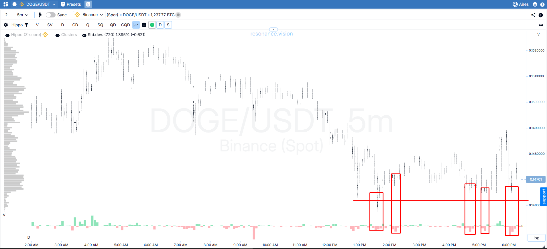
Entry logic: selling inefficiency on clusters
- Cluster chart: selling is present, but no new lows
On the cluster chart, market selling clearly dominates (red areas), yet price stops updating local lows. This is the key sign of selling inefficiency: market sellers are active, but there is no downward move. In such cases, the probability increases that the market is shifting into a local-deficit phase, and attempts to push price lower are likely to fail.
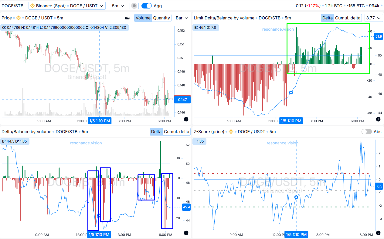
- Dashboard confirmation: sellers dominate, but price doesn’t fall
Delta / volume balance: aggregated data (across exchanges and pairs) still shows selling dominance, but price does not continue declining. This confirms what the clusters suggest: the seller is active, but inefficient.
Limit delta / volume balance: additionally, limit buy orders dominate. This limit support provides a logical place to protect the position: the stop can be placed beyond the area held by limit demand.
Exit logic: the move is realized + limit resistance grows
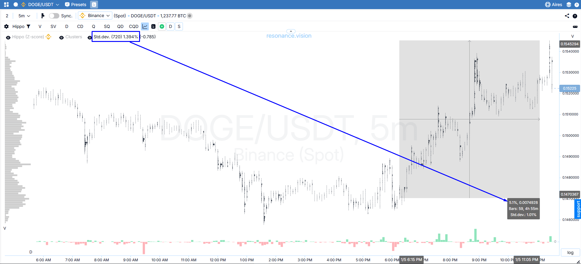
- Cluster chart: impulse
From the entry point, price moved up by roughly 5% — a meaningful move (almost 4 standard deviations with a Z-score period of 720). After such an impulse, it makes sense to at least partially take profit or switch to trade management (trailing the stop behind price).
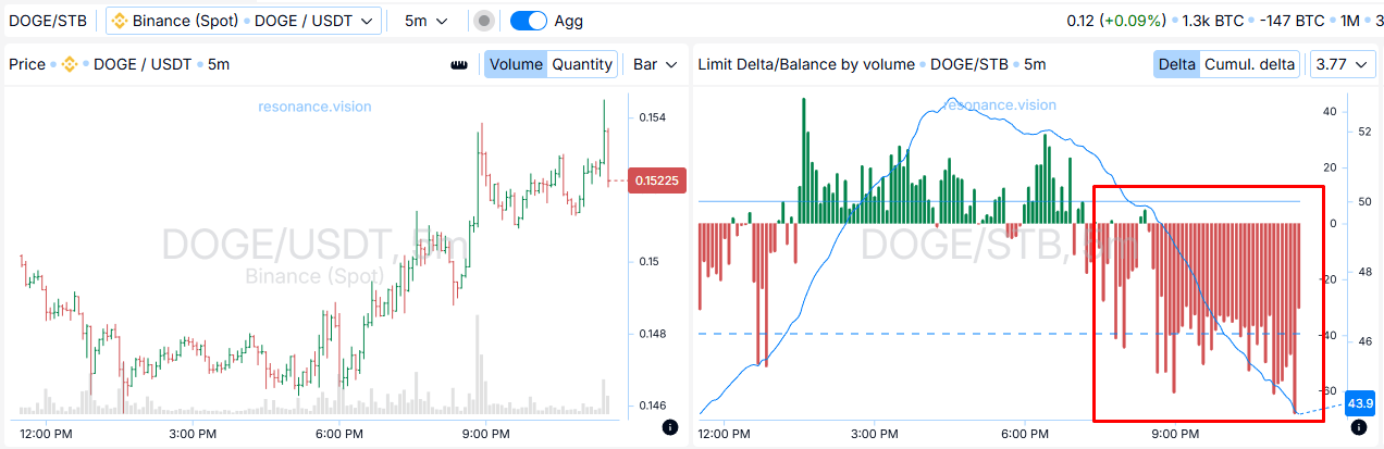
- Dashboard: the seller starts taking control with limits
Limit delta / volume balance: if limit buys dominated at entry and later limit sell orders begin to dominate, that creates a barrier to further upside. In this moment, locking in profit becomes a logical decision. Price meets resistance overhead.
Trade conclusion
This is a clear example of volume analysis in trading built on the principle of market “inefficiency”: entry occurs when aggressive selling stops pushing price lower, which points to absorption of supply. Exit is driven by the combination of a realized impulse and increasing limit pressure. This approach—combining a cluster chart online, delta, and limit activity—helps you find justified entries and exits based on supply-and-demand mechanics.
Recommended articles


