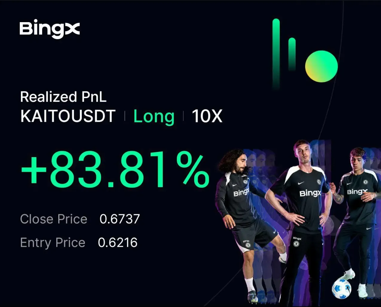
KAITO +83.8% (Resonance Directional Strategy)

Resonance case: on D1 — selling without a price drop; on the lower TF — market buys; on the dashboard — volume confirmation. Entry, stop, and exit — step by step.
Table of contents

Selling is present, yet price keeps rising — for day trading, this is one of the most informative signals: selling pressure exists, but it fails to produce results. In the KAITO case, this anomaly on the cluster chart pointed to strong limit demand and the formation of a local deficit. Next, we dropped the timeframe to see the activity of the market buyer and get an entry point. Volume analysis in trading was confirmed by aggregated metrics across exchanges and pairs: buys dominate, and price continues to rise. This means there is a deficit.
Context: the daily chart and the anomaly “selling without a price drop”
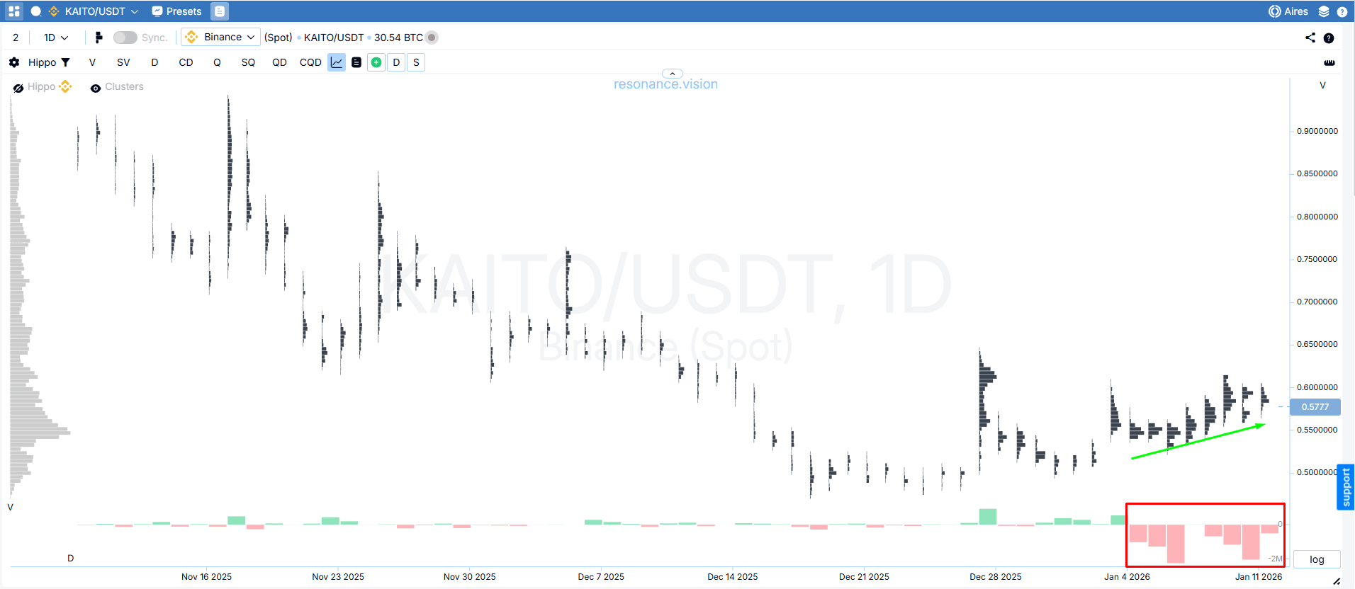
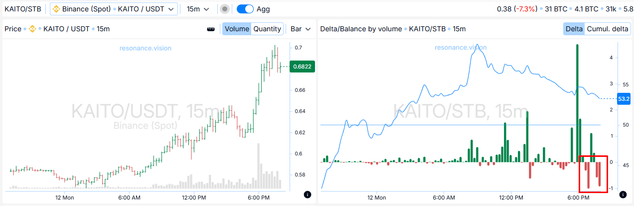
Cluster chart (D1): the seller dominates, but price holds and rises
On the daily timeframe, you can see that selling dominates on the coin (red rectangle), while price rises smoothly (green arrow). This is a classic inefficiency: seller volume is active, but there is no downside impact. This picture most often indicates strong limit demand that absorbs supply and increases the probability of continued upside.
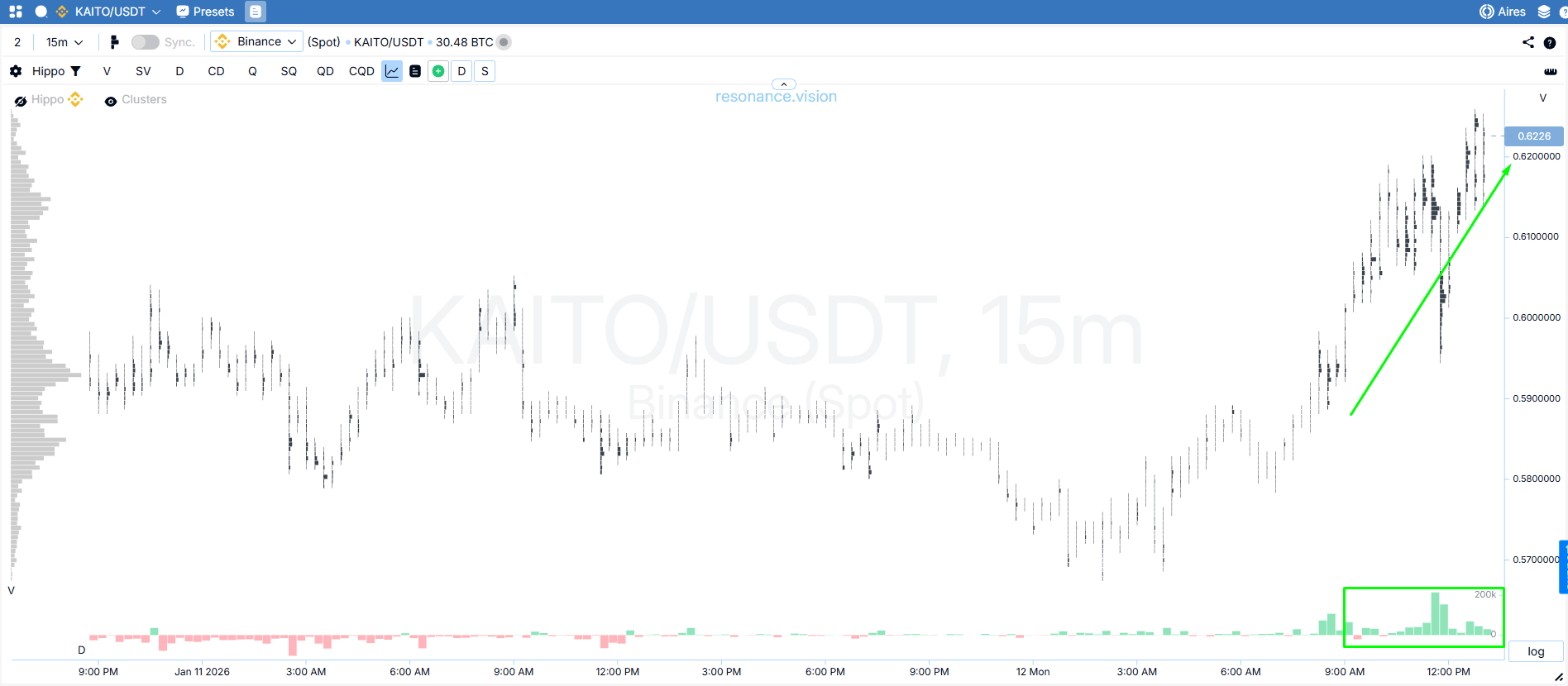
Entry point: switching to a lower timeframe
Cluster chart (lower TF): market buys appear and the impulse is confirmed
After the segment where selling dominated on D1, the lower timeframe reveals participant behavior: market buys start coming in (green rectangle). Price responds by rising and printing new local highs (green arrow) — this confirms that the buyer is not only defending price with limits, but actively pushing it higher through market trades.
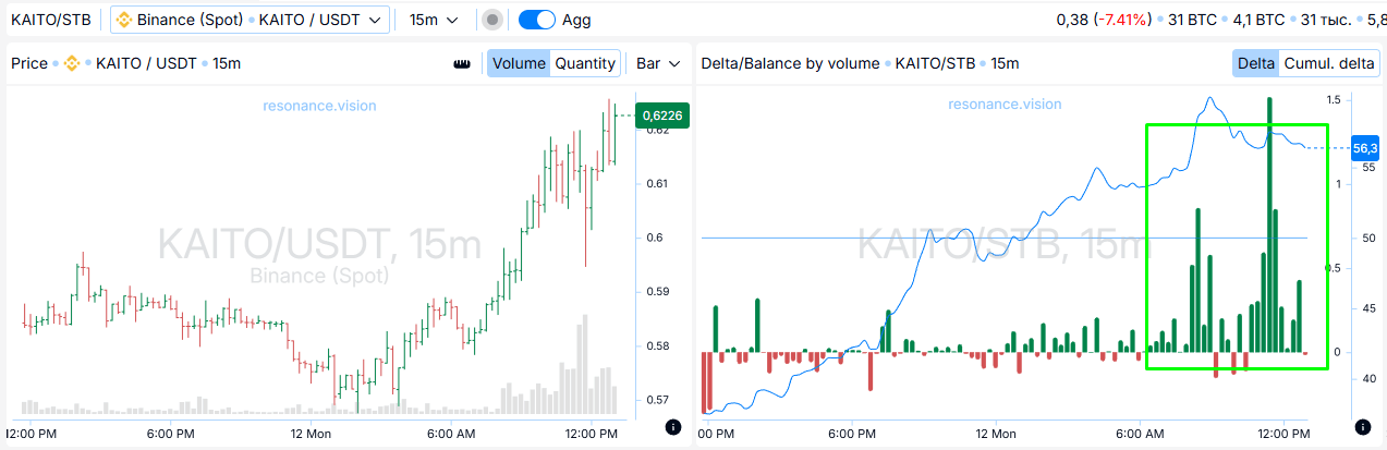
Confirmation: aggregated metrics (dashboard)
Delta / volume balance: buys are coming through across all exchanges and pairs
To avoid relying only on local cluster analysis, we reinforce the idea with aggregated data. Delta/volume balance shows that active buying is indeed coming through across exchanges and pairs: price is rising, and market buys are present. This means the local deficit is confirmed and the probability of continued upside remains high.
Stop-loss is logically placed beyond the nearest local low (the point where structure breaks if the deficit disappears).
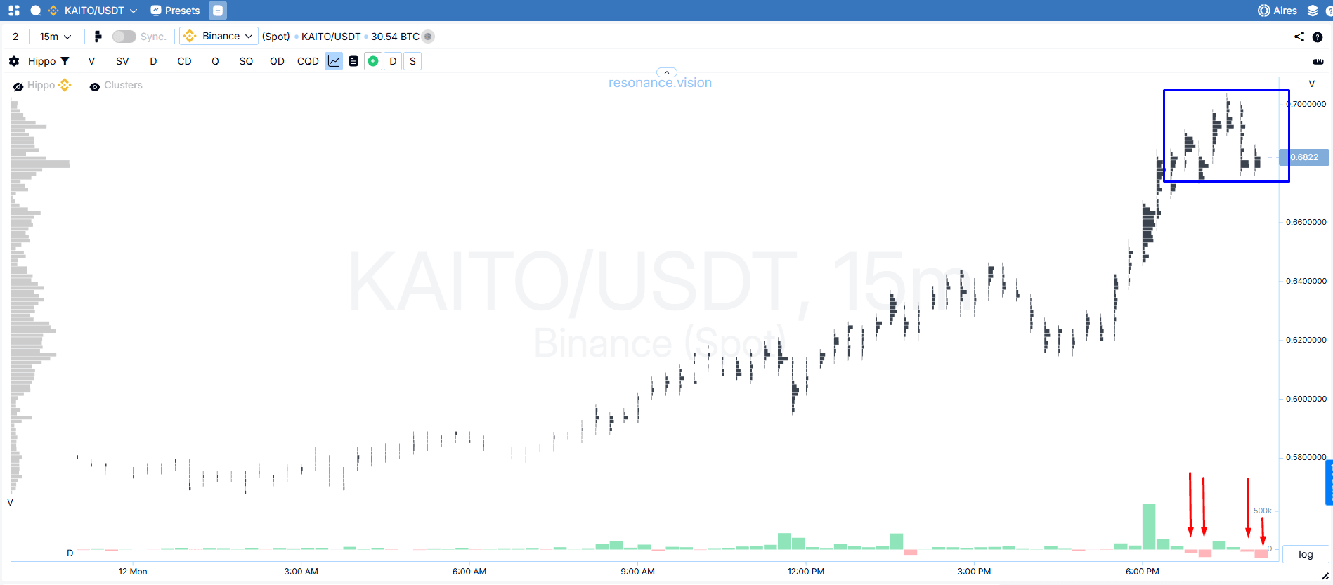
Exit reasons and position management
Cluster chart: the buyer weakens, dense clusters appear, and market sells show up
As price advanced, dense cluster concentrations began to form (blue rectangle). Buyer activity started to decline, and then market sells appeared (red arrows). This is a sign that the impulse is ending and the first signs of surplus are appearing on the coin.
Dashboard: declining buys + rising sells → correction risk
Aggregated metrics strengthened the case for closing the trade: a drop in market-buy activity and the appearance of market sells increase the probability of the move stalling and pulling back. In this situation, the decision was made not to manage the position by trailing the stop-loss behind price, but to close the full size.

Trade result
The idea played out: we captured about 8% of clean movement. The trigger was selling inefficiency: selling did not lead to a price decline, which pointed to a local deficit. Switching to a lower timeframe made it possible to see buyer activity and join the move, while aggregated metrics helped confirm the deficit and find the exit point in time.
Follow new insights in our telegram channel.
No need to invent complex schemes and look for the "grail". Use the Resonance platform tools.
Register via the link — get a bonus and start earning:
OKX | BingX | KuCoin.
Promo code TOPBLOG gives you a 10% discount on any Resonance tariff plan.
Recommended articles


