How to find trading ideas?

Step-by-step guide: set up the cluster chart, BAS, and Z-score heatmap in Resonance to filter trading pairs and spot profitable ideas in just five minutes.
Table of contents

This guide contains one way to search for trade ideas for the Resonance directional strategy.
Note: Before you continue reading this article familiarise yourself with the principles of the strategy with the formation we are looking for within this strategy. To familiarise yourself with it, go to the Resonance platform, to the RTT page and in the top right corner call Aires (AI assistant), it will show and explain the essence of the directional strategy.
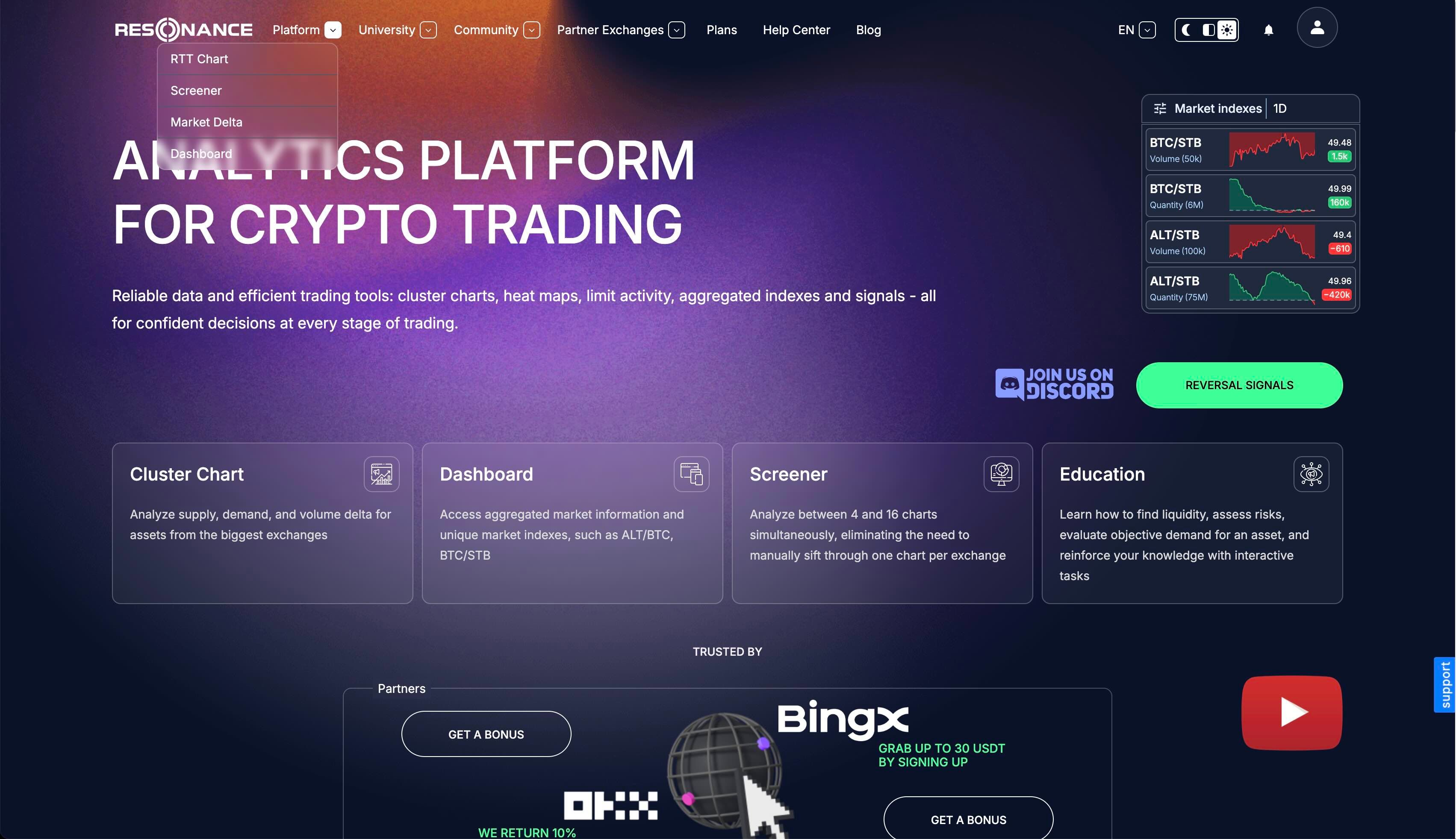
RTT
On the platform go to Resonance to the RTT section. It is highlighted by a green rectangle with an arrow.
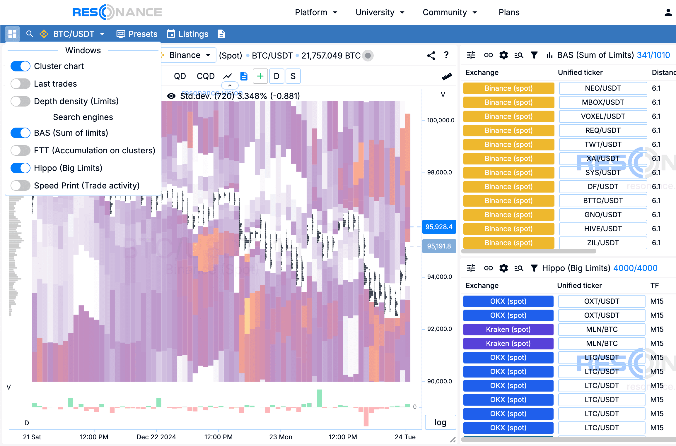
Add windows and search engines
Open the top menu on the left (tile icon). Add windows, all highlighted with arrows:
- Cluster Chart
- BAS
- Hippo ( Heatmap).
Note: each window on the PTT page can be moved, by the window cap. You can also resize the window by pulling the bottom right corner of the window.
Pair tree
Open the pairs tree by clicking on the ticker at the top right. In the opened window open settings (settings icon, top left). Customise the pairs tree for convenient search.
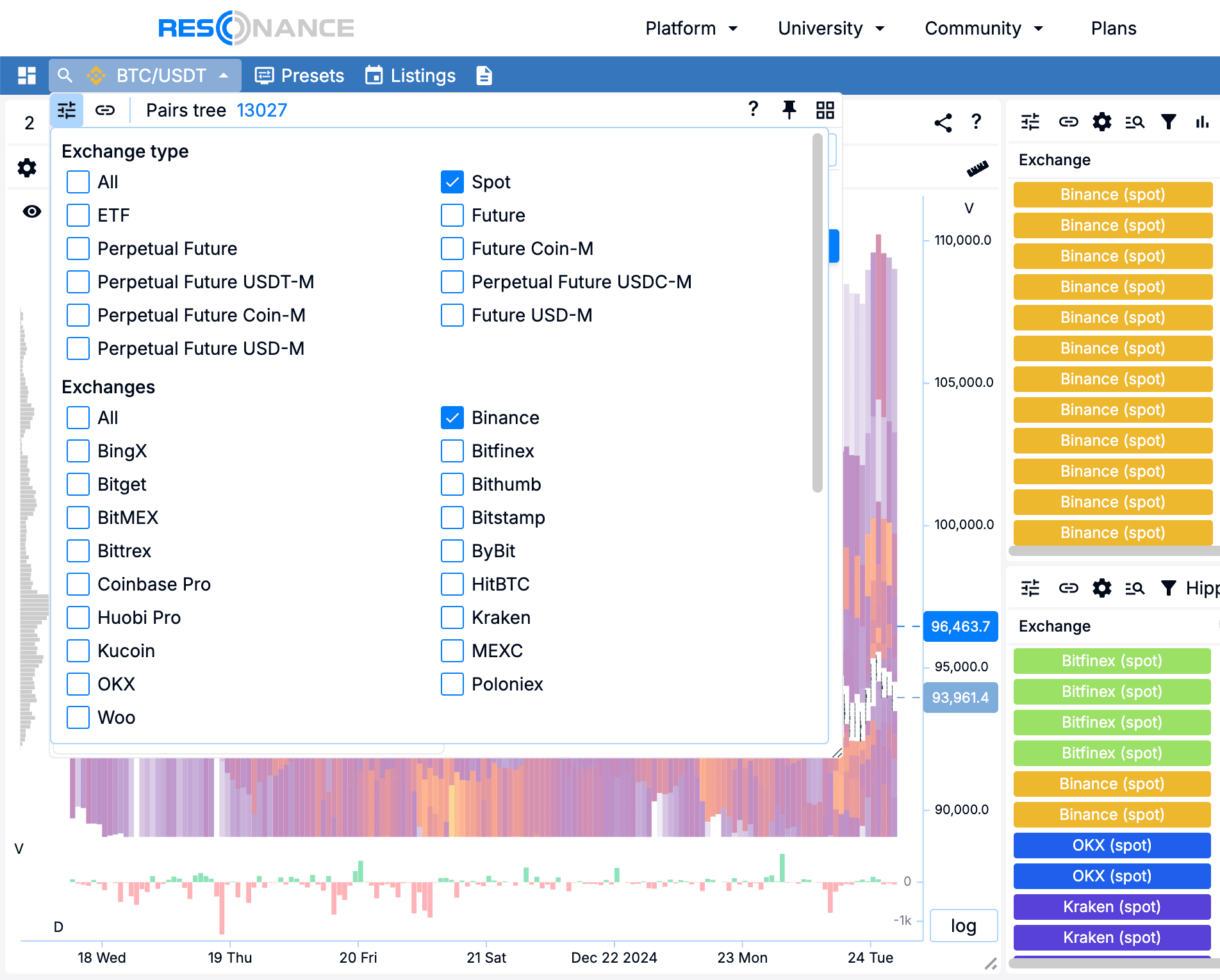
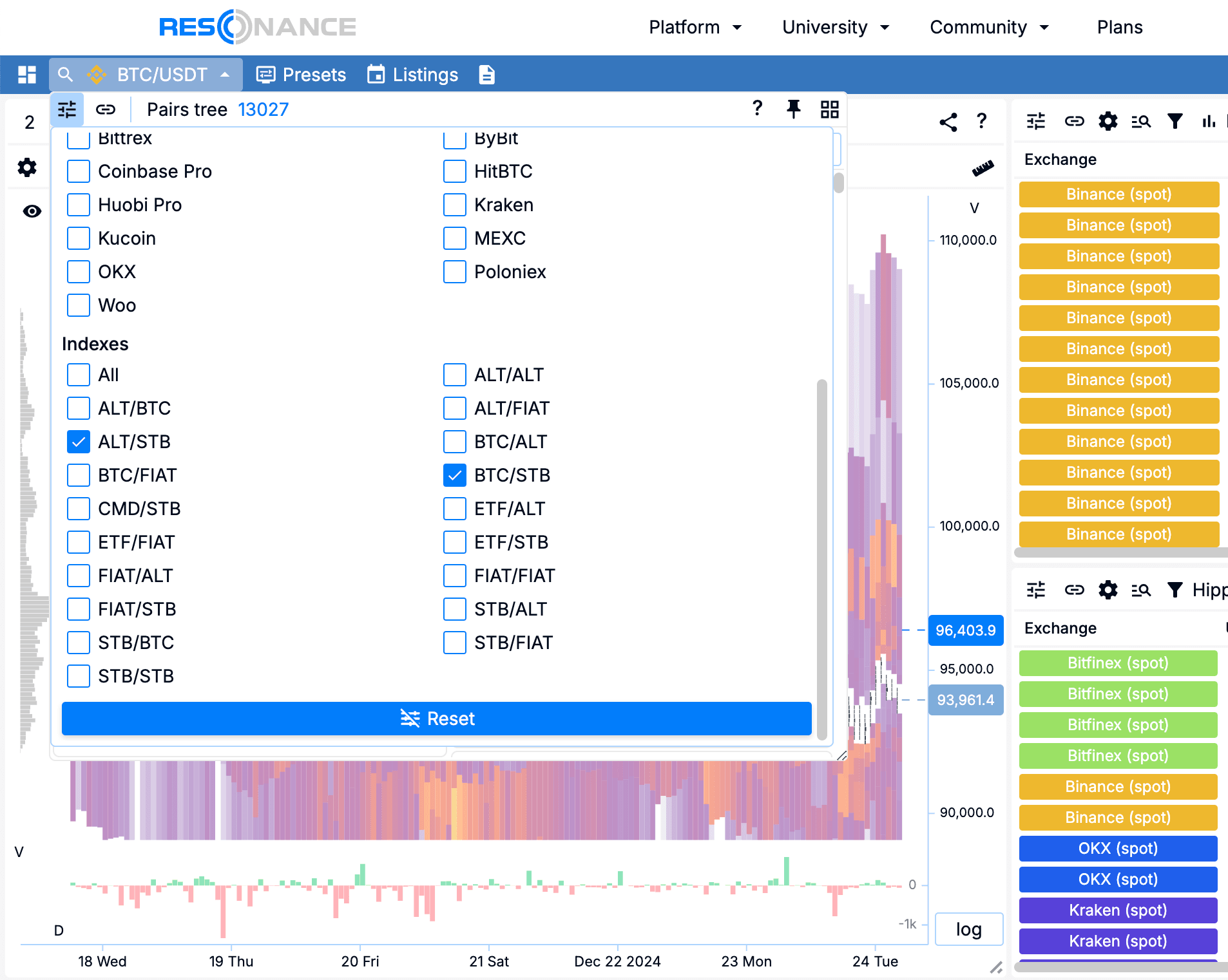
Select the Exchange Type, Exchange and Indices (all settings are shown with arrows):
In the search line (highlighted by a rectangle) type the */USDT filter to display only tickers that are traded to USDT.
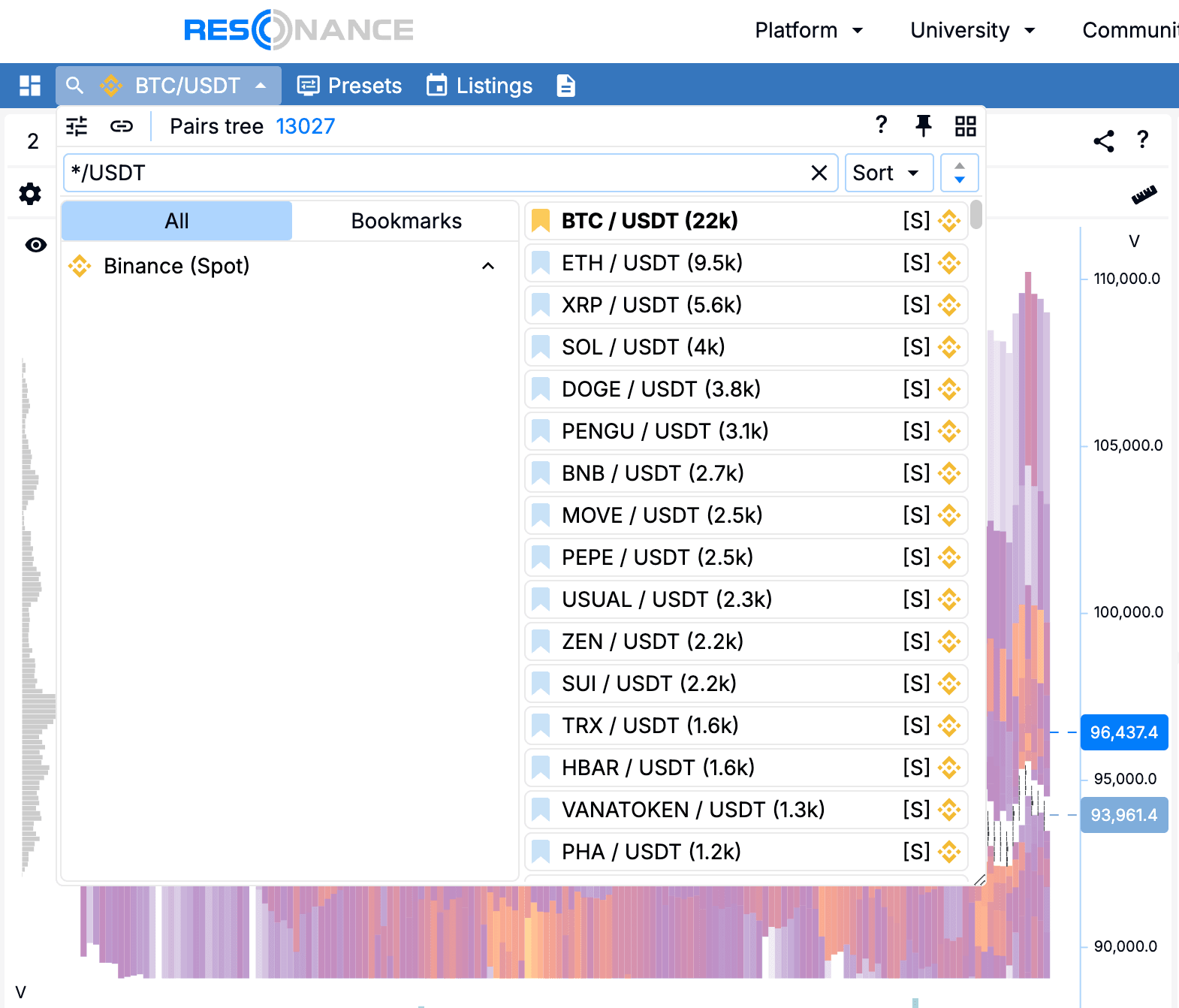
For convenience, we open the pairs tree as a widget (marked by a square icon of a stationery button).
Adding additional cluster charts
You can add up to three charts. These steps are highlighted by rectangles with an arrow on the screenshot. It will be more convenient to work with two cluster charts.
On the cluster charts we need to select the data type - volume, this can be done:
- or by pressing Shift + V with the keyboard hotkeys
- or by pressing V in the chart header
- or through the cluster chart settings. The gear icon in the second row of the chart header, select ‘Volume’.
Change the histogram data type from the cluster chart settings (gear)
- on the right chart set ‘Delta number of deals’. Vertical’ volume block
- on the left chart set the delta. ‘Vertical volume’ block.
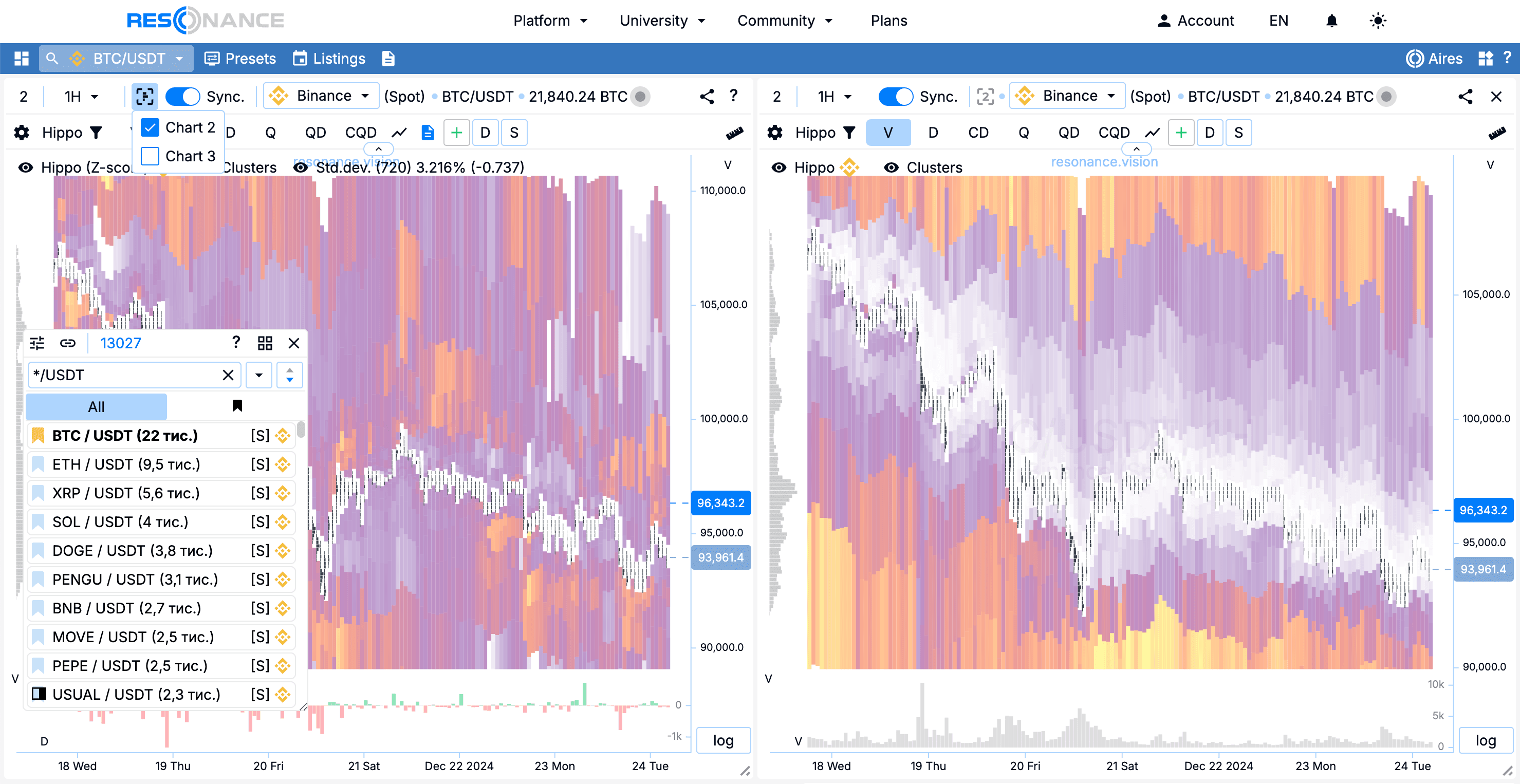
Note: We need different types of data on the cluster chart for quick evaluation of deals that have already been executed.
Chart synchronisation
In the header of a cluster chart there is a switch signed 'Syn’. When the synchronisation mode is enabled, the ranges and timeframes of cluster charts are synchronised, which speeds up the analysis of charts, as it is not necessary to change the ranges on clusters separately.
Timeframe
In my example the timeframe chosen is 30m, a smaller timeframe requires a greater presence in the market and a greater level of concentration. A larger timeframe requires more time to work out.
Range
The range on a cluster chart averages 120 bars.
Note: Range is the visible number of bars on the chart. It depends on the size of the chart. If the chart is large, then you can set a larger range. If the chart is small, then the number of bars should be reduced.
If the number of bars is small, we risk not seeing what we have seen recently (context).
If there are a lot of bars, then we will not be able to see clusters and spots on the heat map in this ‘mess’.
Granularity
Note: The granularity is the size of the clusters in height. This setting allows you to adjust the height of the clusters automatically.
Also, the size of the setting depends on the size of the chart. If the chart is stretched to the full width and height of the screen, then Detail 4 will be fine. If the chart is small, it is better to reduce the detail. Clusters should be visible!
On average, for my monitor, the detail on clusters is selected 2. But it also depends on the volatility of the coin. If we noticed something ‘interesting’ on the heat map and there is also something ‘interesting’ on the histogram under the chart, then it makes sense to look at a few details to see how unusual these clusters are compared to the average trading activity.

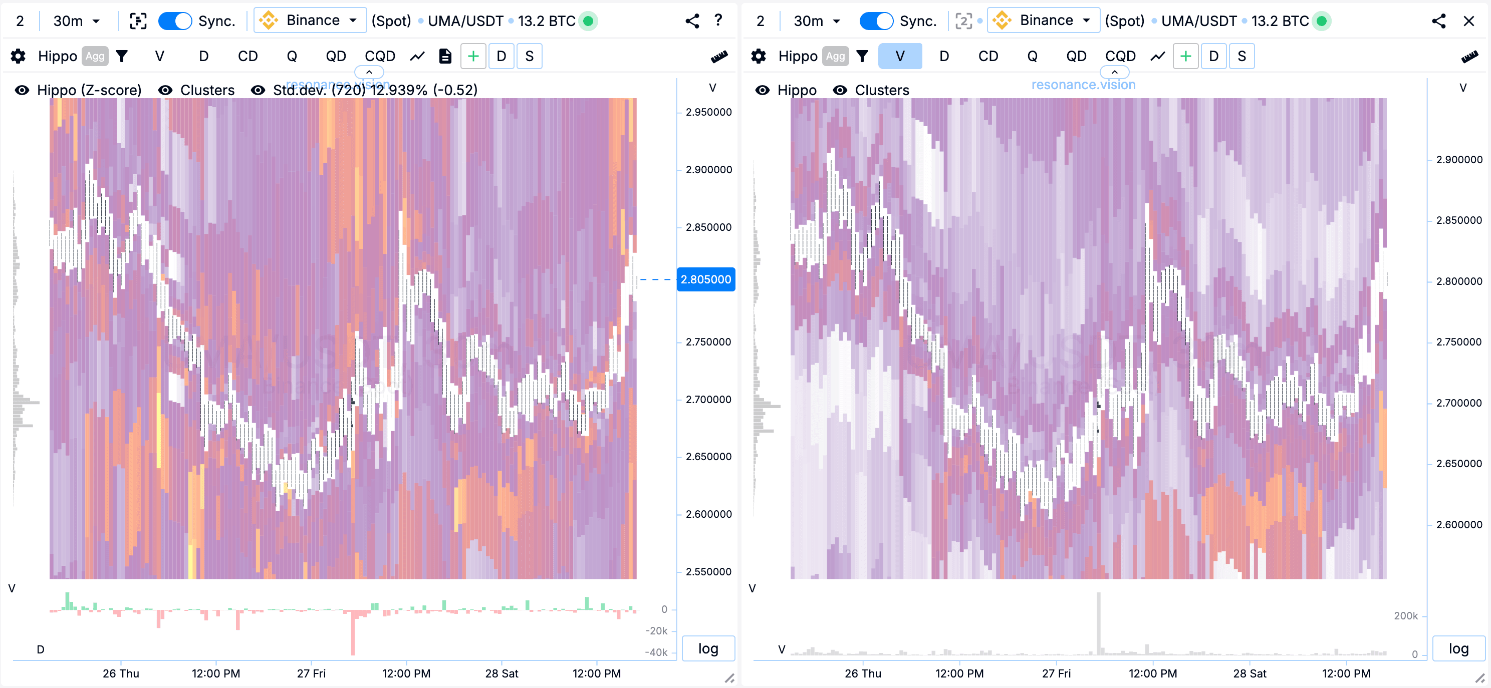
Hippo heatmap
The cluster chart has Hippo labelled on it, this is a drop down menu with settings, modes and filtering.
Chart 1
adjust in Z-Score mode. There is a Volume/Z-score switch in the menu, top right.
Chart 2
adjust in volume mode. There is a Volume/Z-score switch in the menu, top right.
Both charts should have the following selected:
- Aggregation: enabled
- Data type: volume
- Colour scheme: dynamic
- Distance,%: 0.01 to 15.97-41.81
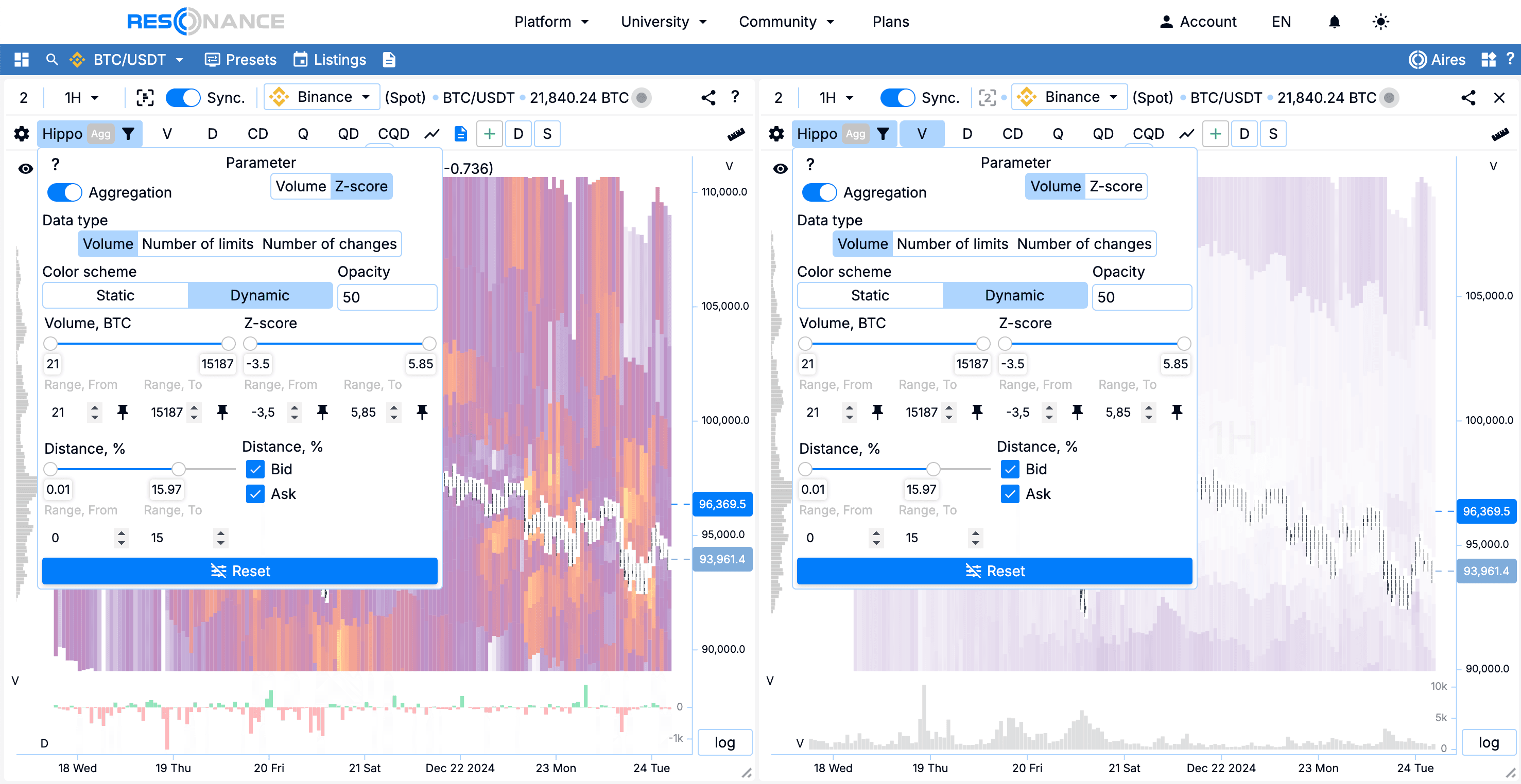
Note: Distance,% is a setting that hides ranges in the heatmap. We hide the far ranges because there may be large limits there that would interfere with the objective evaluation of the near limits. Than closer limit orders are to the price, than more ‘influence’ they have on the price.
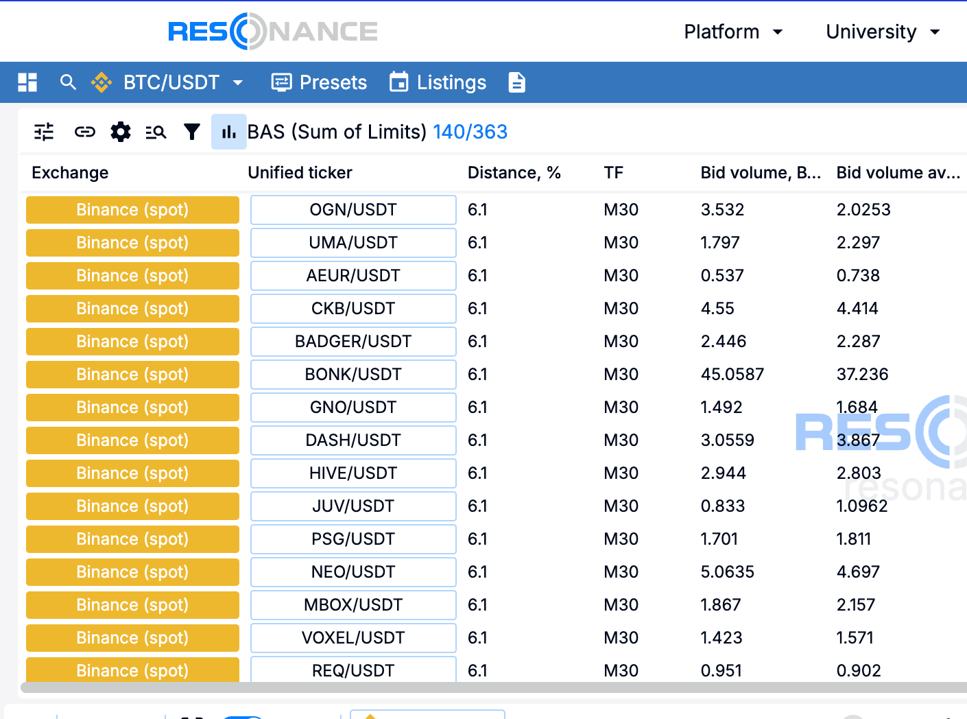
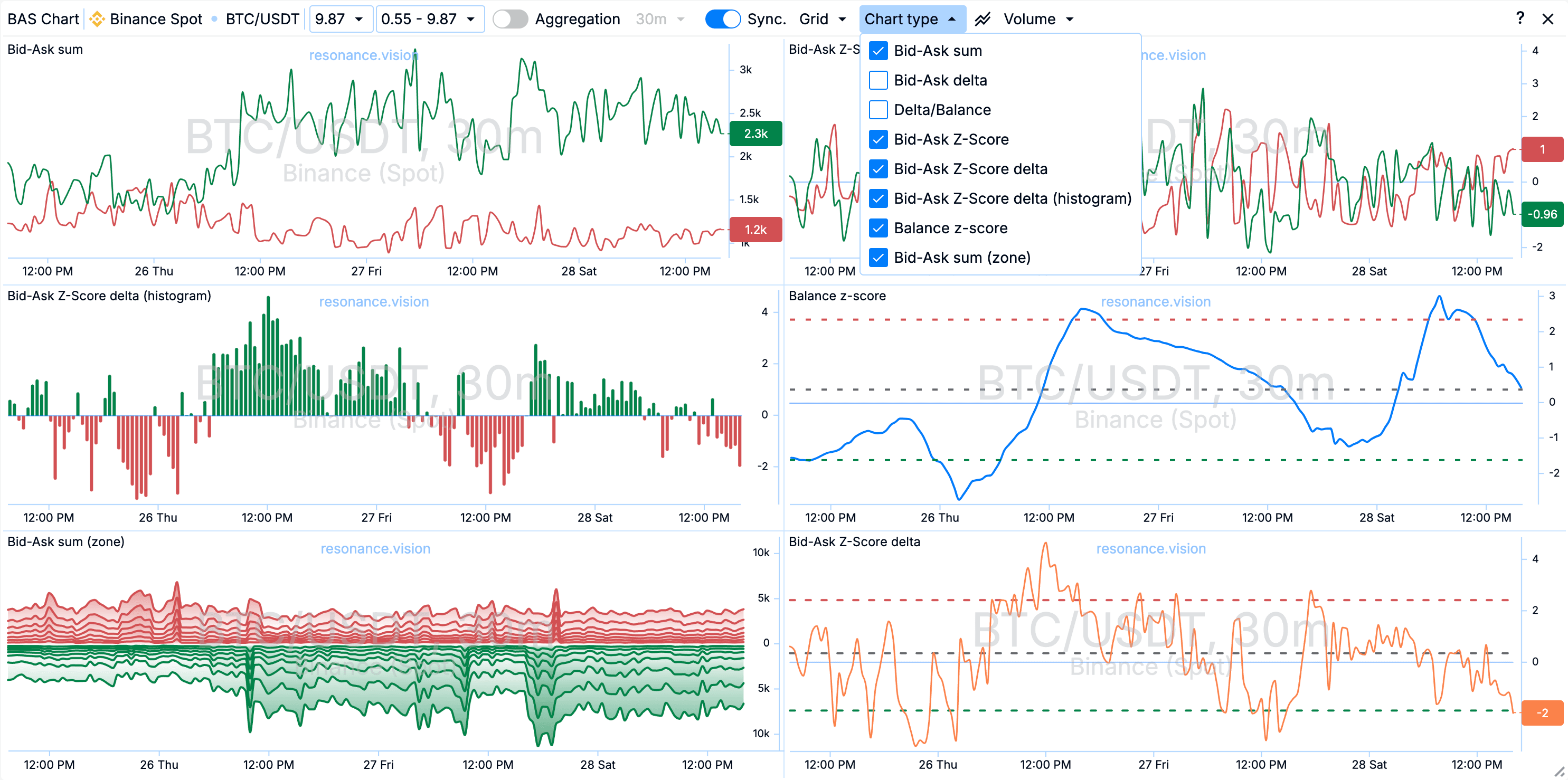
BAS Chart
When opening the BAS tool window, we open the table of the search engine. To open the BAS chart, you need to click on any ticker in the table or click on the chart button in the table header.
For example, we select CKB/USDT (highlighted by a rectangle) in the list ‘BAS (Limit Amounts)’. The button is in the column ‘Unif. Ticker.’
Customising the chart window
To speed up data analysis, I recommend selecting Grid 2 in the chart header. The grid will allow you to place charts in 2 columns.
You should also select the data type - ‘Volume’
For convenience, we enable the Synchronisation mode - ‘Syn’. This will allow synchronising timeframes between the cluster chart and the BAS chart.
Also enable the aggregation mode, which will allow to evaluate data from all exchanges simultaneously.
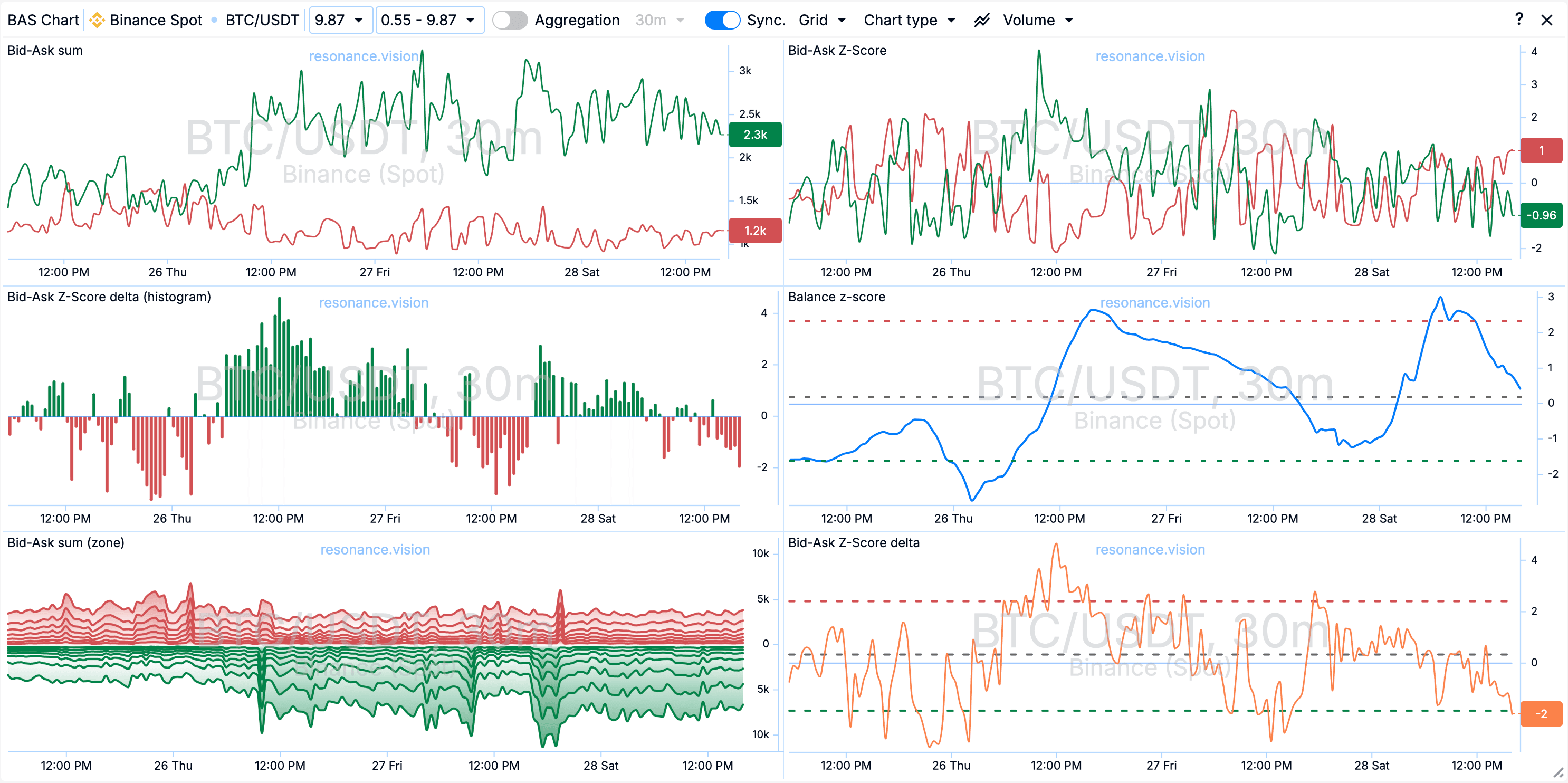
Open the ‘Chart Type menu’ in the chart header, here we will be able to select:
- Bid-Ask Amount. This chart shows us the change in the dynamics of the sums of limit orders.
- Bid-Ask Z-Score. This chart shows us the change in the dynamics of ‘anomaly’ of the sum of limit orders.
- Bid-Ask Delta or Delta/Balance. Both of these charts show the difference between the amounts of buy and sell limits, just in different visualisation, either by a line or a bar chart, but in the case of the bar chart, we still have a balance line showing the ratio of buy and sell limits.
- Z-Score Balance. This is a line chart that shows us the balance deviation between the Buy and Sell limits. It shows how much the current balance value has deviated from its average values.
Quick Jump Buttons
To speed up the work on data analysis, we recommend using the Dashboard quick-open buttons - 'D’. When you click on the button, a new tab with the Dashboard page opens, and there you select a ticker from the cluster chart.
Dashboard
When opening the Dashboard via the shortcut key, in addition to the ticker and stock exchange, the timeframe is selected in the settings.
It makes sense to change the range if you need to set a larger or smaller range for detailed analysis of history.
Note: within one block of charts, all charts are synchronised by range and timeframe. To synchronise the ranges and timeframes of all blocks, you should use the ‘Sync’ button in the top menu of the Dashboard.
In the top menu I set the aggregation mode on in advance. The switch is 'Agg’. This will allow to evaluate information from all exchanges, which removes the effect of arbitrage.
I also select ‘Grid’ - either 3 or 4 in the Grid menu. This will allow placing 3 or 4 charts in a row.
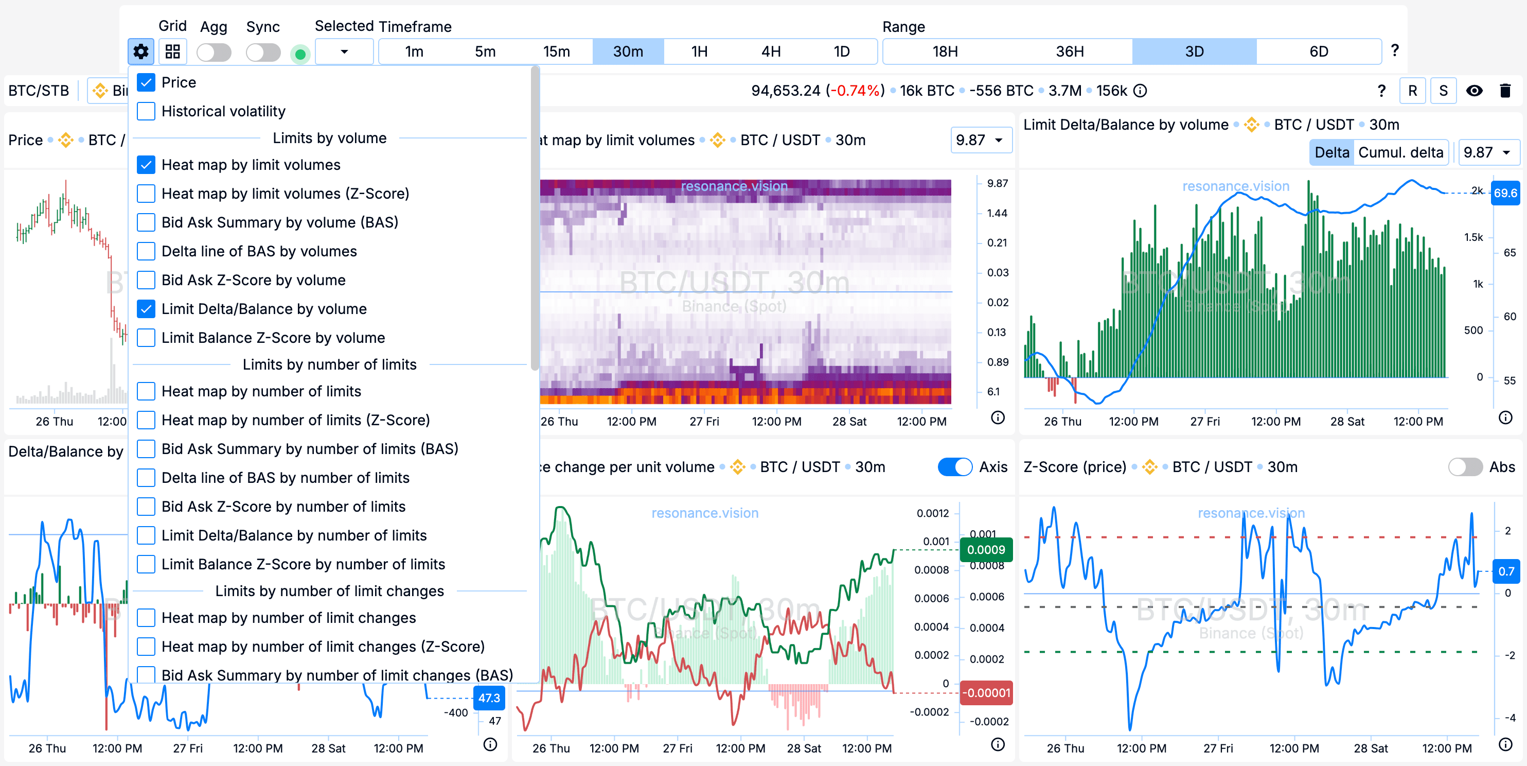
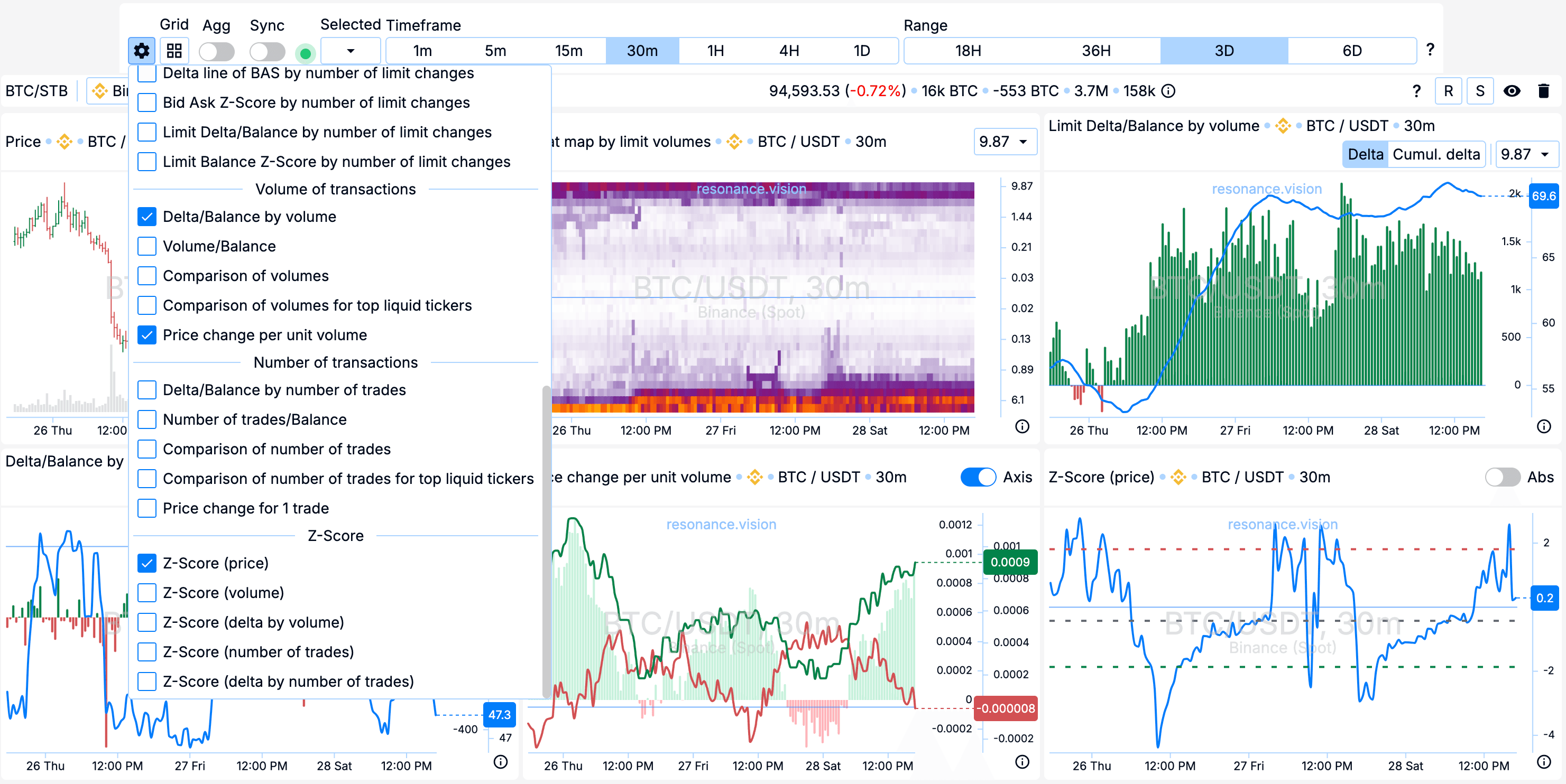
In the window selection menu (icon with gears), you need to add the key charts for this approach:
- Price
- Heatmap by limit volume
- Limit Delta/Balance by volume
- Delta/Balance by Volume
- Price change per unit of volume
- Z-Score (price)
If some block with currency charts is no longer relevant, there is a basket icon in the header of the block on the right side, using it you can delete the block.
If a block is temporarily not needed, you can hide it by clicking on the icon with an eye near the basket icon.
How to search?
We have set up a working environment for analysing trading pairs. Now in RTT, in the pairs tree, we change pair by pair and see what the charts show.
You can look through the list several times a day, several times a week, and even several times a month in case of large timeframes. It all depends on your choice of timeframes and the strategies you are trading.
In order to select trading ideas for this blog, a timeframe of 30 minutes is used. Therefore, the market is viewed several times a day.
Bottom line
This article is the answer to the question ‘How to look for ideas in the market?’.
Remember that using a systematic approach and strategy you will be able to find profitable trading ideas.
There’s no need to invent complicated schemes or look for the 'holy grail’. Use the tools on the Resonance platform.
Register via the link to get a bonus and start earning:
OKX | BingX | KuCoin.
Use promo code TOPBLOG to get 10% off any Resonance plan.
Recommended articles


