Hippo: trading strategy with limits

Hippo guide: using cluster chart and limit orders heat map to learn to see trend stops / support, spoofing and to plan precise entries/exits in trades
Table of contents

The first configuration: stopping the movement
When we want to enter a reversal of the movement, we need to make sure that it is really a reversal and not a local calm.
Let’s take the example of growth.
A reversal happens when:
- sellers run out of resources to drive the price down
- or when sellers are no longer profitable to sell at lower prices
- or they realise that the volume of buyers is too low and they decide to wait for the arrival of new buyers
- or buyers use more resources than sellers.
To simplify things, a reversal occurs when there is a shortage of supply and a surplus of demand.
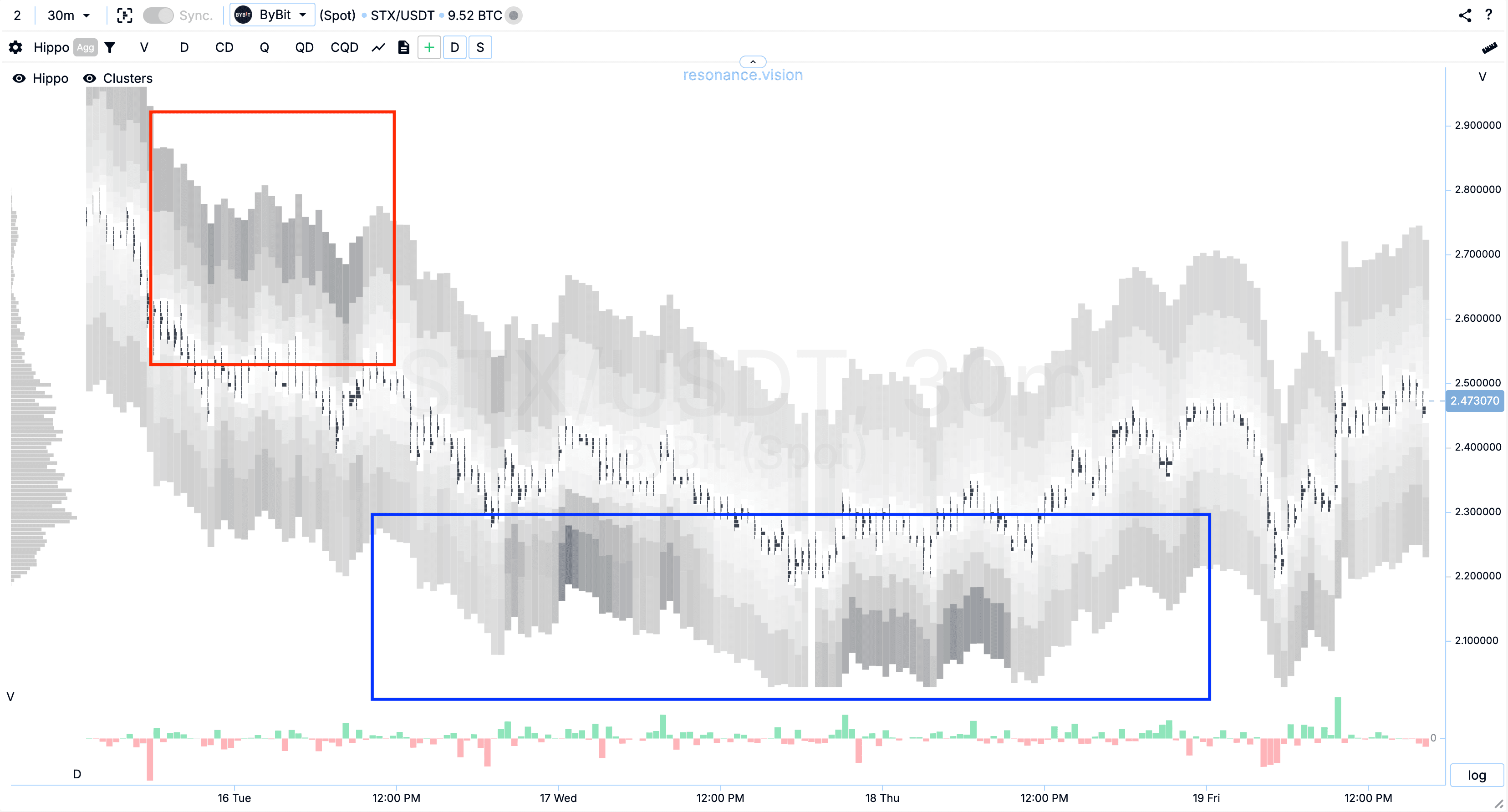
This is very easy to see on a cluster chart:
- there is a decrease in price on sales (red arrow)
- the price stops at some price zone (green line)
- there are new sales that do not lead to further price fall (small red arrow on the right).
We can evaluate the sales by the delta histogram below the chart (red - sales and green - buys).
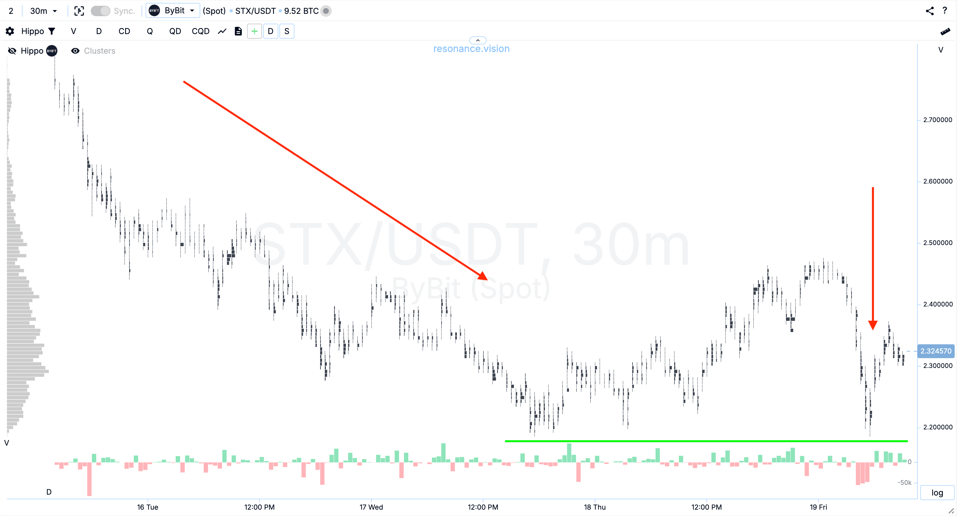
Large delta sales are confirmation and validation of the position.
But there can be many such situations in the market. Therefore, they need to be additionally validated in order to select the asset where the deficit volume is the largest.
To do this, we activate the heat map on the cluster chart.
As we can see on the chart, in the red and blue zones we have approximately the same amount of volume to buy. But orders with the volume to sell are much less in the blue zone.
This is an additional factor that speaks about the reduction of supply on the part of sellers.
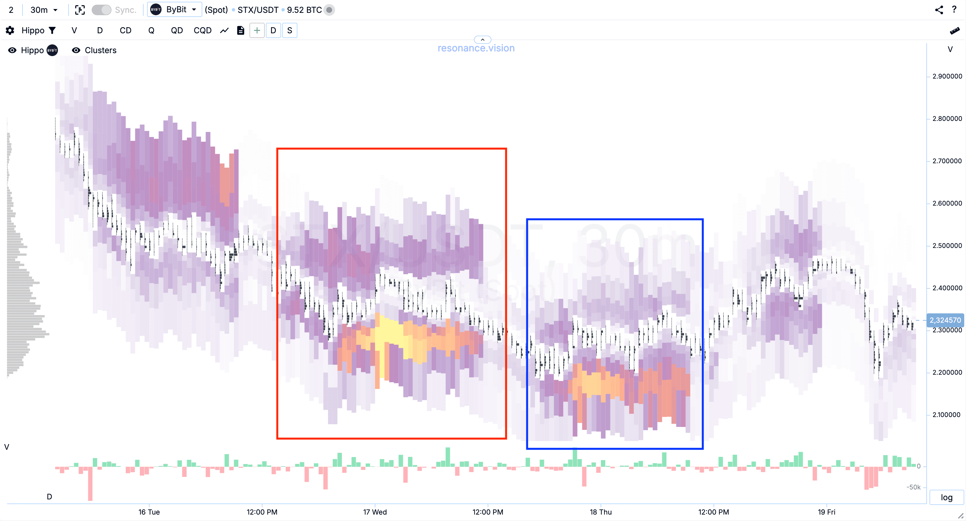
When we switch the heatmap to the data type number of limit orders, we also see that the number of orders is significantly different.
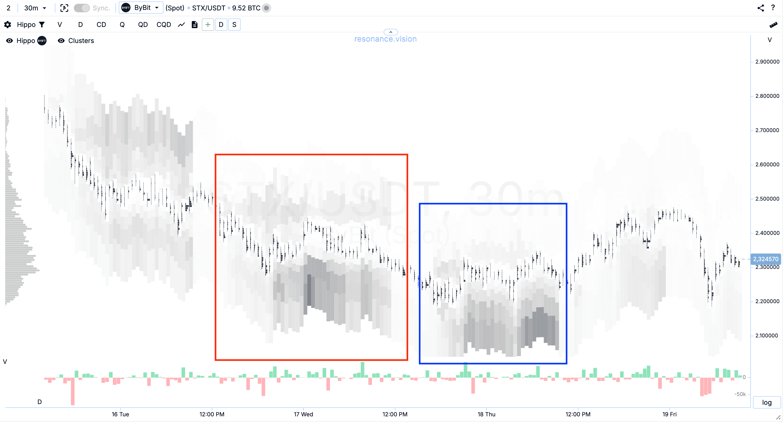
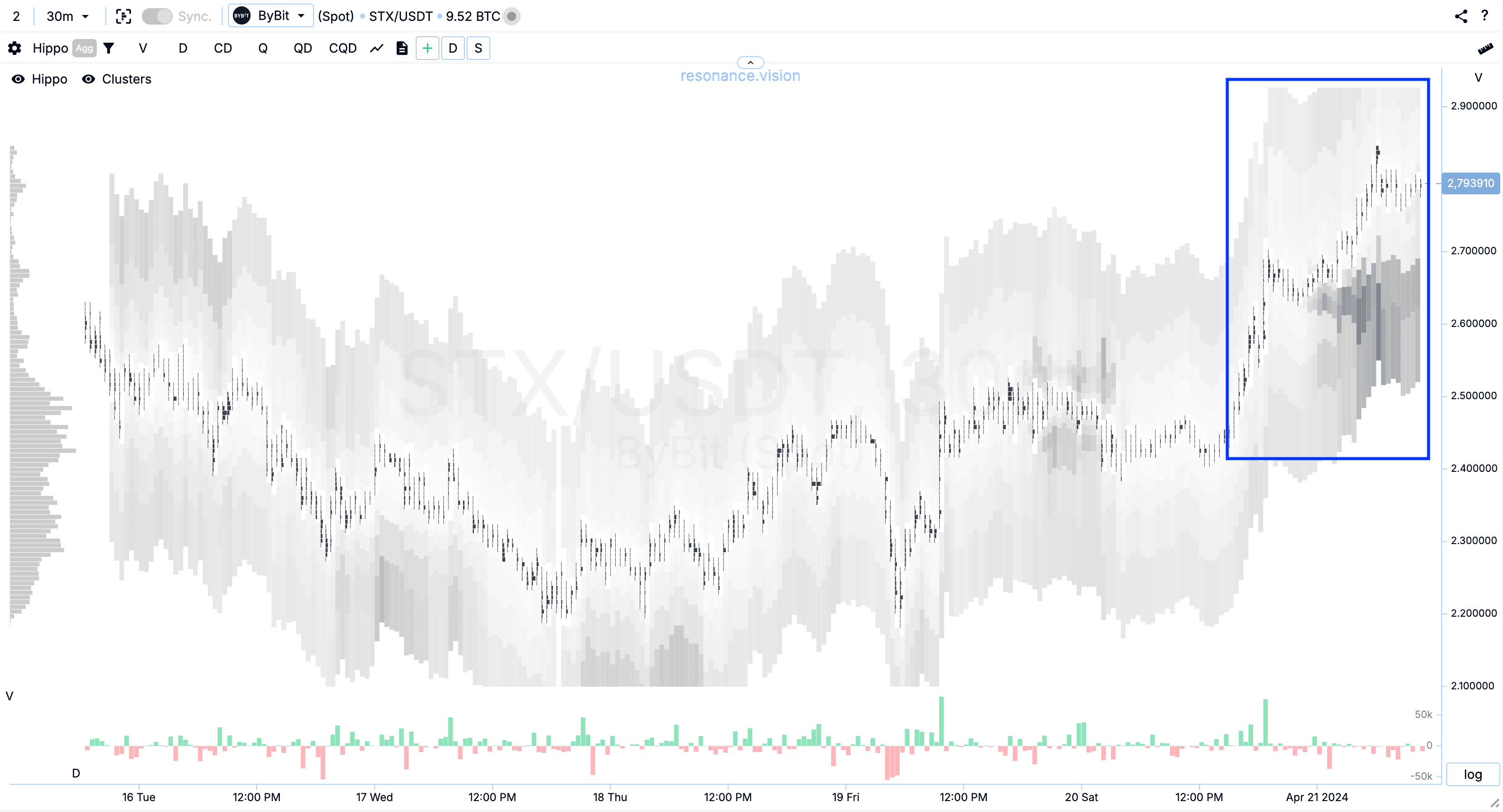
Such factors help us with the initial search and evaluation, but the heatmap has a second mode - aggregated data.
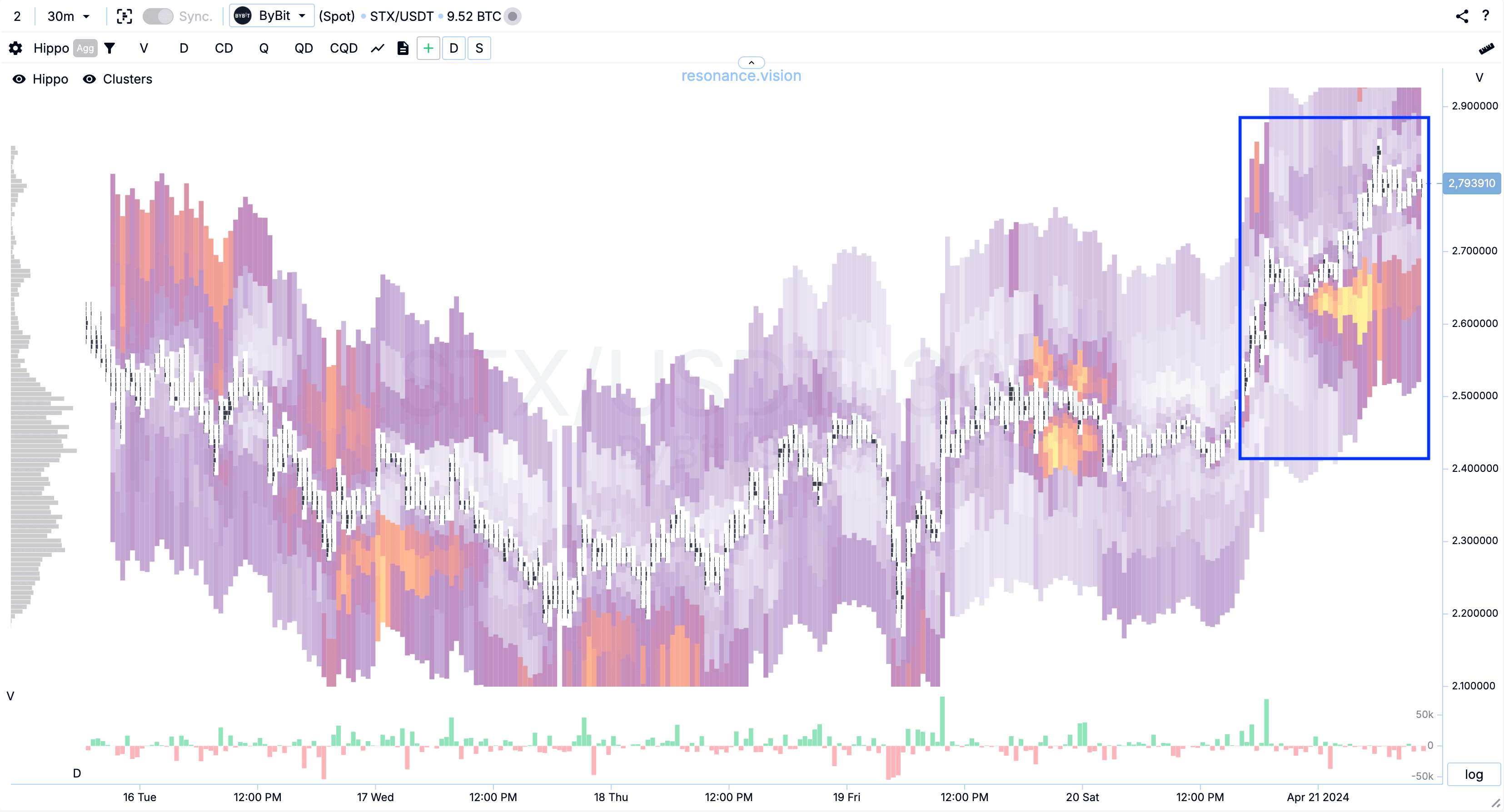
STX coin is traded on a dozen exchanges. Therefore, it is better to look through all pairs of this coin to understand the picture as a whole. And to save some time, we activate the aggregation mode.
In this mode, you can clearly see where there are more limit orders of the buyer, and where of the seller:
- red zone limit orders for sale
- blue zone limit orders for buying
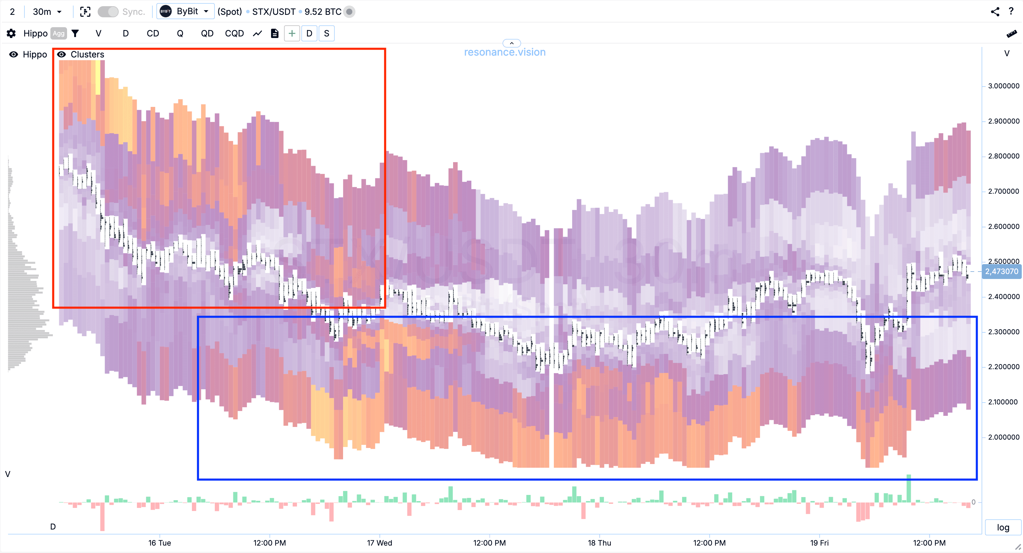
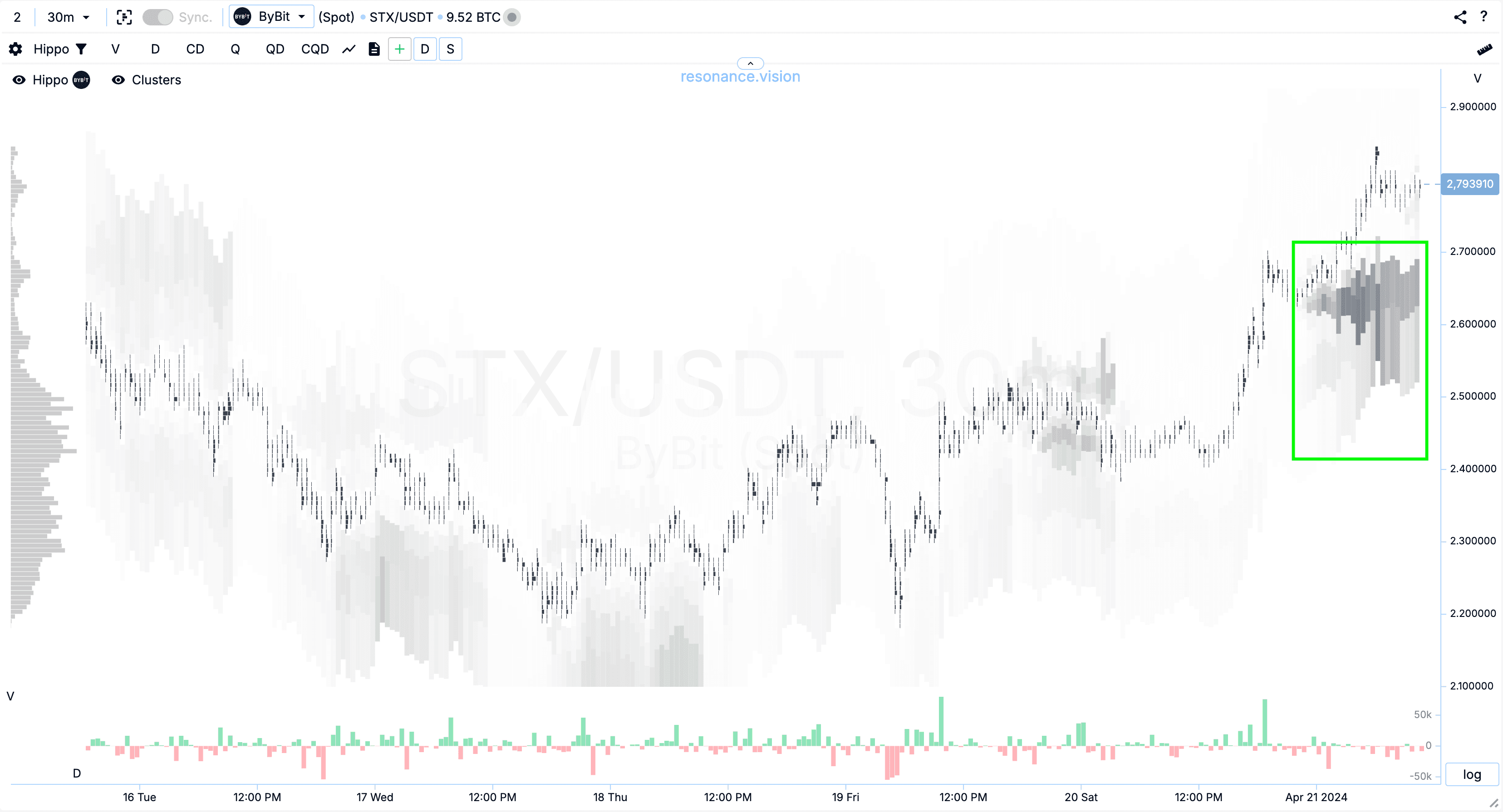
The same is true in the limit quantity mode:
- in the red zone the number of limits for selling prevails
- in the blue zone the number of buy limits prevails

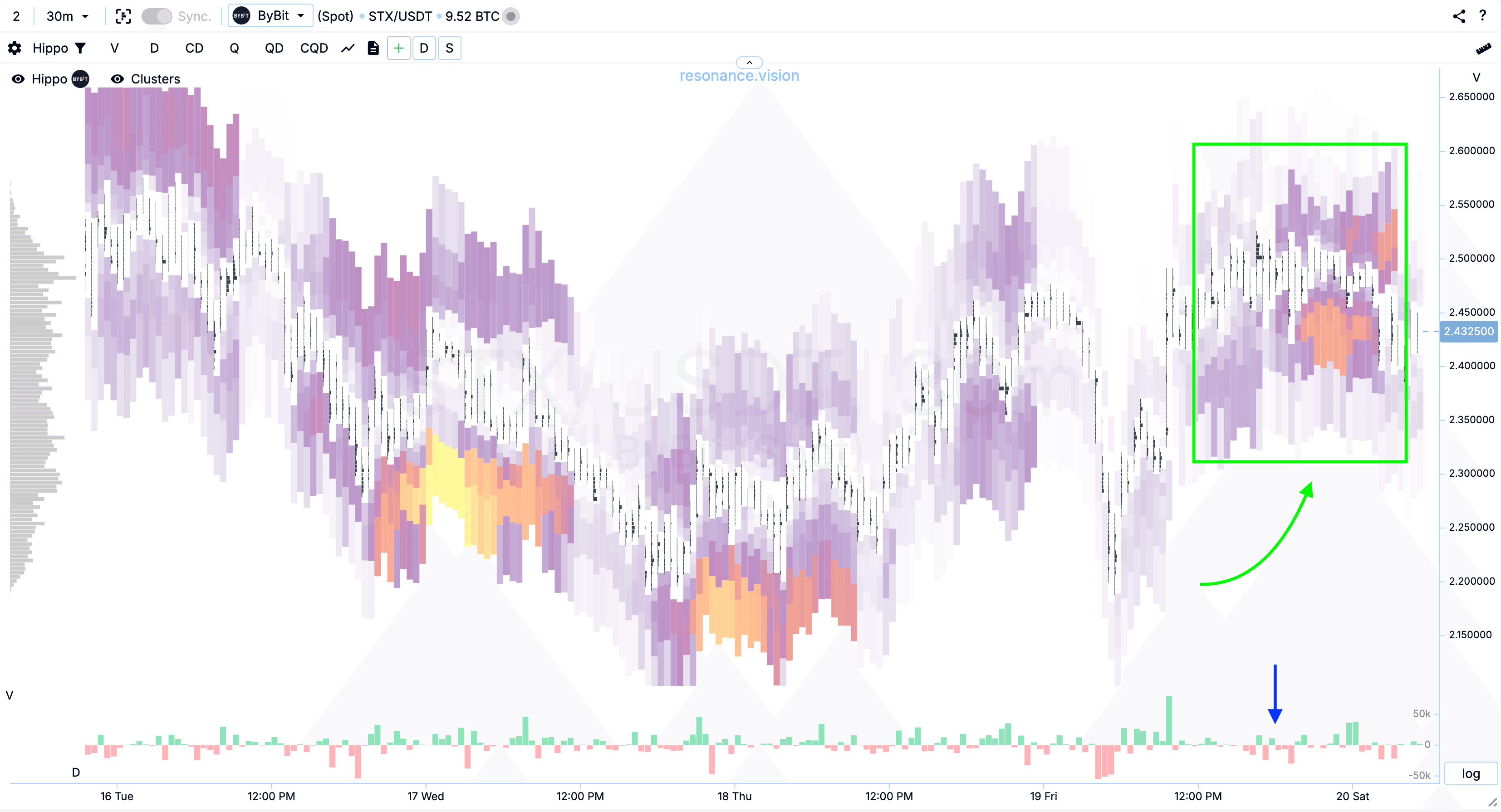
Second configuration: support for the move
When we have received the necessary validation and opened a position, we need to understand how long to hold the open position.
To do this, we need to keep a watch on the balance of supply and demand as the price moves.
After a significant drop in price, we should not expect a strong impulsive upward movement. Because the size of such an ‘impulse’ depends entirely on the size of the supply deficit created. And this directly depends on how long the buyers have been accumulating a limit position, buying out the sellers’ supply without making any market purchases.
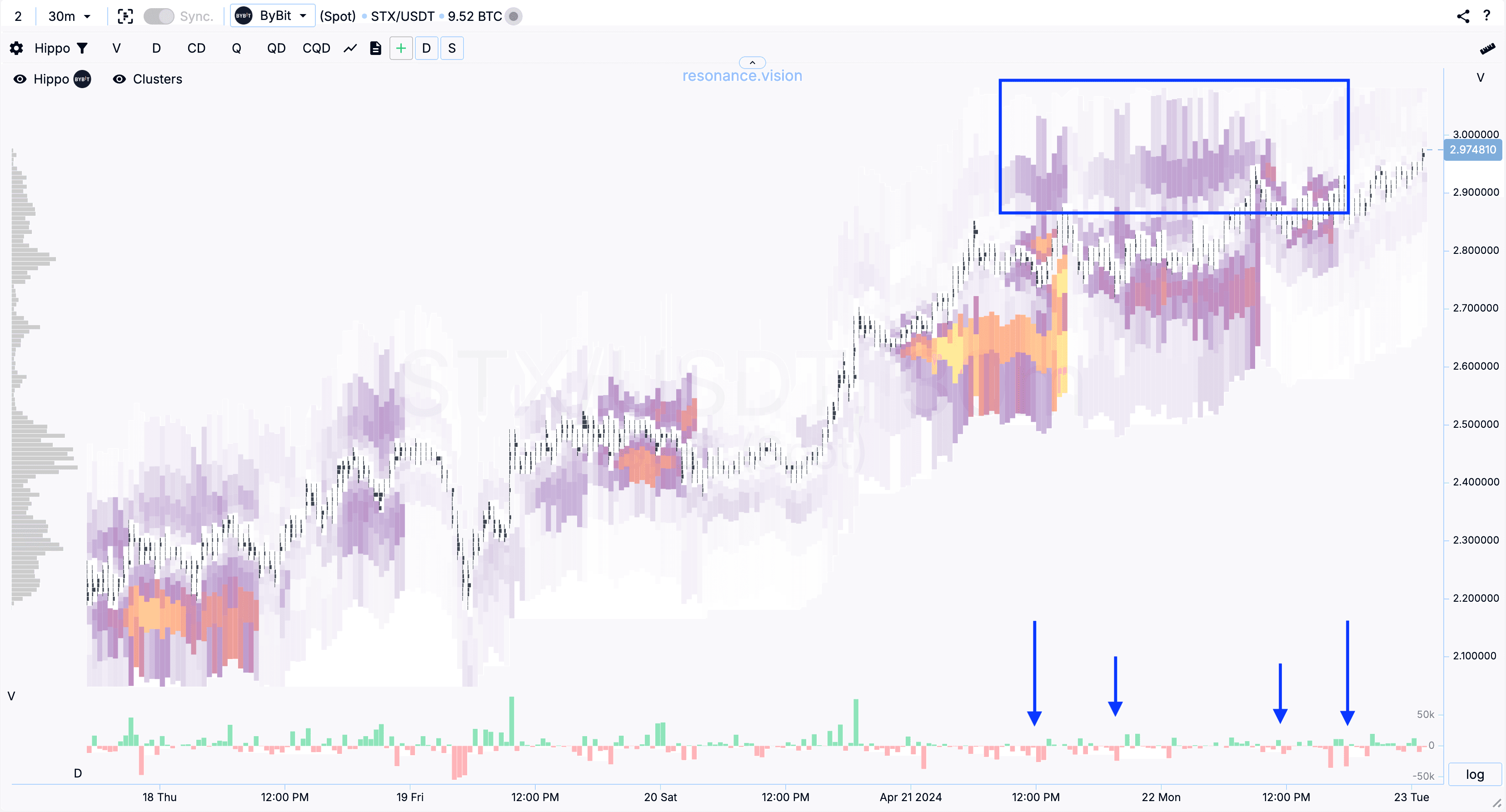
After the price starts moving upwards, we watch how the participants behave by placing their limit bids. We also watch how much the price is affected by the volume of market purchases and sales:
- start, growth and position entry - green arrow
- parity zone - green zone
- blue arrow, indicates sales that do not lead to a significant price decrease.
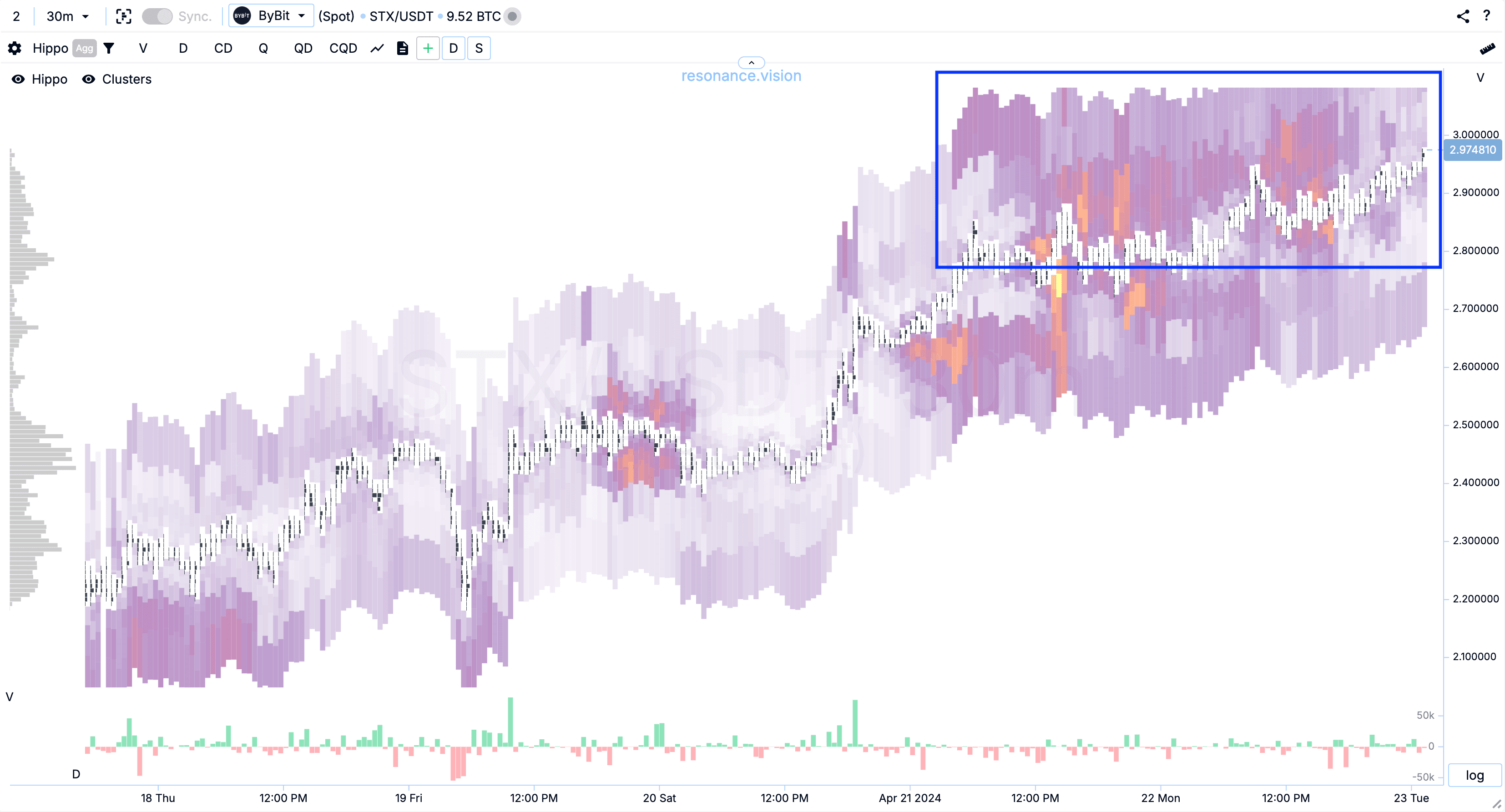
The situation is similar in aggregation mode.
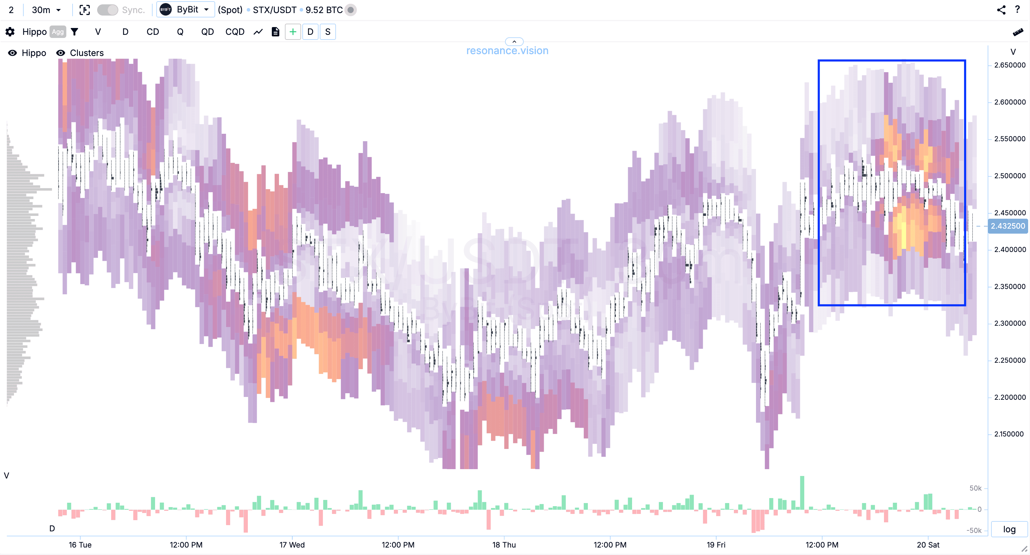
These signs tell us that sellers continue to dump their asset. As they did earlier when the price was falling. Sellers have seen more liquidity. But the fact that the price on the sales did not move down significantly, further confirms the outnumbering of buyers.
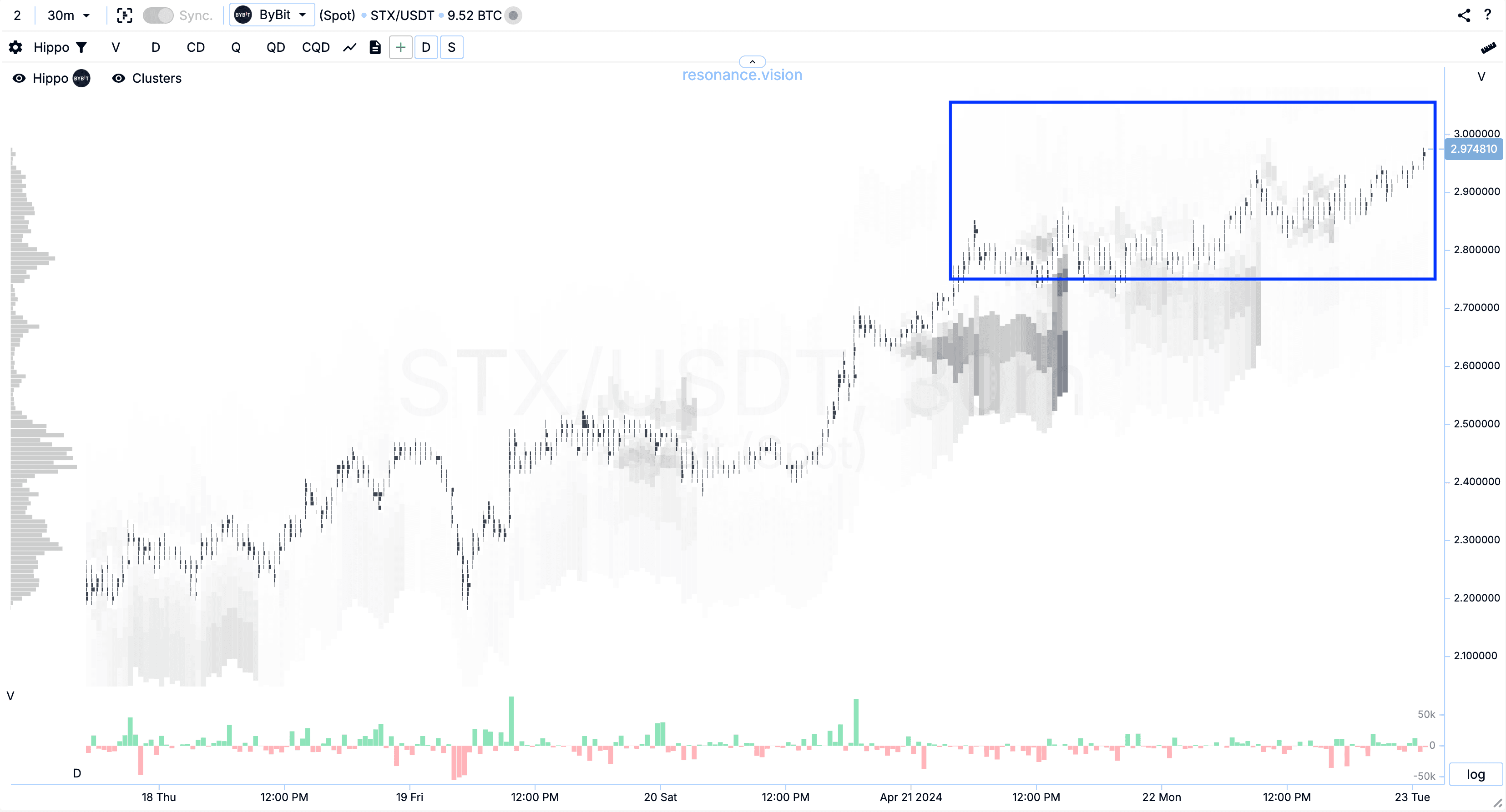
Further we see the price rise on market purchases (blue arrows).
This is a confirmation of the low limit offer.
And also we see that in the highlighted zone after the price growth buyers set their limit bids to buy (green zone).
We see that sellers use this liquidity to fix their positions (red arrow, market sales).
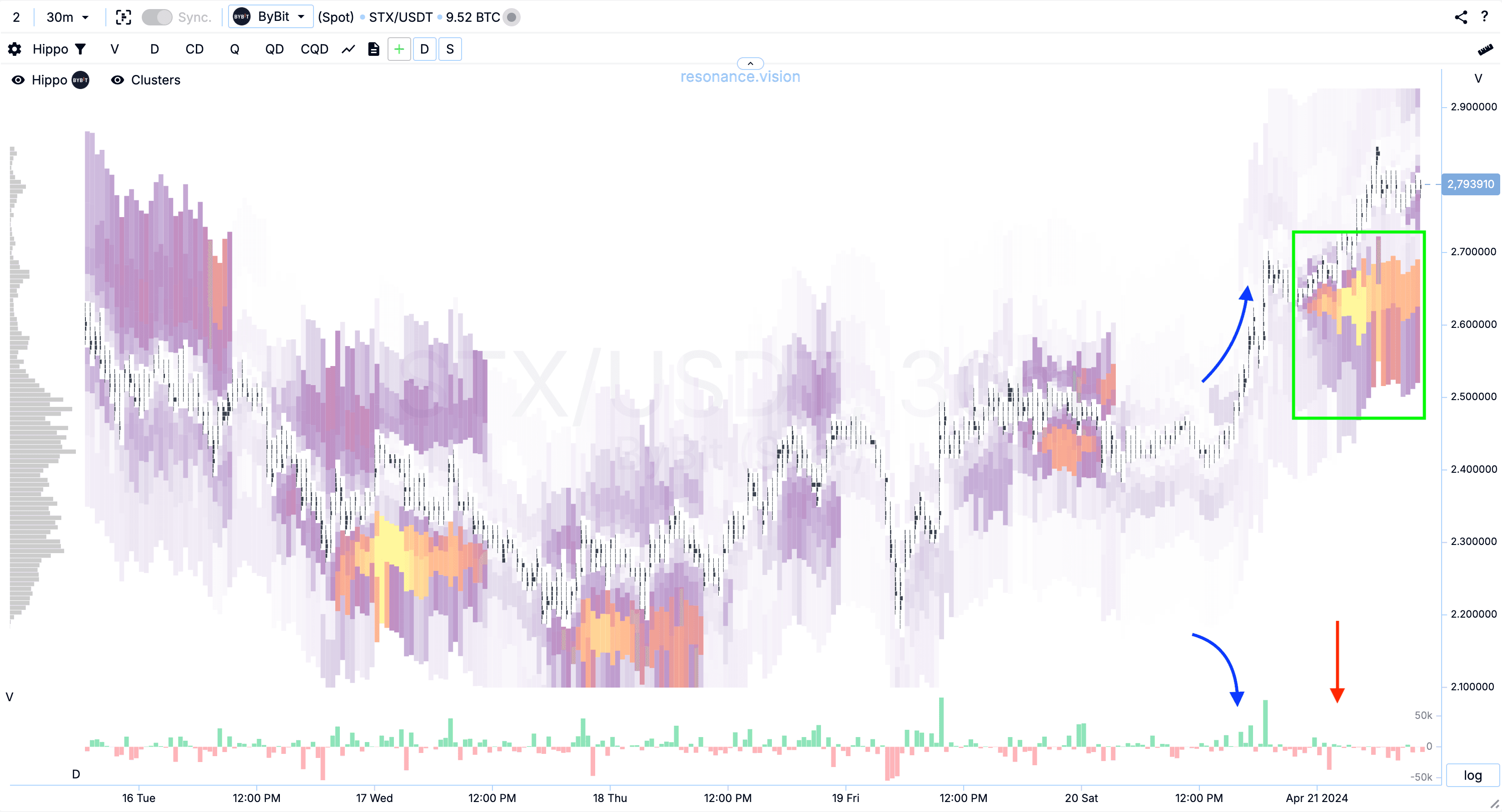
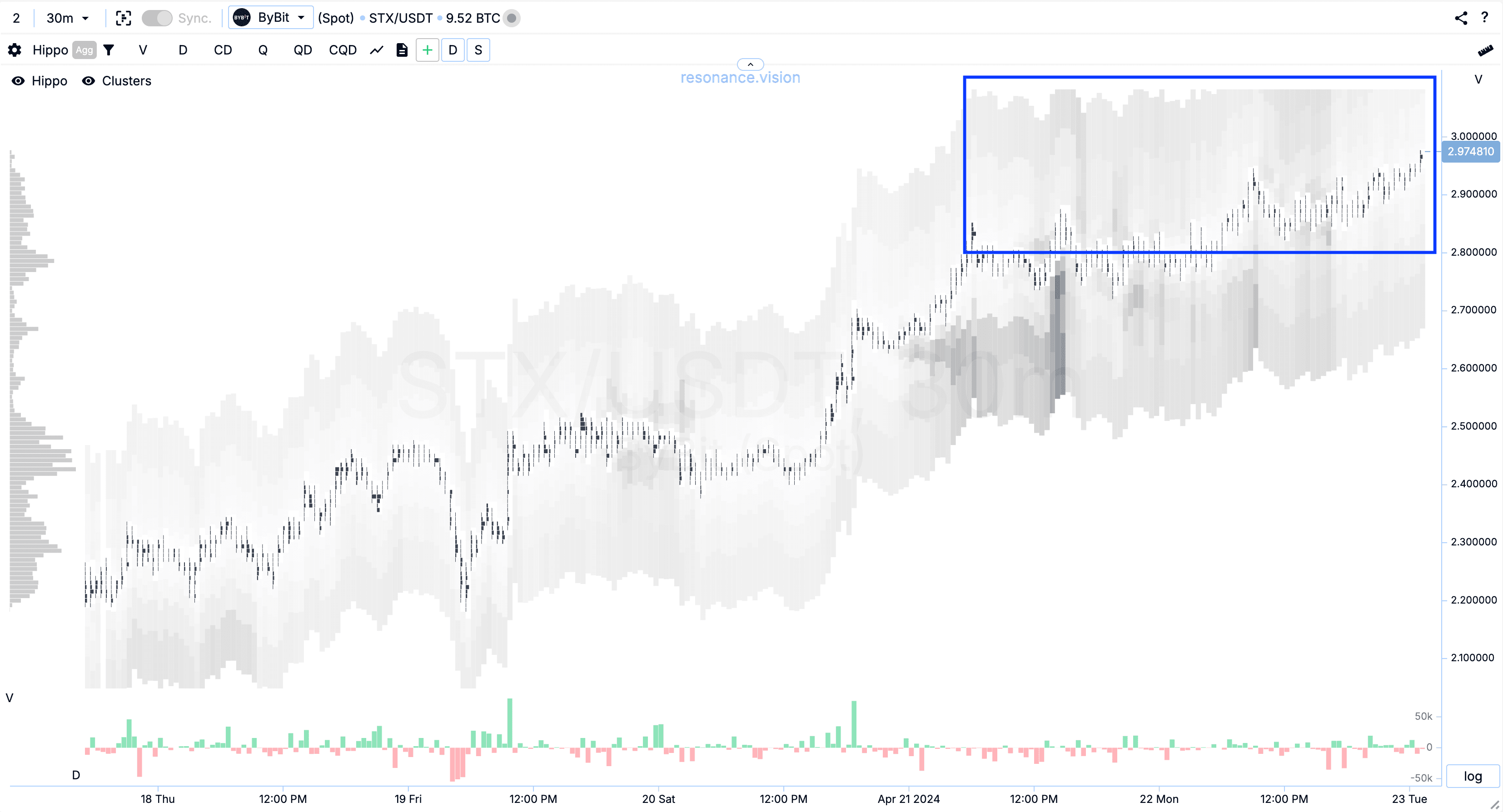
The aggregated heat map shows (blue zone) that in total, the situation is similar for the other exchanges. Participants behave in the same way.
On the heat map by the number of limit orders, we can clearly see that the number of limit orders of buyers is very high compared to other places on the chart (green zone).
The aggregated heatmap by the number of limit orders shows that the aggregate limit density is even higher for all exchanges (blue zone).
These factors confirm that the preponderance is still on the side of buyers. And the position can still be held.
Note to your strategy: If your position volume is larger than the volume of these support limits, it is better to close part of the position and lock in some profit. But the part to be closed should be such that it does not move the price and does not give away your intentions. Otherwise, other participants with long positions (longs) may realise that the competition for liquidity is very high, get scared and start closing their long positions (selling the asset) en masse, thus driving the price lower.
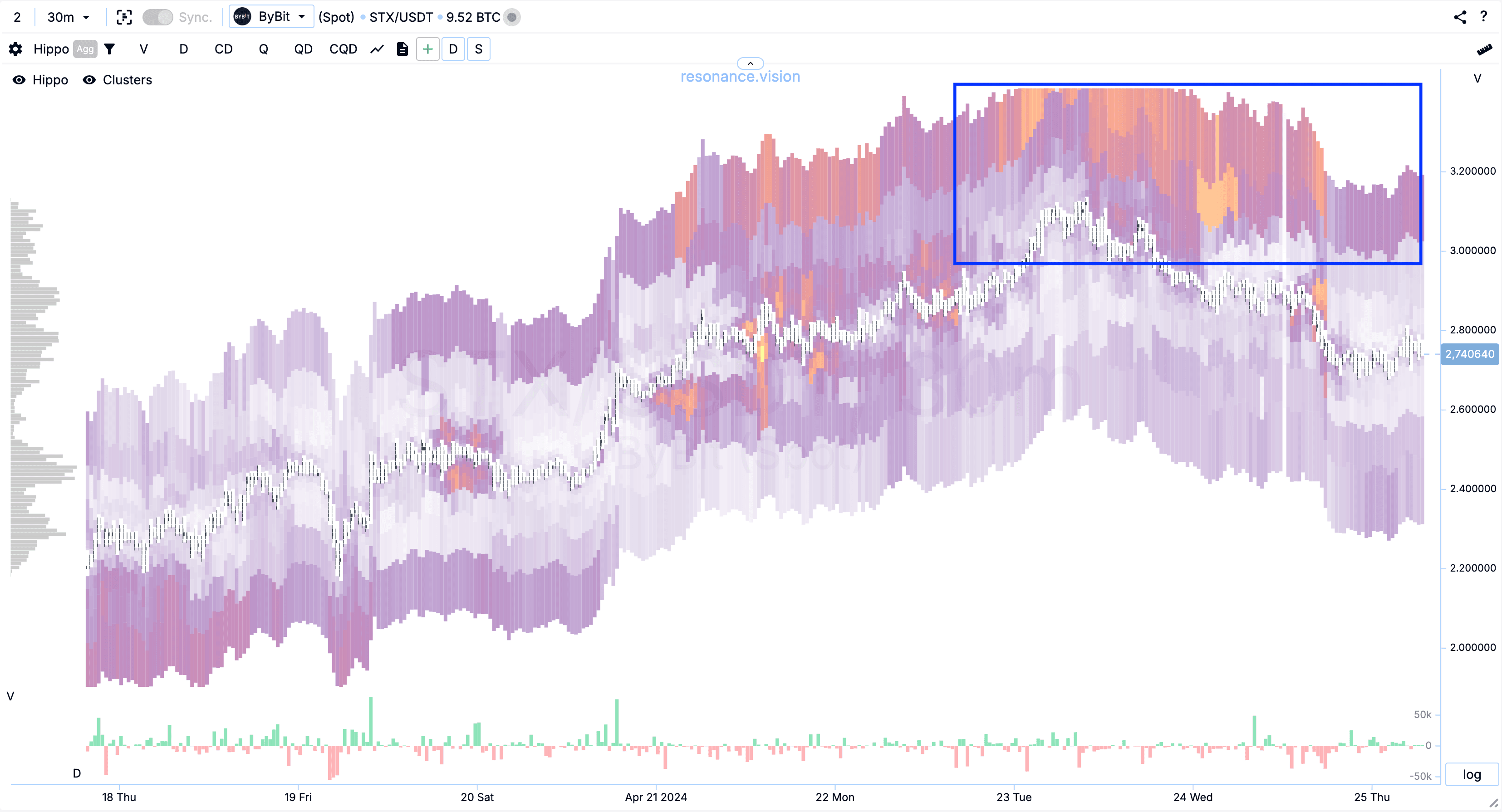
The third configuration: spoofing or ‘pressure by presence’
When we analyse limit orders, we must remember that there are market participants who trade intraday, medium-term and long-term.
The larger the capital size of a participant, the larger his time range for entering and exiting a position. This is because large capital faces a ‘liquidity problem’ when there is not enough money in the market, in short periods of time, to execute its positions without significantly affecting the price.
Note: this effect is clearly demonstrated in a simulation of a major player in a free interactive training course
Therefore, realising this problem, the large players can start to ‘pressure the rest of the market with their opinions’ in order to ‘force’ them to sell volumes, which will be picked up very quickly by the large players.
For this purpose, large (long-term) capital, seeing the growth of the asset price, starts to place large sell orders in order to force smaller (intraday and medium-term) participants to start selling.
This can be recognised by a number of signs:
- when there are clear signs of the supply shortage described earlier, we see an increase in limit supply, not far from the current price (blue zone)
- market sales not lowering the price (blue arrows).
In the screenshot this phenomenon is not super pronounced, but the principle is realised.
But the aggregated heat map shows this effect much better (blue area)
Additionally, this can be confirmed by the number of limit orders in this zone. If it is really a global desire to sell out the asset, then the number of limit orders should be significant. In this case, there is no such ‘significant’ increase, even if we exclude buy orders from the visualisation, leaving only the number of sell orders.
And even in the aggregated version (blue area), there are no significant densities.
Exiting a position
An asset cannot rise or fall forever. Because sooner or later participants will want to fix their profit or loss, and will close positions, shifting the balance in the opposite direction from the trend direction.
Signs of balance shift when it is better to fix a position:
- a decrease in price during market sales (blue arrows). This indicates that most of the buyers are no longer ready to buy at these prices
- higher volume of limit orders for selling than for buying (blue zone)
- buying does not lead to price growth (red arrows)
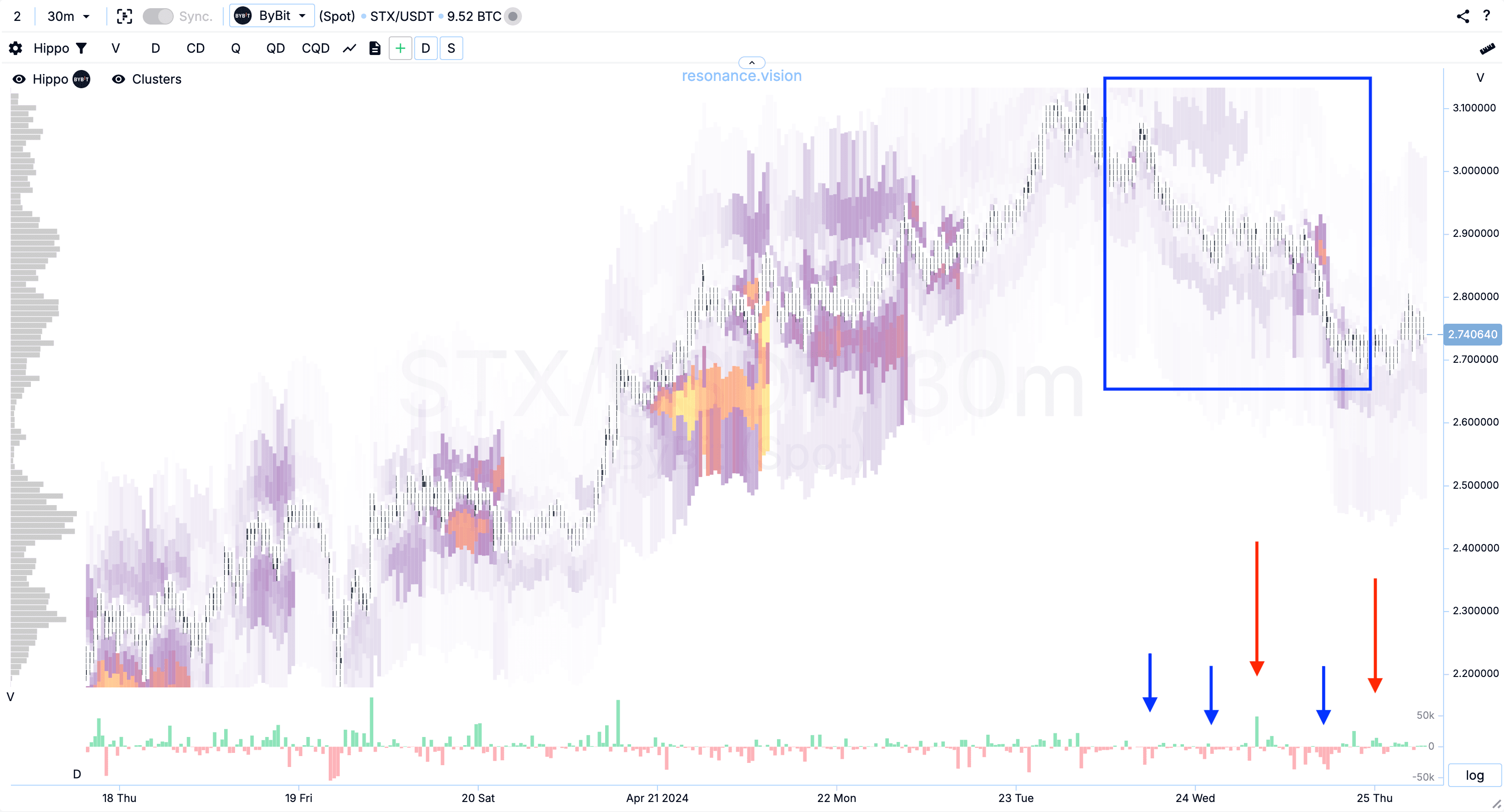
In this example, we have no tight limit resistance at the local high. But on the aggregated heat map (blue zone) we can see that in total for all exchanges, the limit supply is unambiguously greater than the limit demand.
Recommended articles


