Hippo: применение инструмента. Часть 2. Скальпинг

Осваивай скальпинг с тепловой картой Hippo. В статье ты узнаешь, как находить скрытые «точки входа» на рынке, оценивать уровни лимитов и использовать колебания цены для стабильной прибыли.
Содержание

Эта статья - продолжение первой части “Хиппо: торговая стратегия с лимитами”, где мы рассматривали, как анализировать структуру рынка с помощью Hippo. В этой части сосредоточимся на практическом применении инструмента для скальпинга криптовалют: как определять момент слабости агрессивной стороны и быстро реагировать на развороты. Если вы торгуете в моменте - это must read.
Скальпинг
Чем ближе лимитный ордер размещён к цене, тем большее влияние он оказывает, как психологическое на тех кто видит этот ордер, так и непосредственно на противоположные ордера которые об этот лимит исполняются.
Принципы работы любой направленной стратегии на рынке описаны в статье про рыночные конфигурации.
В этой статье мы не будем повторятся и просто разберём на примере одной ситуации все принципы анализа рынка с помощью кластерного графика и инструмента Хиппо.
В первую очередь нужно настроить запросы (фильтр в таблице), чтобы отфильтровать не интересные ситуации, при которых нет ничего аномального.
За “аномальность” отвечает показатель Z-Score (детальнее про описание настроек читай тут).
- Если показатель 1 - это обычное состояние лимитных ордеров.
- Если показатель 2 и выше тогда объемы лимитных ордеров условно в два раза больше чем обычно.
- Если больше 4, тогда участники подставили очень большие лимиты, которые на анализируемых дистанциях не свойственно наблюдать.
Аномальным значение на дистанции может стать в двух случаях:
- или участники выставили очень крупные лимиты
- или цена подошла к ранее установленным крупным лимитам
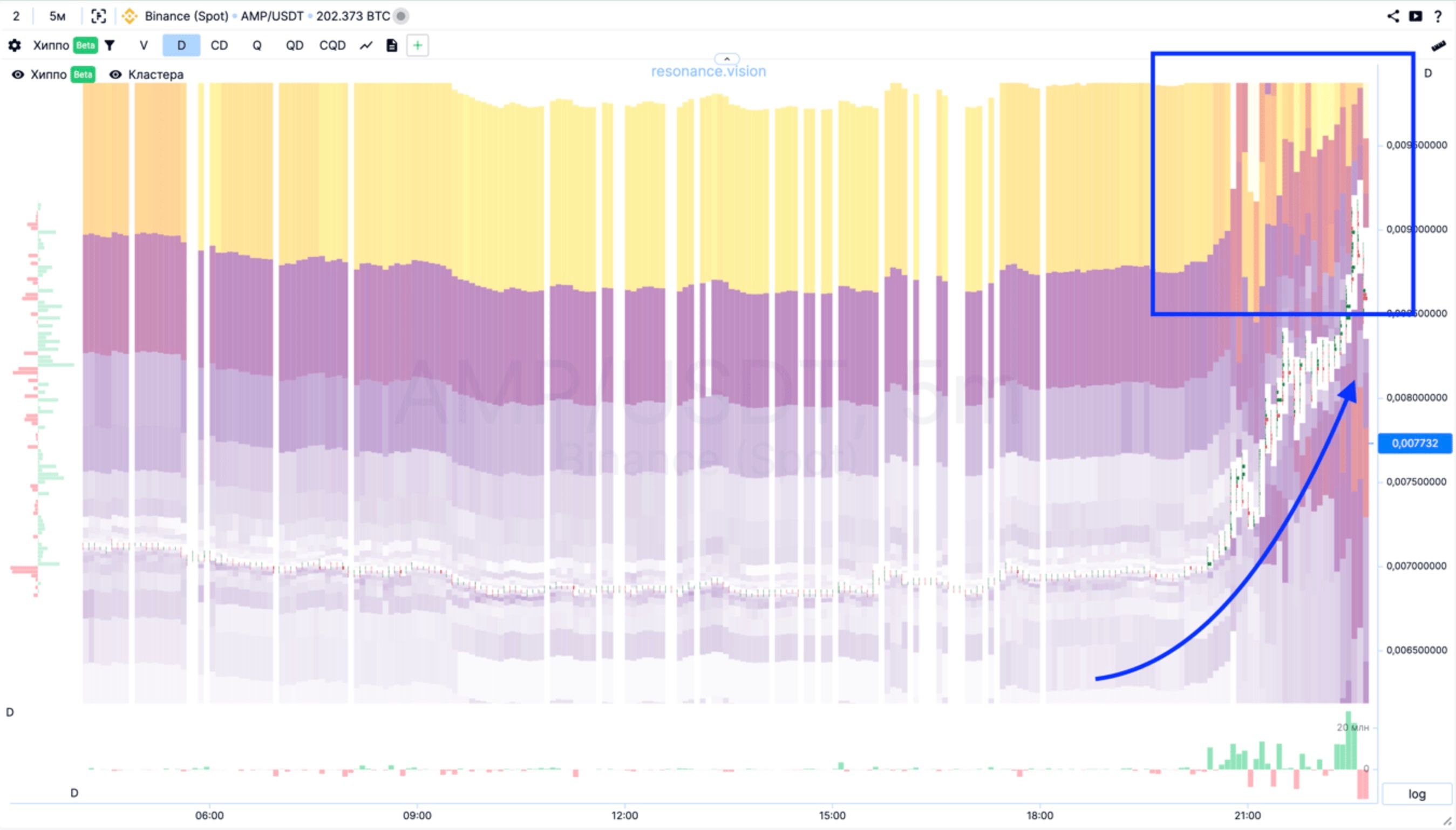
На примере ниже, мы видим на далёкой дистанции большие ордера (выделено синим). Они нам не интересны, так как находятся очень далеко от текущей цены. И в целом не оказывают никакого влияния на текущую цену.
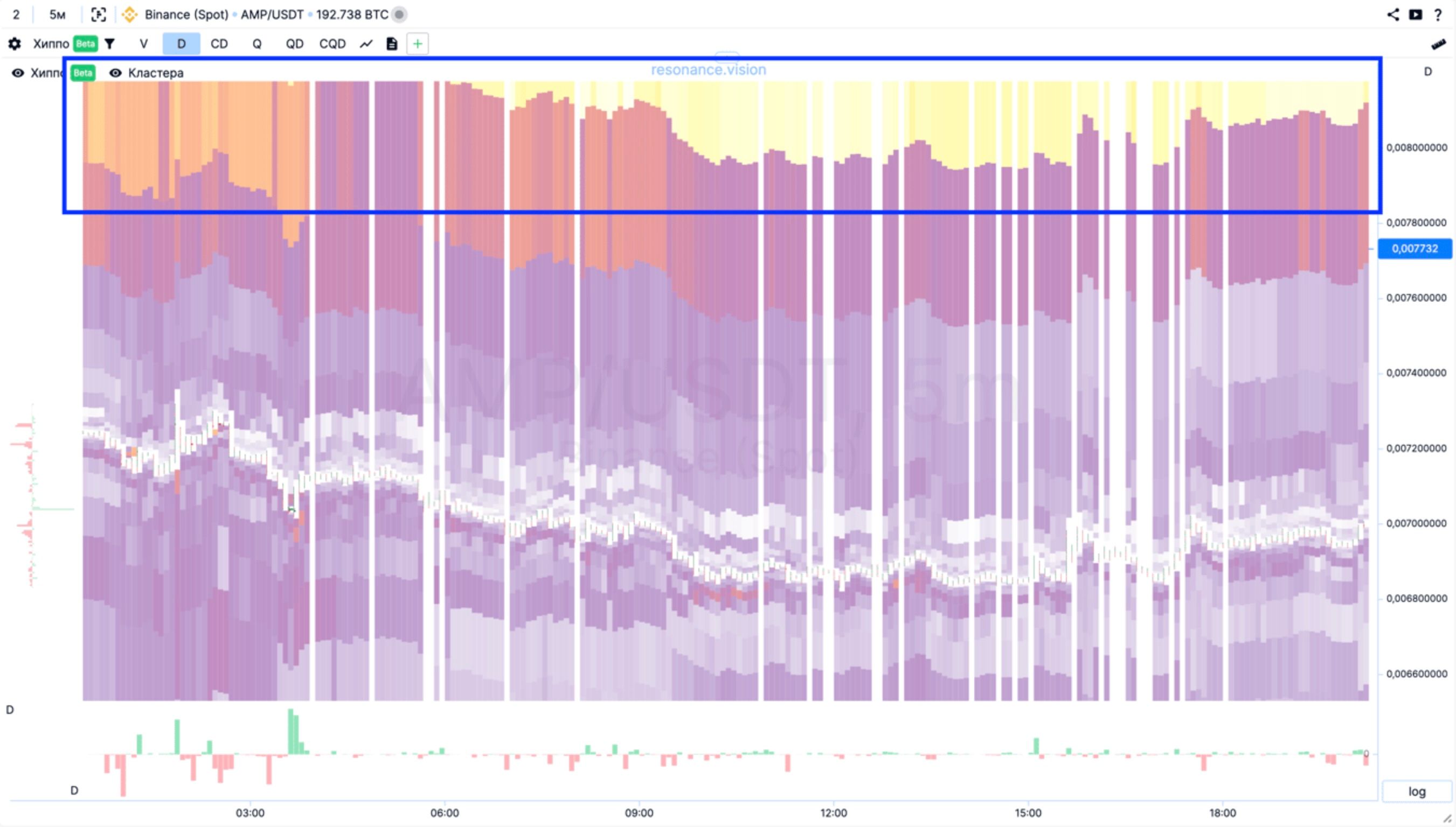
С помощью настроек тепловой карты скроем далёкие диапазоны. И разберём то, что происходит на монете.
По гистограмме дельты (под графиком) видно (по красным барам, стрелки вниз) что продавцы, продавая, снижают цену (наклонная красная стрелка). А усилия покупателей (зелёные столбики между красными стрелками) не приводят к успеху. Это означает что перевес на стороне продавцов и покупатели еще не создали достаточный уровень дефицита, хотя по тепловой карте видим что подставляют крупные лимиты на покупку (красные зоны).
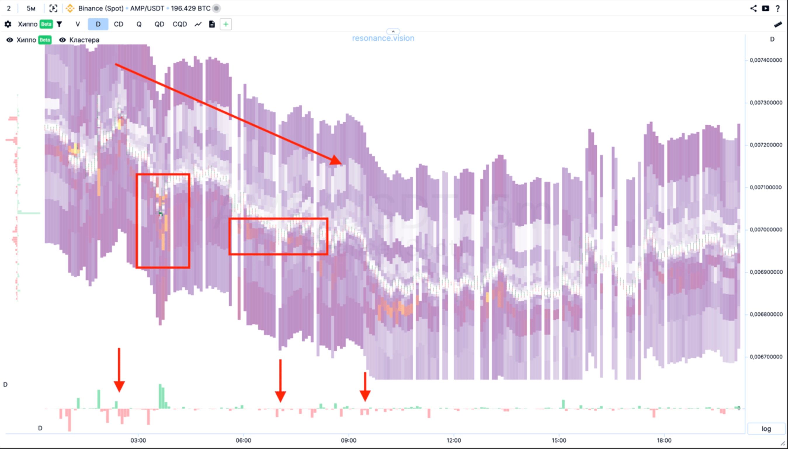
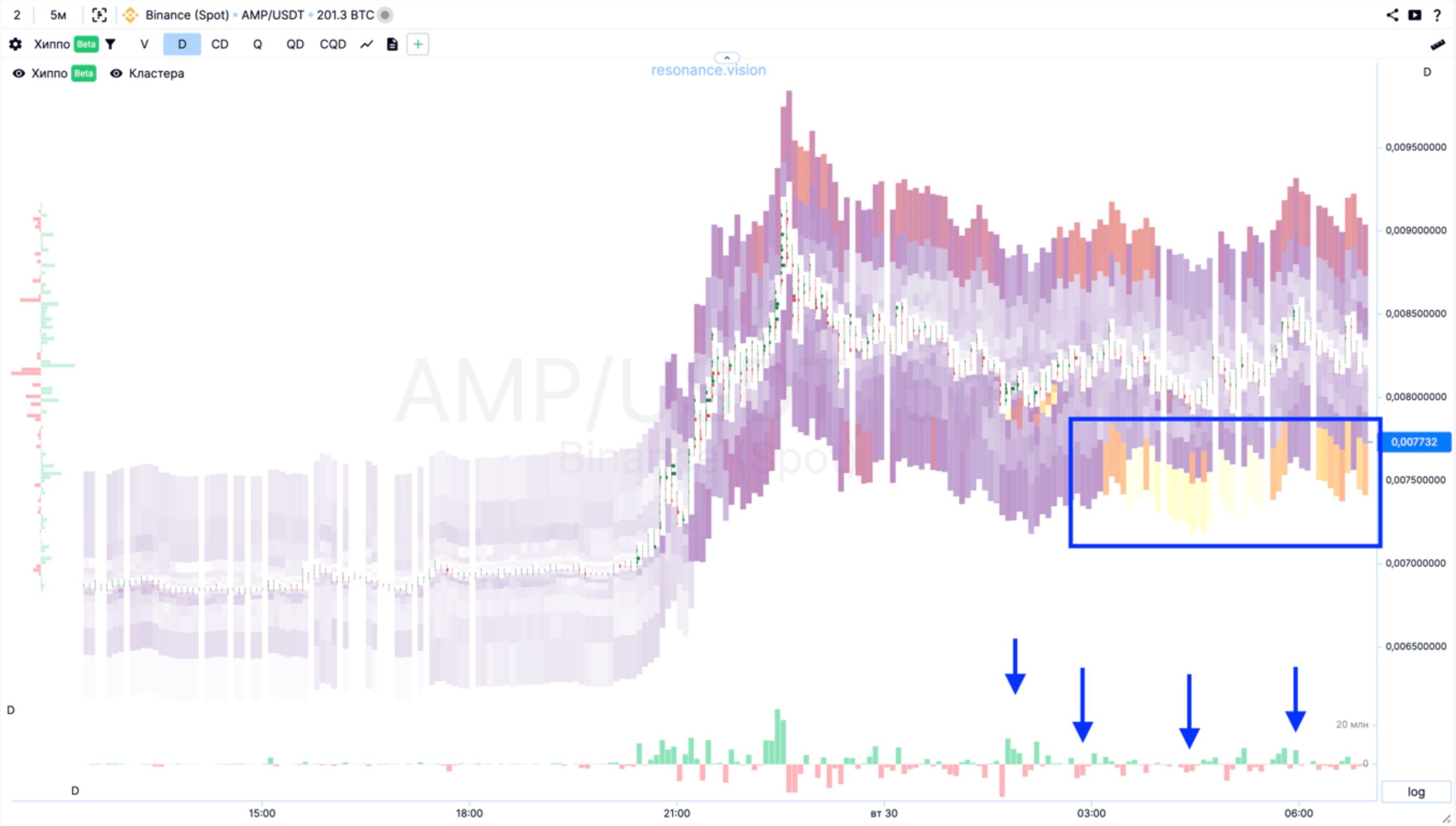
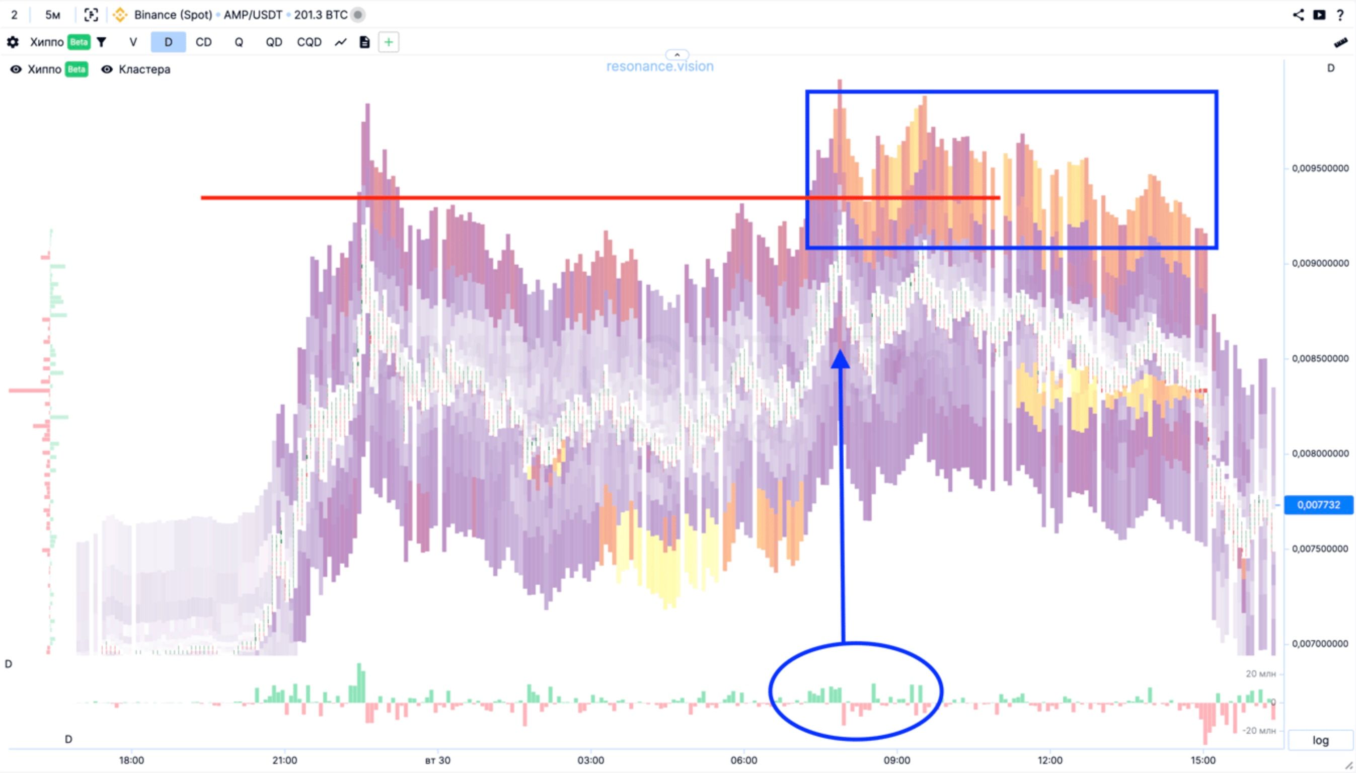
Первая конфигурация: остановка движения
Далее на графике мы видим образование первой конфигурации - остановка движения (про конфигурации читать тут).
На графике выделено место (квадратная синяя зона) где покупатели подставляют лимитные ордера, а рыночные продажи (синие стрелки) уже не приводят к снижению цены.
Также на графике видим (овальная зона со стрелкой) что усилия покупателей приводят к росту цены. Из статьи про конфигурации понимаем что это часть подтверждения перевеса покупателей. А после этой зоны видим (красные столбики гистограммы) - усилия продавцов уже не приводят к успеху.
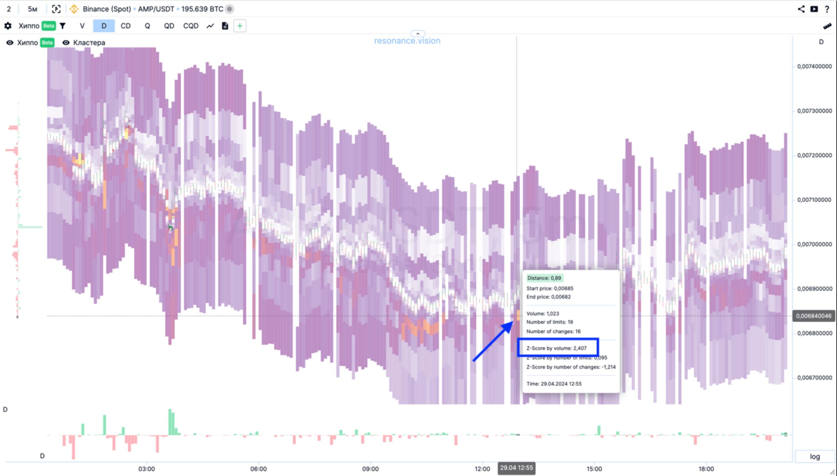
Эта ситуация была найдена через таблицу Хиппо. Диапазон благодаря которому была найдена эта ситуация имеет относительно небольшой объем в 1.023 биткоина, но Z-Score у этого диапазона 2.407 что уже интересно для более детального рассмотрения.
Для настройки таблицы, открываем фильтр запроса данных.
- Выбираем биржу
- Выставляем Z-Score по объему, От
- Выбираем таймфрейм
- Выбираем расстояние
- Нажимаем кнопку поиск
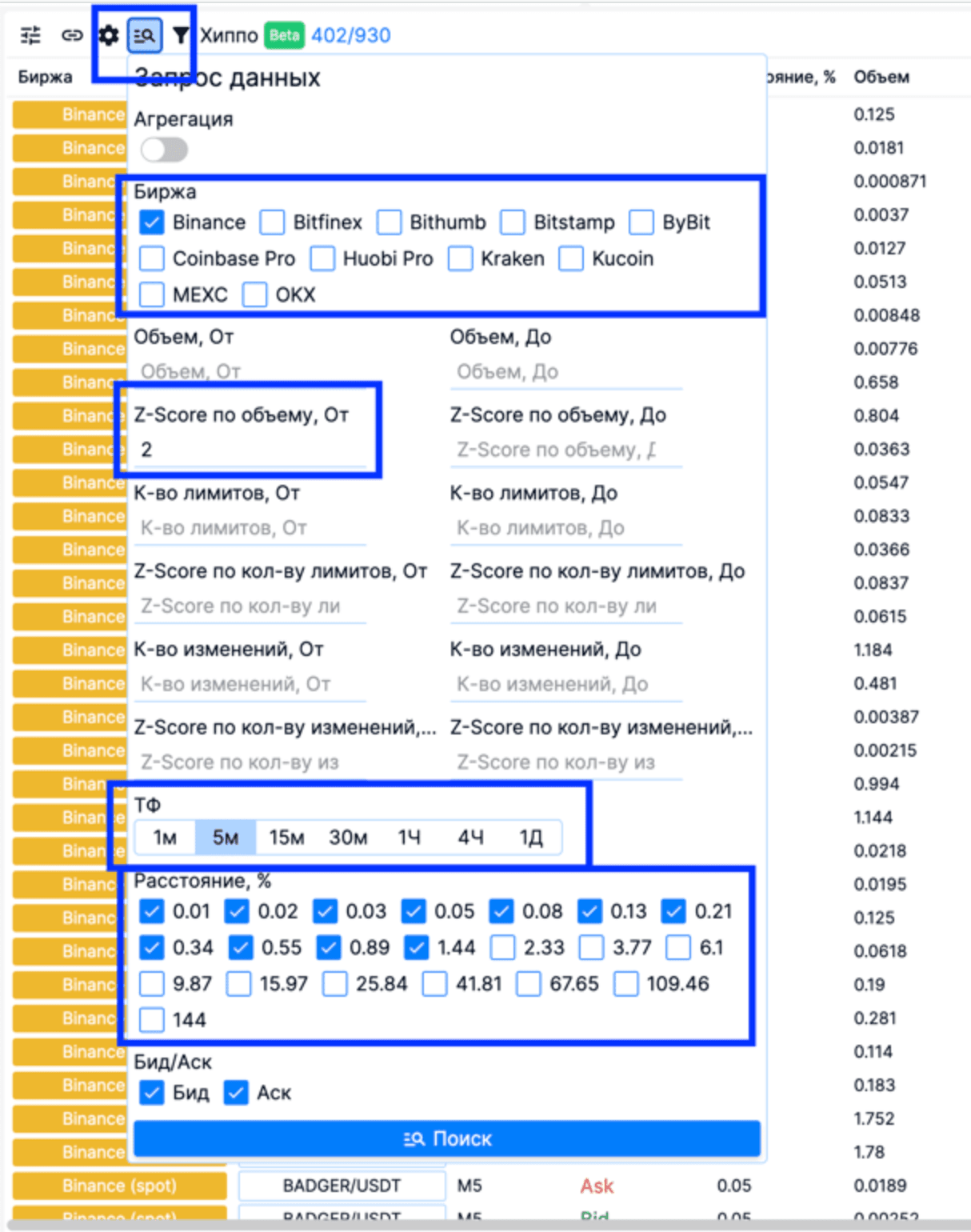
Дополнительно можно отфильтровать таблицу по тикерам. Например, если вы торгуете только фьючерсы, тогда стоит отфильтровать написав в поле унифицированного тикера */USDT
Если у вас есть ограничения по объему, например если ваш капитал не позволяет вам торговать низколиквидные активы, тогда можете в этом фильтре указать минимальный порог по объему в биткоинах (Объем, От), что позволит заранее отфильтровать результаты в таблице.
Вход в позицию
После того как мы обнаружили конфигурацию и смогли её валидировать, необходимо, входить в позицию.
Для входа в позицию стоит понять, насколько объем Вашей будущей позиции будет влиять на цену. Если ваш капитал не превышает среднего объема лимитов, тогда можете заходить одним ордером, но мы рекомендуем расставить несколько ордеров, на случай если участники предпримут еще одну попытку продавить цену.
Выход из позиции
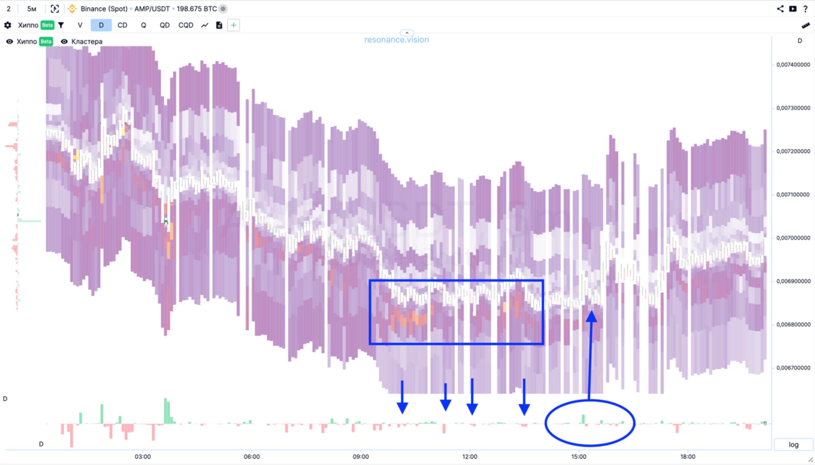
Далее покупатели предприняли ряд усилий и без особого сопротивления подняли цену на 30%, как раз к зоне с крупными лимитами, которую мы скрывали ранее.
Для торговли внутри дня, это очень крупное ценовое движение. Плюс цена достигла зоны с существенным лимитным сопротивлением.
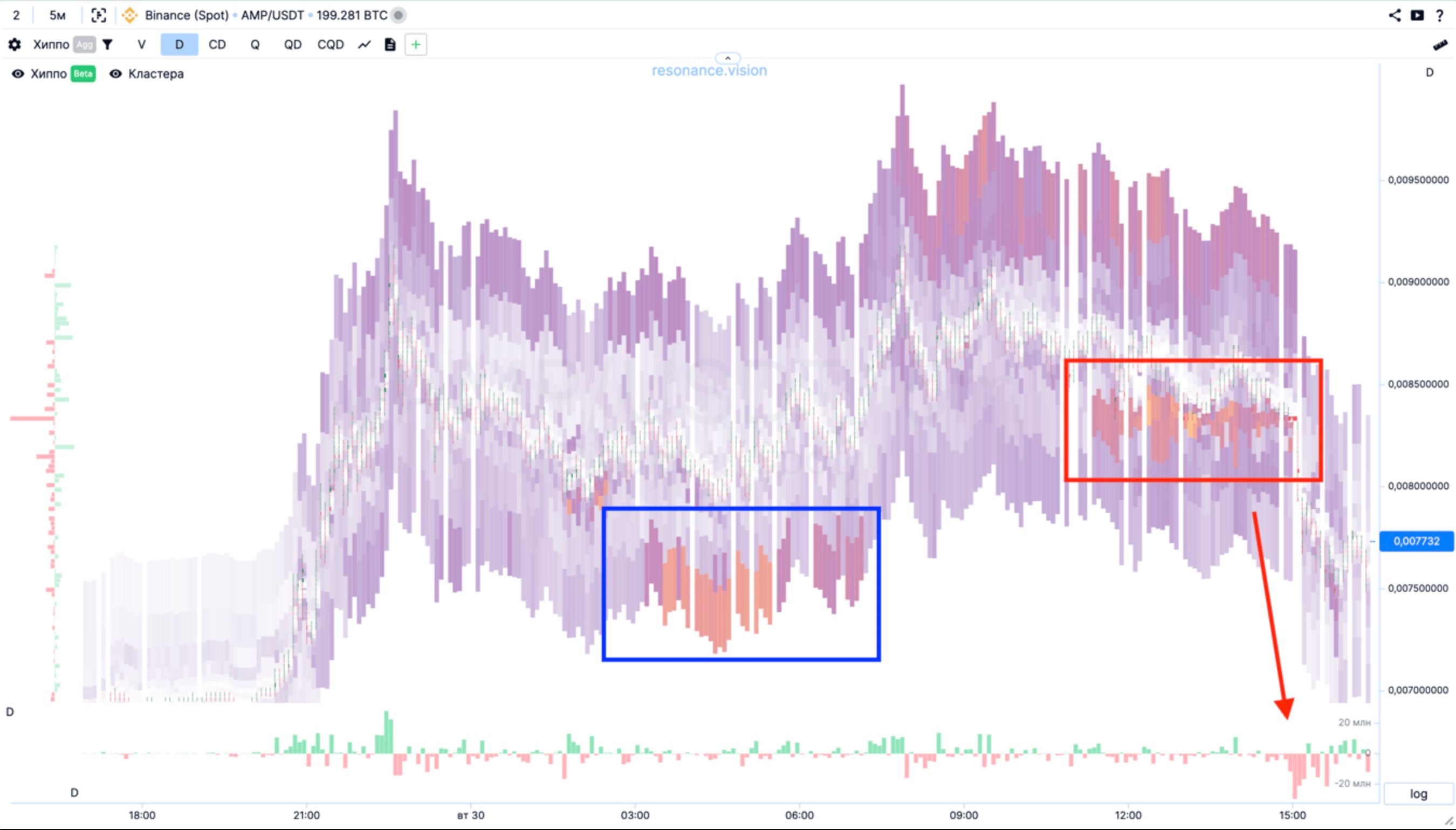
Итог
Если проследить далее, то можем заметить что участники достигли паритета, крупные покупки не приводят к росту, а продажи к снижению (синие стрелки).
Спустя небольшое время, на этом активе образовывается зона лимитной поддержки, недалеко от цены (синяя зона).
И покупки начинают снова поднимать цену.
Далее мы видим новую попытку покупателей обновить ценовой максимум. (синяя овальная зона).
Видим что максимум на покупках не был обновлён (красная линия).
Не обновлён, по причине большого лимитного сопротивления со стороны продавца (синяя квадратная зона).
Заключение
Подходит ли инструмент хиппо (таблица) для поиска существенного перевеса покупателей или продавцов? Да.
Подходит ли инструмент хиппо (тепловая карта) для визуального поиска существенного перевеса покупателей или продавцов? Да.
Достаточно ли только информации о лимитах для принятия решения об открытии сделки? Нет.
Для комплексного анализа и валидации торговой идеи необходимо воспользоваться кластерным графиком, так как лимитные ордера это просто намерения. И даже если по всему рынку (тепловая в режиме агрегации), мы видим плотную поддержку (синяя и красная зоны), это не всегда означает что цена пойдёт в обратную сторону от лимитной поддержки.
В одном случае мы видим что лимитная зона поддержки (синяя зона) сопровождалась рыночными покупками. А во втором случае лимитная поддержка (красная зона) появилась после неудачной попытки обновить ценовой максимум. Плюс плотные рыночные продажи (красная стрелка) скорее указывают нам на то, что участники с открытыми позициями увидели лимитную поддержку и решили воспользоваться ею как ликвидностью для закрытия лонг позиций.
Вывод
Инструмент Хиппо это уникальный по своим характеристикам поисковый алгоритм, который помогает найти подходящие под вашу стратегию настройки поиска весомых лимитных ордеров, а широкая фильтрация позволяют быстро оценить баланс сил.
Видео версию этой статьи смотрите на YouTube.
Следи за новыми статьями в нашем телеграм канале.
Не нужно выдумывать сложных схем и искать “грааль”. Используй инструменты платформы Resonance.
Регистрируйся по ссылке — получай бонус и начинай зарабатывать:
OKX | BingX | KuCoin.
Промокод TOPBLOG дает тебе 10% скидки на любой тарифный план Resonance.
Рекомендуемые статьи


