ETH Short Trade Breakdown: Cluster Analysis and Volume Analysis

In this article, we break down an ETH/USDT short trade step by step: from the first signs of buyer weakness to entry confirmation, trade management, and full position closure based on a change in market behavior.
Table of contents

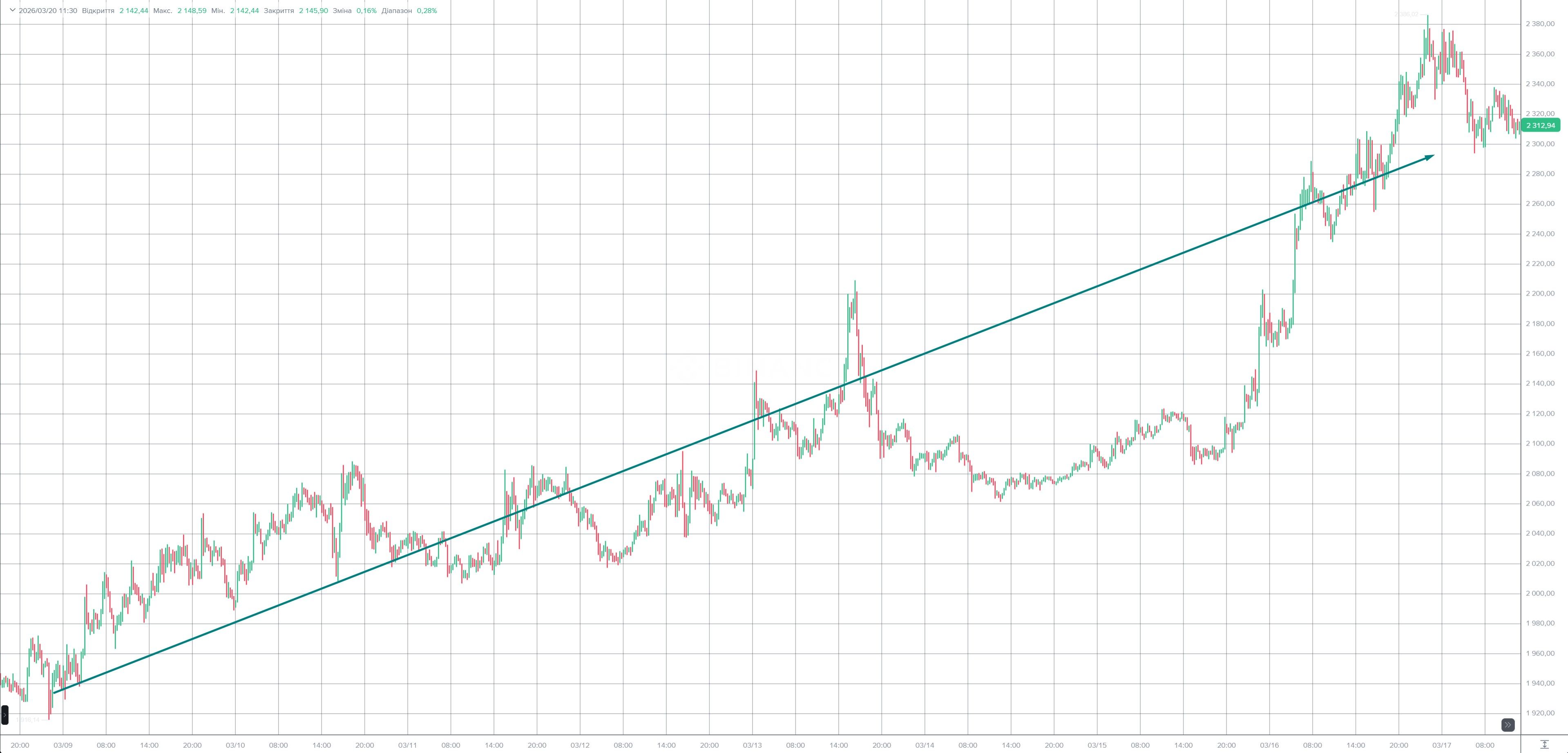
Most often, the market starts to fall apart not when it is already obvious to everyone, but a bit earlier — at the moment when, on the surface, everything still looks more or less normal, but if you take a closer look at the volumes, it becomes clear that the move is already losing quality.
That is exactly what happened in this ETH/USDT trade.
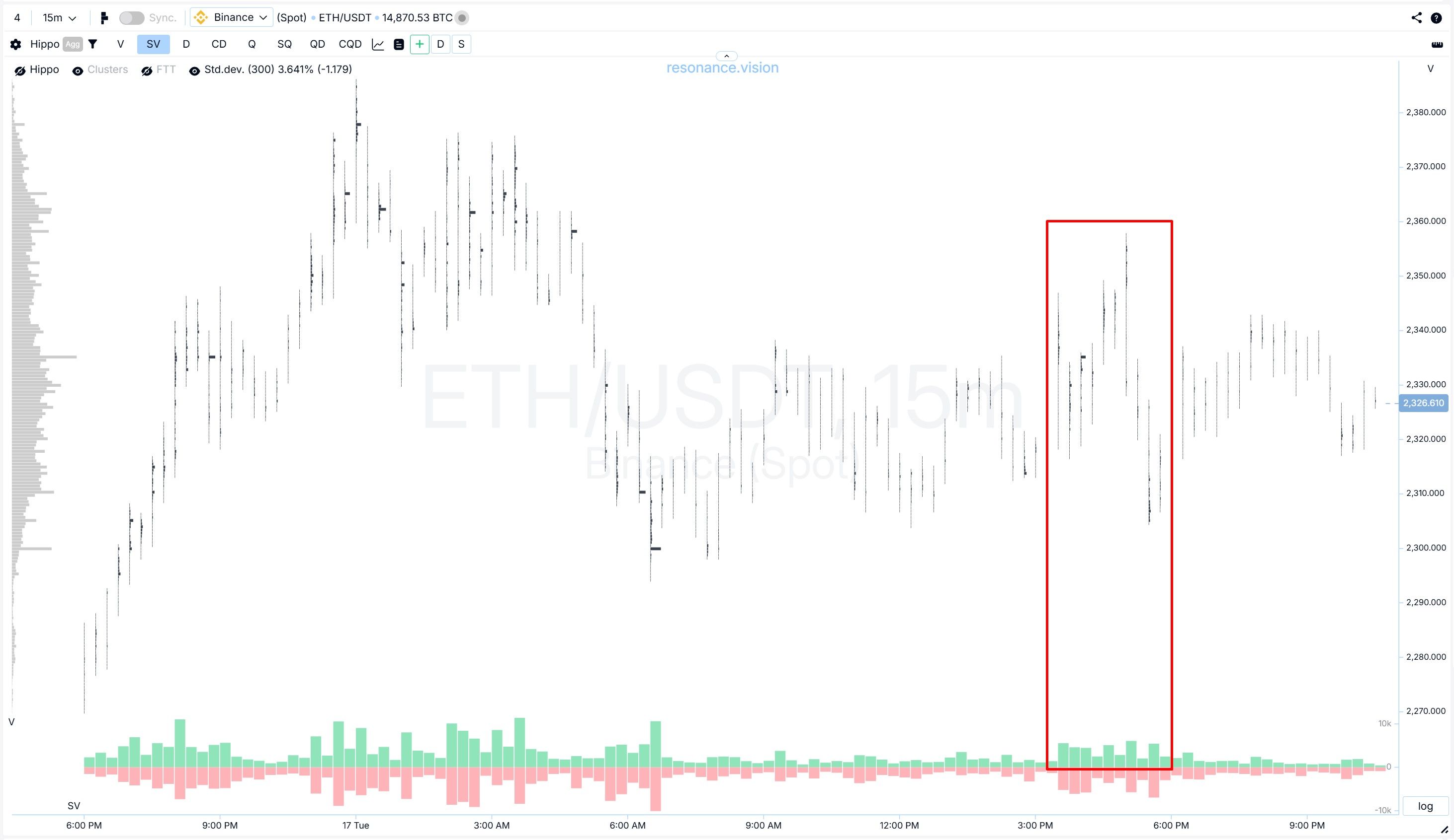
At first glance, especially if you were looking at the candlestick chart, the price was still holding up quite well. There was no dramatic, obvious crash. On the contrary, the market as a whole was rising, and at first glance it still looked like just another local pullback. But in reality, the situation was far more interesting, because very unpleasant signals for buyers had already started to appear.
And these are exactly the moments that are most valuable in cluster analysis. Not only because they provide a well-grounded entry point. But also because they allow you to spot a shift in balance before it becomes visible on a regular chart.
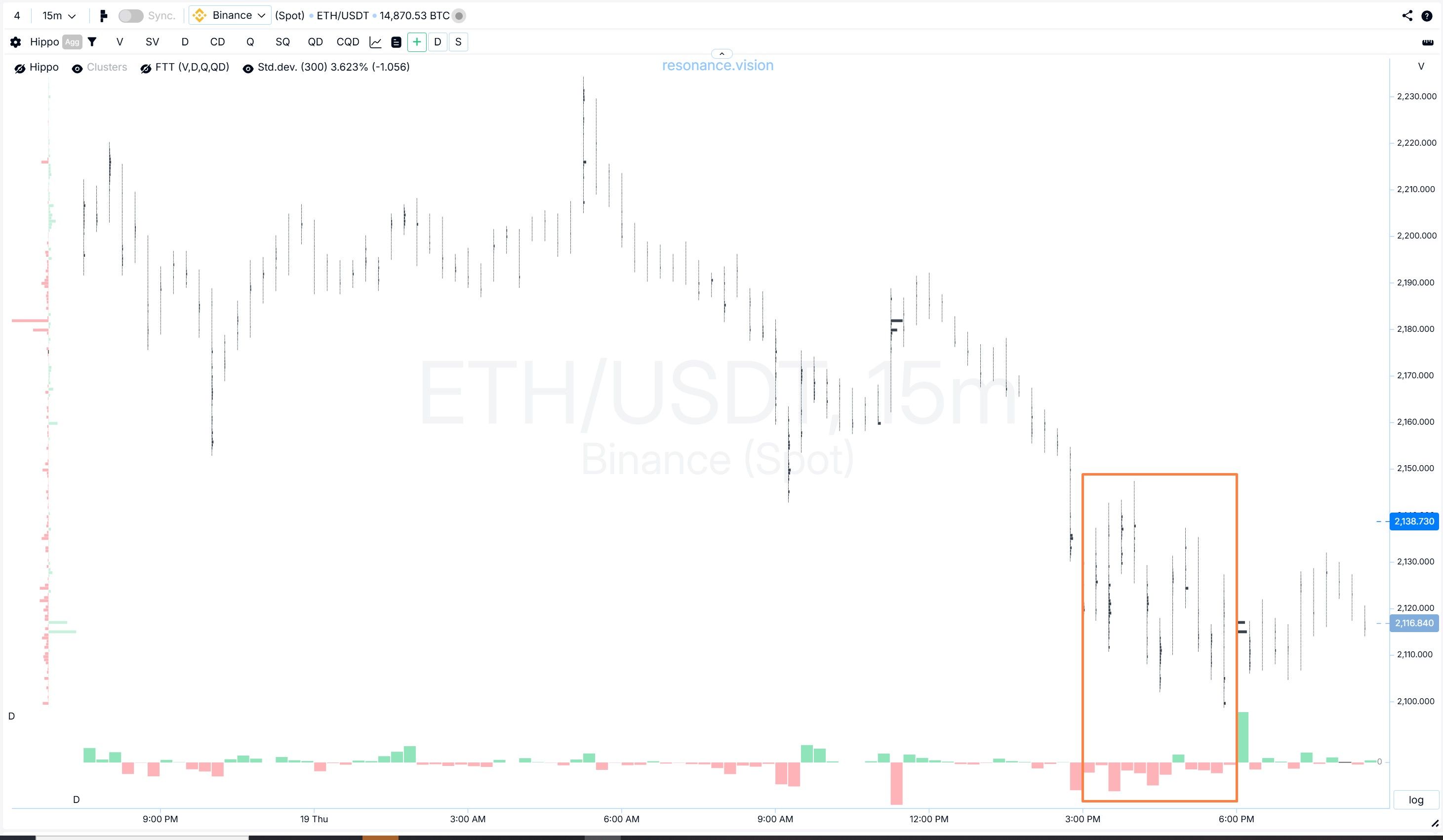
Prerequisites for opening the position
So, before entering the short, the asset looked as if it could still push higher or at least hold the current price. That is exactly why this situation was interesting: at first glance, the coin was not showing obvious weakness.
But if you look not only at the candles, but also at how exactly the price reacts to volume, it becomes clearly visible that the picture was already completely different.
The move upward started to look heavier. If earlier a strong buyer would usually push the price further, here that no longer happened. Yes, the market buyer was active. But the result of that aggression no longer looked convincing, because the high was not updated (orange rectangle). This is clearly visible in the delta: consecutive green bars, but essentially no result from those purchases.
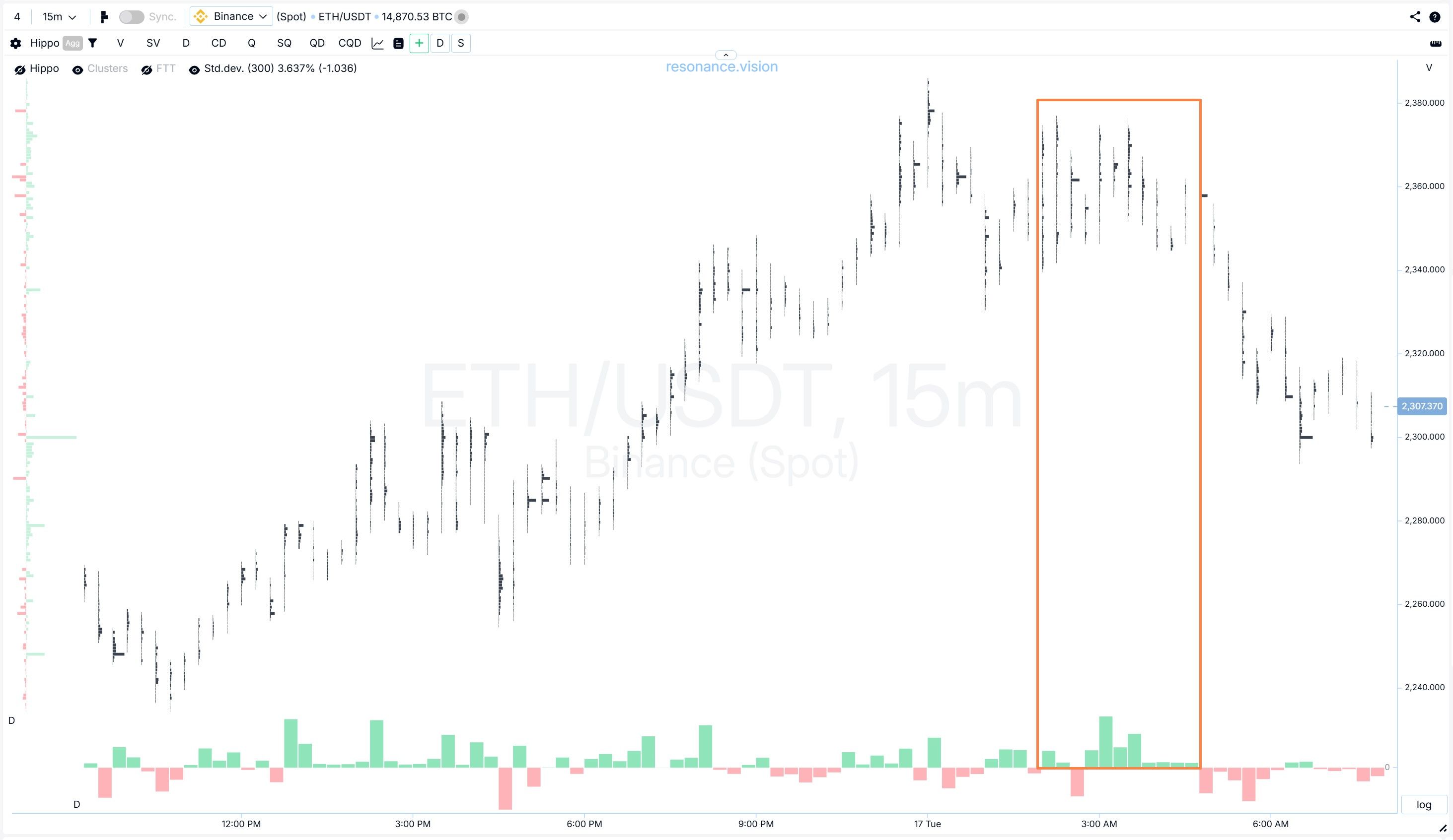
At the same time, to be fair, it has to be said that there had been similar pullbacks before that later turned into growth. Pay attention to the blue rectangles: during the decline, noticeable cluster accumulations appeared, then, as we can see from the red delta, the selling was held back and the price continued to rise. So, was there any guarantee that this scenario would not repeat itself? No, of course there was not.
That is why it made sense to keep watching the coin for a while longer. It was necessary to wait for more meaningful signs of buyer weakness. At first glance, the move was still holding. But confidence in it was already gone.
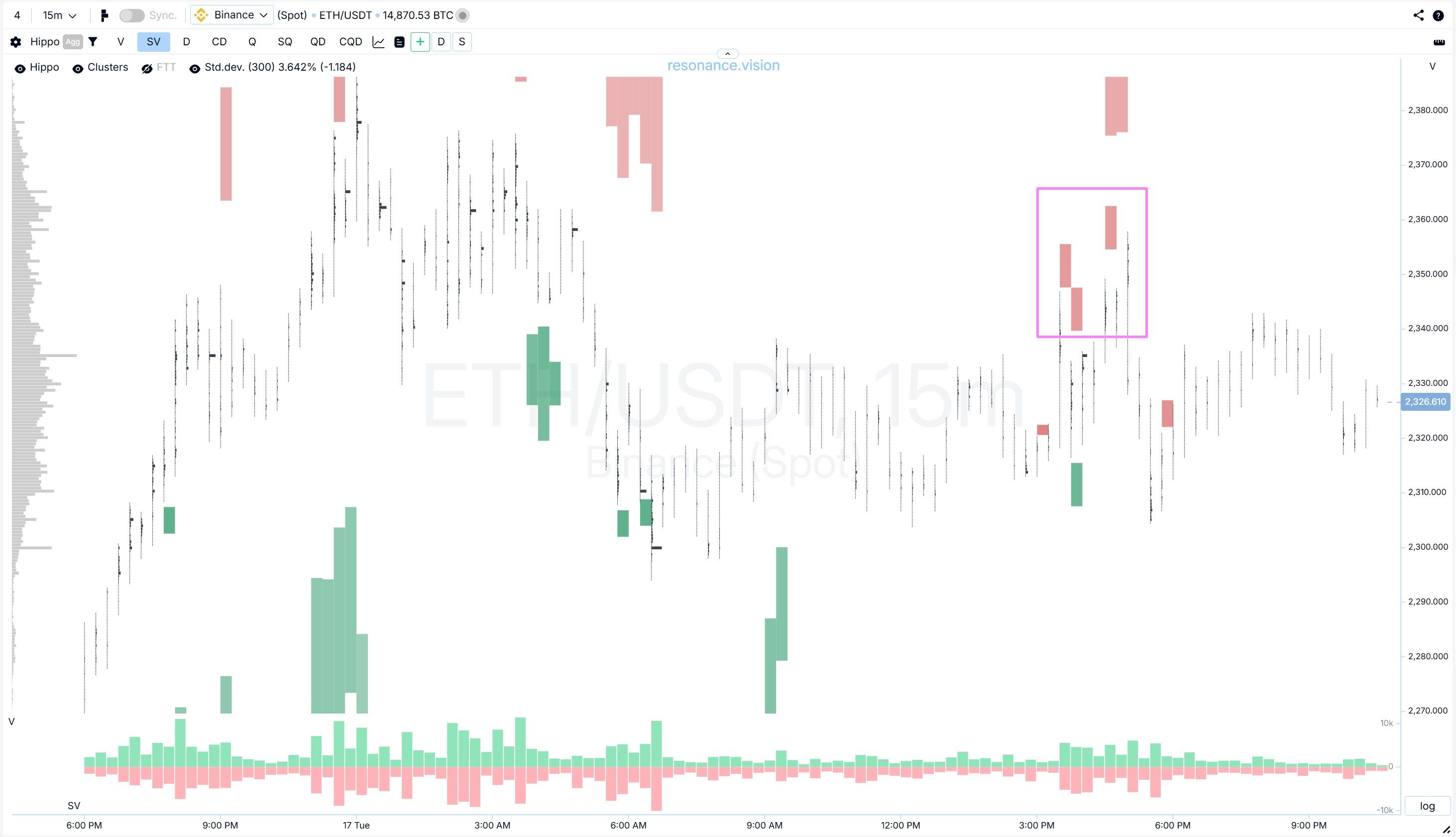
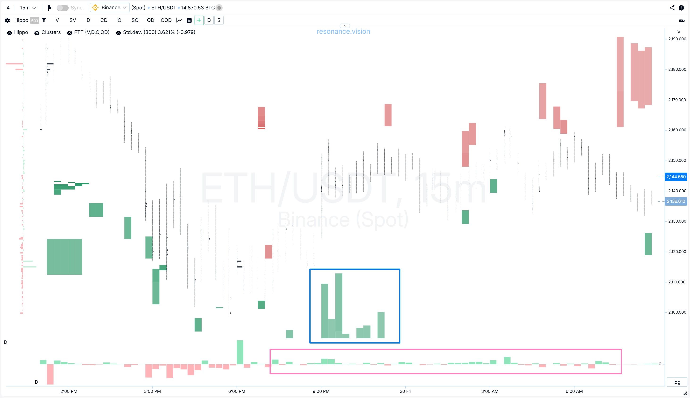
Confirmation of the trade idea
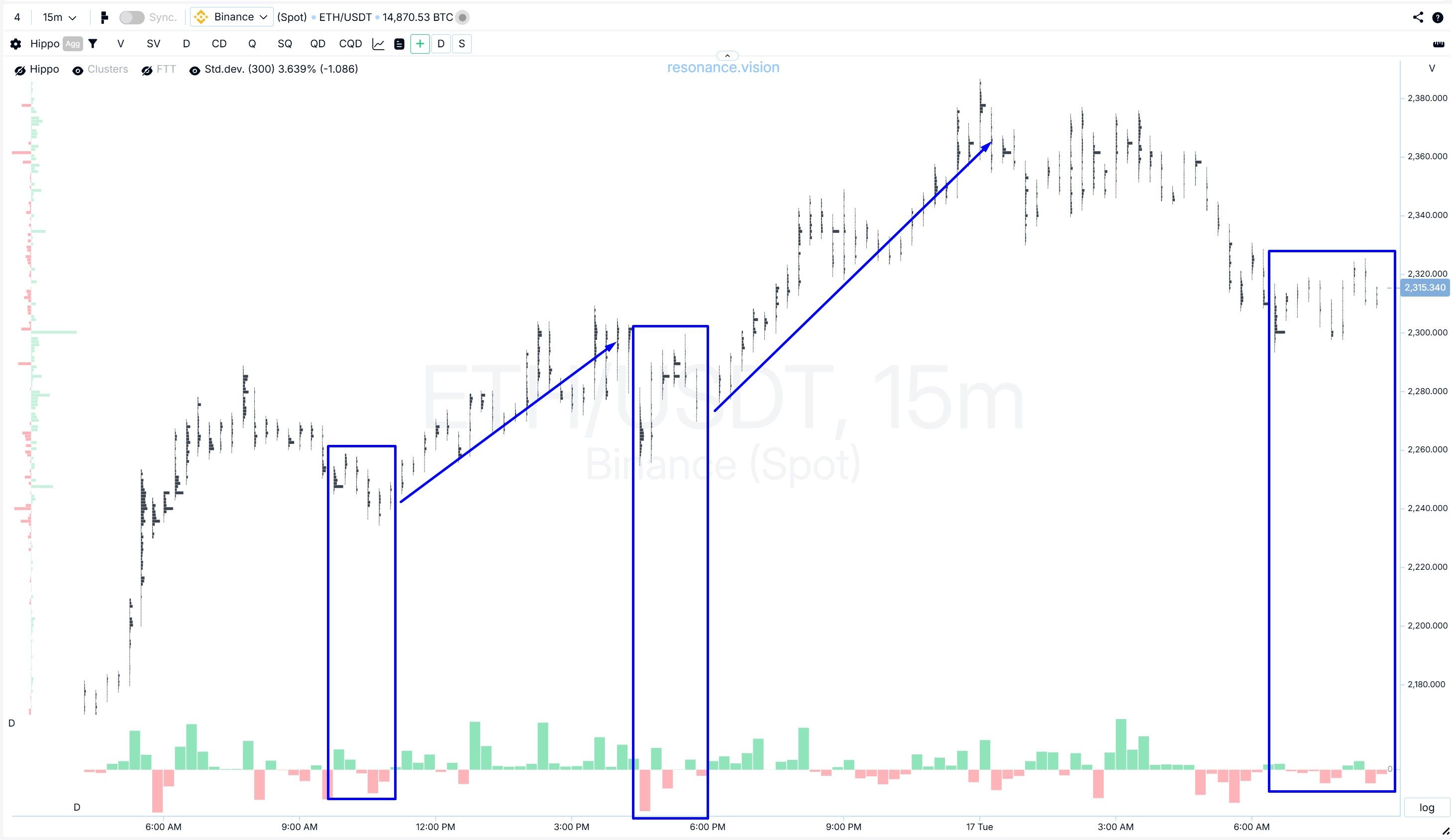
Then the price action turned sideways, and this is exactly where the short got its confirmation. But to see it more clearly, it was necessary to switch on the split-volume mode on the cluster chart. It helps to better assess the waves of activity from buyers and sellers.
What do we see? A new attempt by buyers to push the price higher clearly failed (red rectangle). And look at how easily sellers brought the price back to previous levels. It is exactly in moments like these that you realize: something here is no longer working the way it should in a strong uptrend.
If significant buying has gone through and the price has barely advanced, it means that there is an opposing side present that is calmly absorbing this demand into its sell limits. For the buyer, that is a bad sign. For a future short, it is already an additional argument.
In this situation, volume was coming into the market, the buyer was trying to maintain the initiative, but the price was no longer responding the way it should have. In principle, volume by itself still means nothing. The key question is always the same: what happened to the price after that volume. And the normal upward progress you would logically expect when strong aggressive demand enters the market simply was not there.
In addition, a heatmap was also turned on, and it showed even more clearly that limit pressure from sellers had increased (pink rectangle).
And that is an excellent confirmation for the short. All that was left was to wait until sellers started to act actively, that is, to sell at market rather than through limits.
In this trade, the short was not opened because “the price was already high.” Entries like that rarely end well.
The position appeared only after the market had not just hinted at buyer weakness, but had actually confirmed it. Before that moment, it was only a hypothesis. After that, it became a working scenario.
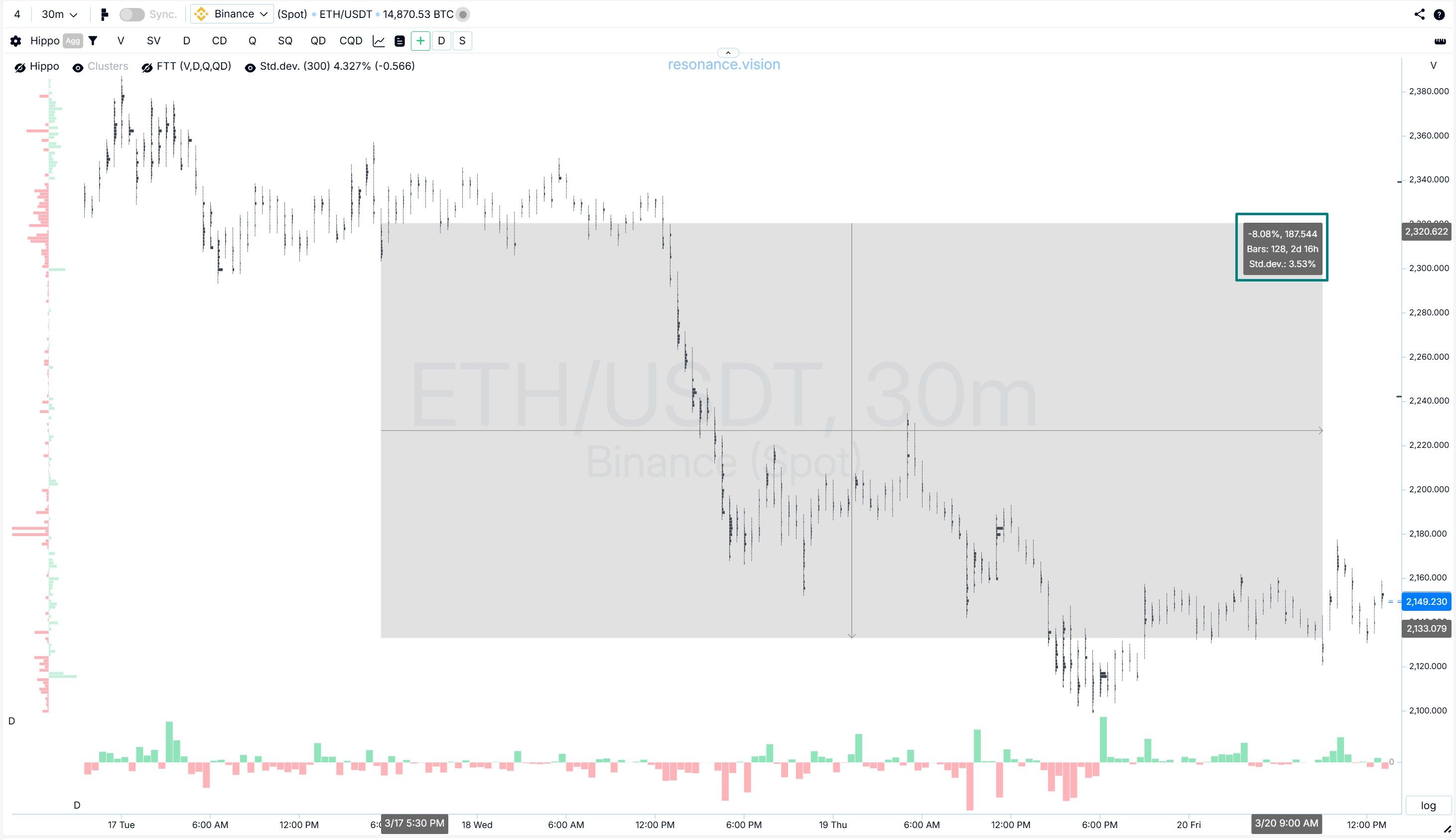
Stop-loss: where the scenario should have broken down
In any trade, it is important not only to understand when to enter, but also to know clearly where the idea stops being valid.
In this case, the stop was not placed “just for the sake of it” behind the local high, but where the logic of the short itself would have lost its meaning (purple zone).
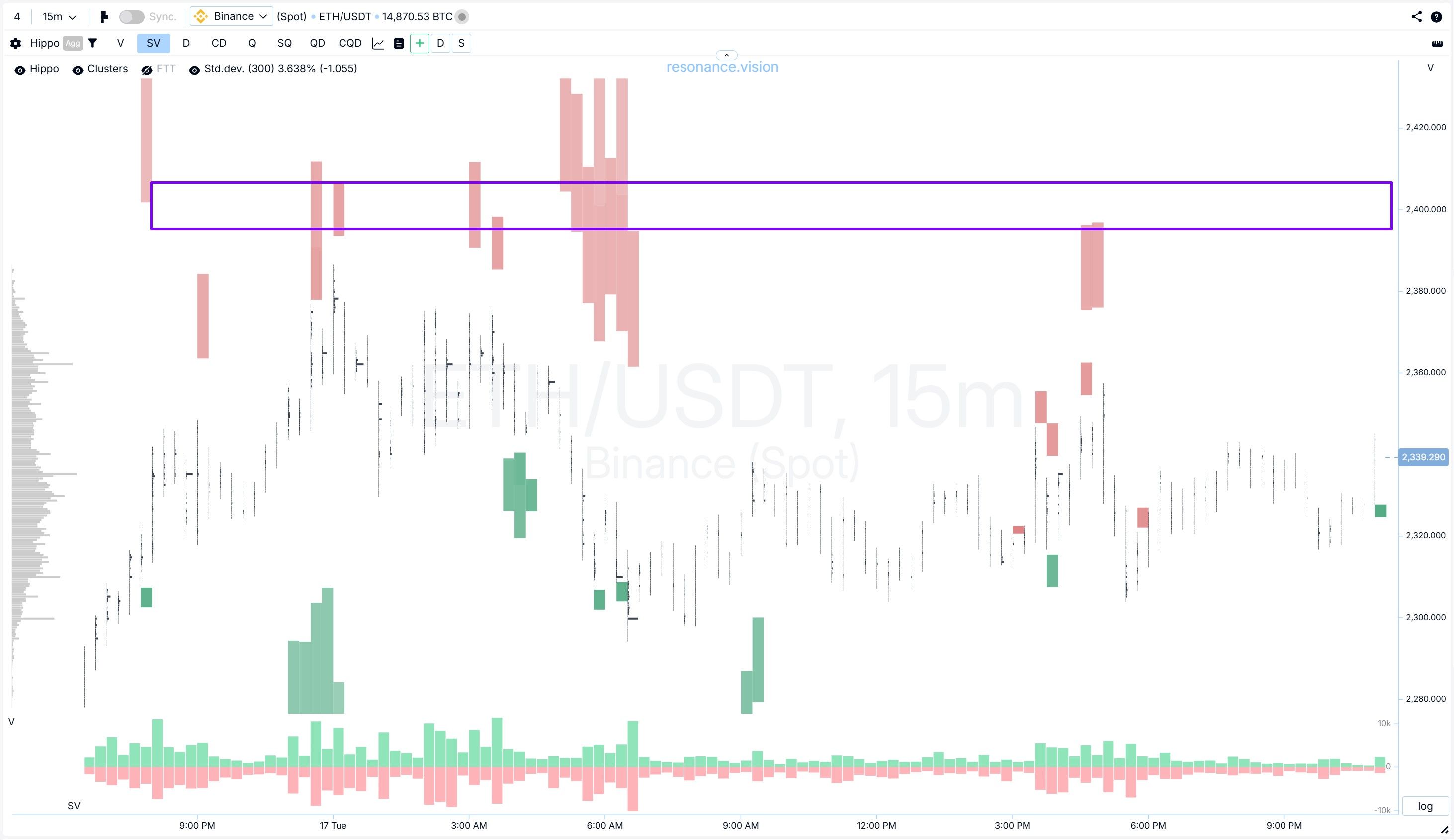
If buyers had regained control and the price had once again started to respond normally to their aggression by updating the high, that would have meant that the hypothesis about weak demand was either premature or simply wrong.
That is why a stop-loss is not only about limiting losses. It is about being honest with your own idea.
Trade management: partial profit-taking
After the position was opened, the market did move in the desired direction, but a good trade is not just about the entry. It is also about being able to lock in profits in time.
The first partial profit-taking did not happen at some abstract level. It appeared at the moment when the first meaningful signs of resistance from buyers showed up (orange zone).
What exactly was concerning:
- selling was no longer producing the same result as it had at the start and throughout the move;
- the pressure was still there, but the price was pushing downward with more difficulty;
- accumulations formed at the bottom of the cluster bars, although in some places they were somewhat blurred.
It became clear that the seller was still pressing, but the efficiency of that pressure was decreasing.
But weakness alone is still not a reason to close the position completely. This is a very important point. Because the market is not obliged to reverse immediately. Holding the full position size was no longer as logical. That is exactly why the first part — 25% — was taken off here.
The main argument was that sellers were still pressing downward, but the selling was no longer working as well as before.
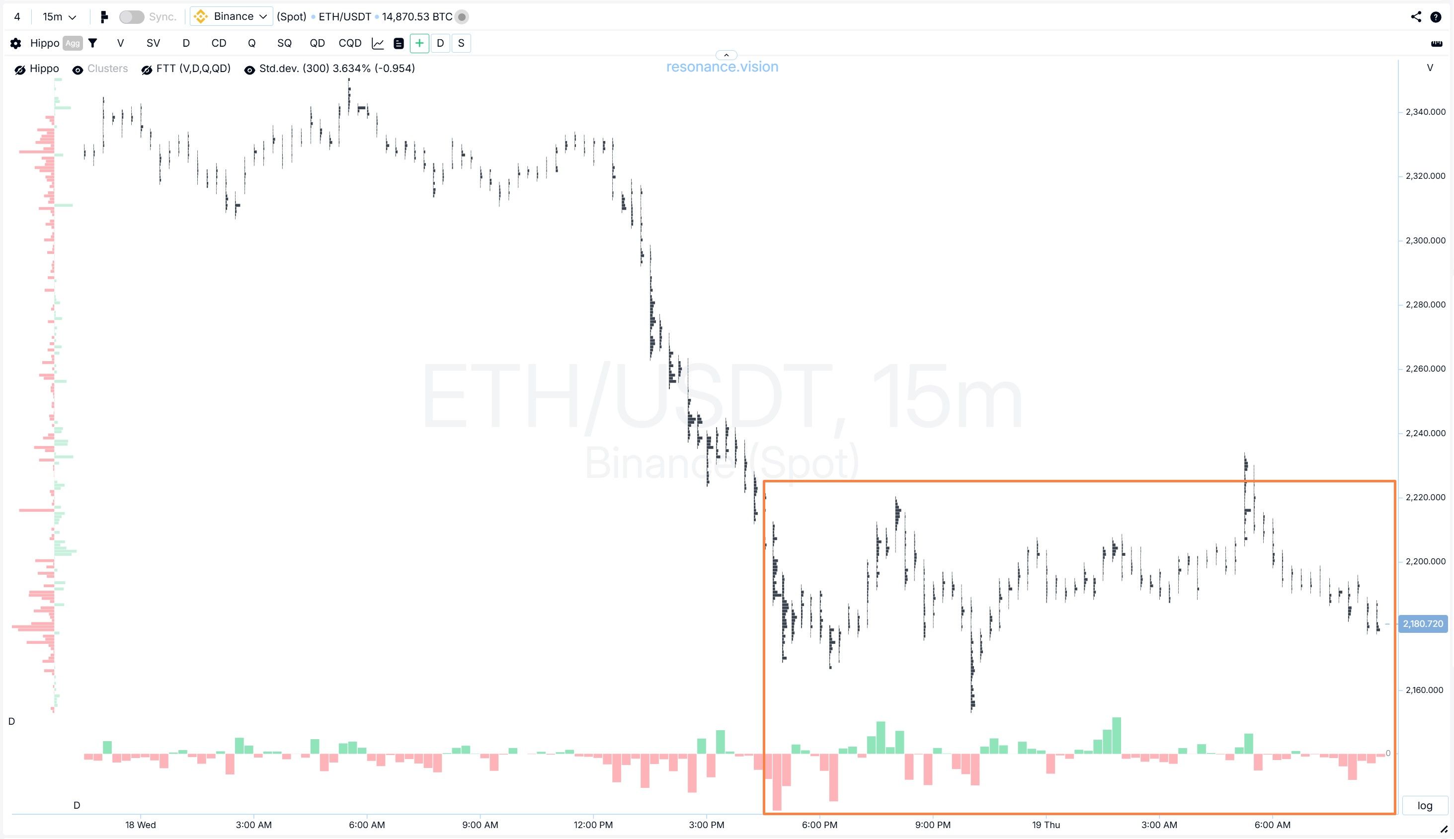
The second partial profit-taking took place when the holding back of selling became even more noticeable. Look at the zone highlighted by the orange rectangle. Consecutive red bars show market selling, but notice the change in price dynamics — it was no longer reacting with a decline as strongly as before.
The downward move itself had lost the strength it had at the beginning. There was more struggle. The seller had not lost yet, but its dominance was no longer as convincing.
That is why the decision was made to lock in another 25% of the initial position size.
The stop-loss was moved below the entry point, beyond the area of the previous consolidation. Thus, in the event of an unfavorable market development, the position would have been closed in profit in any case.
Closing the trade
The final exit was not tied to any specific chart target. It was linked to a change in the asset’s price behavior.
From below, the buyer had already marked out its area of interest with limit support (light blue rectangles), while the move itself had started to lose momentum. It is also worth paying attention to the consecutive green bars on the delta histogram — the market buys, although not large, were lifting the price upward more or less effectively (pink rectangle).
And this is a very important difference between simply holding a position and managing it properly. The short idea may not yet be formally “broken,” but its potential is already becoming much more limited. And that means that keeping the trade open further often makes less sense than closing it well. That is why the trade was closed in full.
To sum up, the position was closed when an active buyer had already appeared from below and the downward move itself had started to lose momentum.
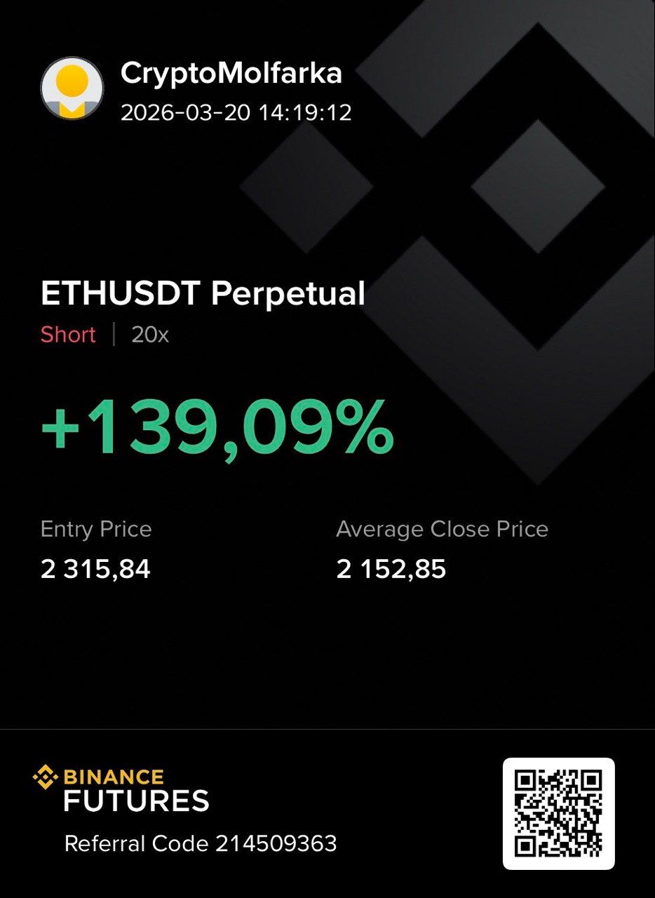
Overall, the price declined by more than 8%. And with 20x leverage, it was possible to make 139%.
Conclusion
The real strength of supply and demand analysis through volume lies in consistency. The clusters showed what was not visible on the surface. On a regular chart, this situation could still have been interpreted in different ways. But the cluster chart gave a much more honest picture.
It was visible that the buyer’s aggressive activity was not producing the expected result. In other words, attempts to move higher were there, but they were being restrained. The most interesting thing in such situations is the change in the impact of market volume on price movement.
In this case, there was no “secret pattern.” There was careful analysis of volume, its efficiency, and the change in the behavior of market participants.
Follow new insights in our telegram channel.
No need to invent complex schemes and look for the "grail". Use the Resonance platform tools.
Register via the link — get a bonus and start earning:
OKX | BingX | KuCoin.
Promo code TOPBLOG gives you a 10% discount on any Resonance tariff plan.
Recommended articles


