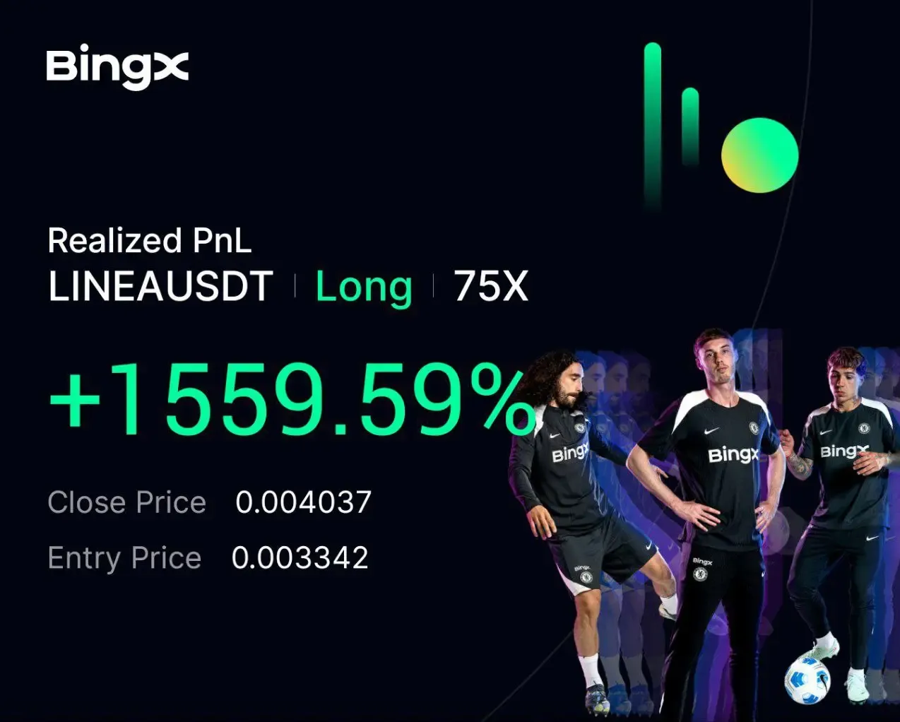
LINEA +1559.59% (Resonance Directional Strategy)

How to read accumulation through volume: clusters reveal selling inefficiency, the dashboard confirms market buying, and the exit is taken when volatility rises and clusters get dense.
Table of contents

The LINEA idea formed when, on the higher timeframe, seller pressure stopped pushing price lower. The asset stopped printing new lows and moved into an accumulation phase. For day trading, this is one of the most practical setups: when pressure is there but the outcome is not, it often signals that local support is being built. In terms of supply-and-demand analysis, that structure creates the conditions for a follow-up upside impulse.
Below is a trade breakdown using the Resonance method: crypto cluster analysis helps assess how price reacts to traded volume, and confirmation comes from aggregated dashboard metrics.
Entry reasons
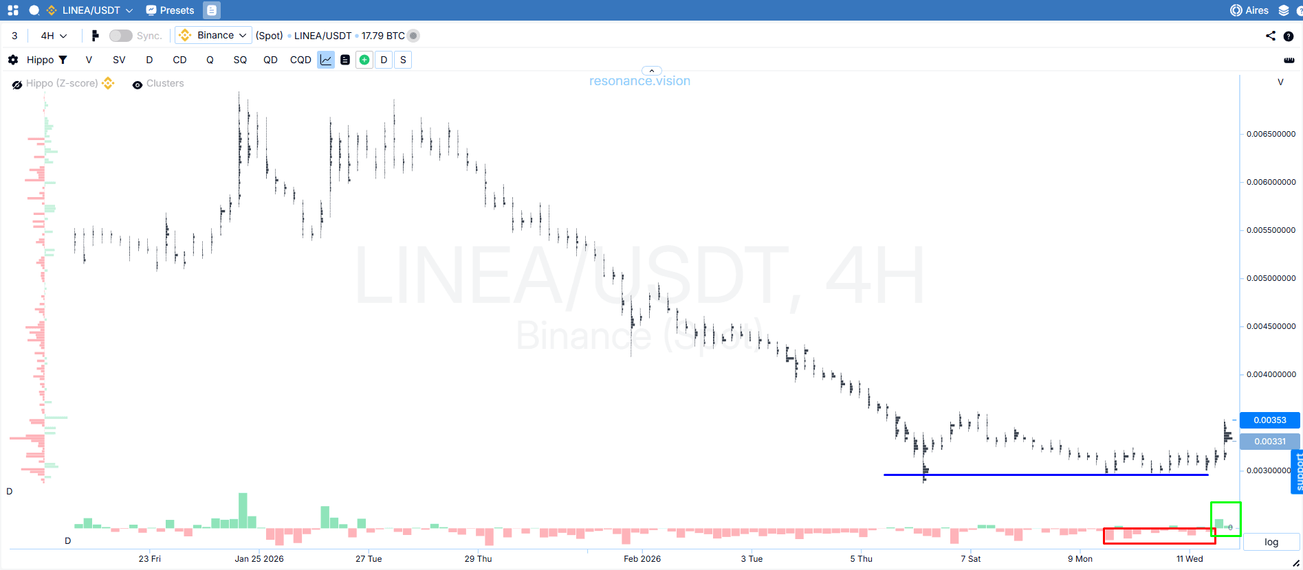
Cluster chart: 4H accumulation and sell absorption
On the 4H timeframe, the coin shifts into a sideways range and stops printing new local lows (blue arrow). All of this happens while market sells dominate (red rectangle). Limit buys systematically absorb supply and form support. We also saw market-buyer activity (green rectangle), and price responded with upside movement.
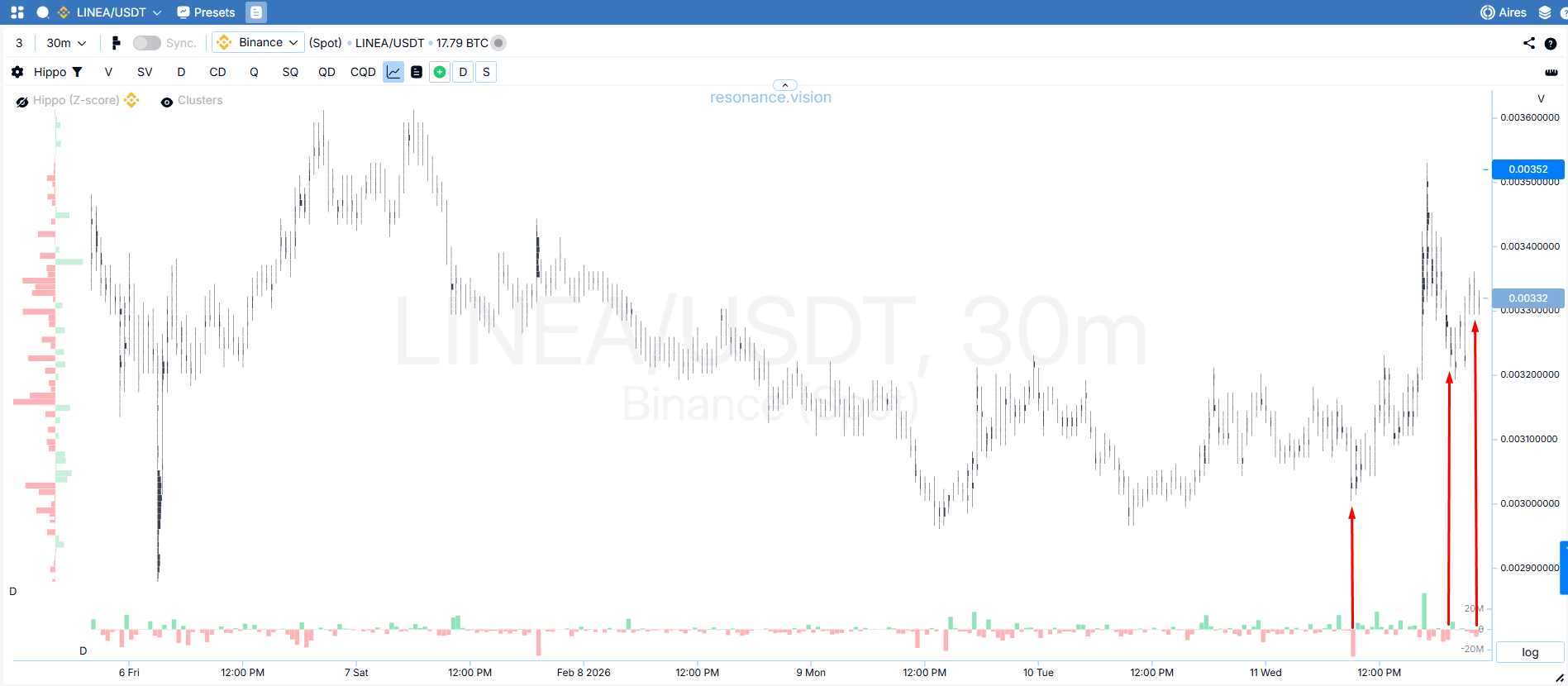
Switching to the 30-minute timeframe allowed us to examine participant behavior in more detail. Price rises actively, while incoming market sells are absorbed by the limit buyer.
Local lows are not updated (red arrows), confirming that demand remains in control.
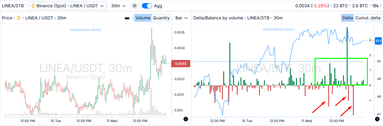
Dashboard: aggregated metrics
Delta / volume balance:
Market buys dominate (green rectangle), while large sells are absorbed (red arrows). This confirms what we see on the cluster chart and strengthens the volume-based conclusion: demand is more effective than supply, so price retains the potential to continue higher.
Risk management
The stop-loss was placed below the nearest local low on the 30-minute timeframe and came to 7.5% — in the area where selling had previously stopped having an impact on price. The trend remains upward, and as long as price holds above this zone, local demand can be considered intact.
Exit reasons
Cluster chart: overheating signals and a higher probability of a correction

After the impulse, dense accumulation began to form (red rectangle). We can also note rising volatility and the fact that price moved up by 47%, which corresponds to roughly 7 standard deviations. These factors increase the likelihood of a stall or correction, so taking profit in this area is a well-grounded decision.
Trade result
We captured 20% of clean movement.
Trade conclusion
The participant-behavior read started on the higher timeframe, and the switch to 30m helped refine the picture, identify the entry, and align with buyers. The position was closed after a significant move and the first signs of opposing supply appeared.
Overall, this case shows how cluster analysis and supply-and-demand analysis create an edge in day trading: the cluster chart reveals that selling stopped being effective, and aggregated metrics confirm the buyer’s presence and the stability of support.
Follow new insights in our telegram channel.
No need to invent complex schemes and look for the "grail". Use the Resonance platform tools.
Register via the link — get a bonus and start earning:
OKX | BingX | KuCoin.
Promo code TOPBLOG gives you a 10% discount on any Resonance tariff plan.
Recommended articles


