How to avoid mistakes when analysing statistics
Explore key Trading Simulator metrics: trade profitability, risk management, trading plan execution, histograms and Monte Carlo simulations.
Table of contents
Trading Simulator statistics show what is actually happening across your trades. The answer comes from several metrics, and they are best read in a specific order. This article explains where to find the statistics, what to look at first, and how to avoid drawing the wrong conclusion from Win Rate alone.
Where to find the statistics
Statistics are available at three levels, from a quick summary to your full accumulated history.
Current session. The statistics panel below the chart shows nine cards with the main metrics for the current session. You do not need to open a separate window to view them.
Detailed Statistics. The button appears in the header of the statistics panel when the panel is expanded and the session contains at least one closed trade. The window includes several groups of metrics, a results histogram and, once there are enough trades, the Monte Carlo section.
All-Time Statistics. The globe button opens the same window for all completed random simulations on the active account. This feature is available on the Simulator PRO plan.
Trades from the current simulation are not included in All-Time Statistics until the simulation has been stopped. The data is calculated only for the active account and is recalculated when you switch accounts.

What to look at first
No single metric gives you the full answer. Read the statistics in the following order, with each step adding context to the previous one.
Overall result. Total PnL and ROI: whether you are up or down, and by how much.
What the result is made of. Win Rate together with Avg Win, Avg Loss, Profit Factor and Expectancy. Win Rate tells you how often you win; the other metrics tell you how much you win or lose.
Long vs Short. Does your approach perform equally well in both directions?
Risk. Does the risk you planned match what actually happened? Look at the metrics in R and at plan execution.
Streaks. What sequences of wins and losses are already present in your sample?
Distribution of results. Use the histogram to see whether the overall result comes from many trades or just a few outliers.
The first three steps are useful as an early reference. Metrics in R, plan execution, trade duration, the histogram and Monte Carlo are more useful once you have a sufficiently large sample. The more comparable trades you have, the less influence any single trade has on the overall metrics.
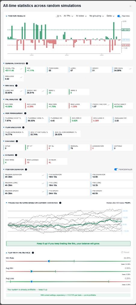
General Statistics
This group answers two questions: what is the overall result, and how many trades produced it?
| Metric | What it shows |
|---|---|
| Total PnL | Total result of all trades in USDT |
| ROI | The same result as a percentage of the starting balance |
| Total trades | Number of trades in the sample |
| Long / Short | Number of trades opened in each direction |
| Win Rate | Percentage of trades closed in profit |
| Win/Loss | Ratio of winning trades to losing trades |
Total PnL and ROI describe the same result in different units. If your starting balance is 1,000 USDT and Total PnL is +150 USDT, ROI is +15%. ROI is more useful when comparing sessions with different starting balances.
Win/Loss counts the number of trades, not their size. Twelve winning trades and eight losing trades give a Win/Loss ratio of 1.5 and a Win Rate of 60%. These figures say nothing about how much you made on the 12 winners or lost on the eight losers.
The number of trades affects how much confidence you can place in the other metrics. A Win Rate of 80% based on five trades and a Win Rate of 80% based on 50 trades look identical, but they carry very different weight. General statistics provide a starting point; they do not tell you whether the result is stable or whether most of it came from a single successful trade.

Win Rate by direction
Long WR and Short WR show the percentage of profitable trades separately for longs and shorts. You can also see the number of winning trades in each direction.
It is worth comparing them because the overall Win Rate can hide an imbalance. For example, suppose you have 20 long trades with a Win Rate of 65% and 20 short trades with a Win Rate of 35%. The overall Win Rate is 50% and looks neutral, even though the two directions perform very differently.
If the difference is noticeable, there are two practical options: focus on the direction that performs better, or review the trades in the weaker direction in your trade history. Before drawing a conclusion, check the number of trades in each direction. A Short WR of 100% based on two trades tells you very little.
Win Rate by direction shows how often trades are profitable, but not how large those profits or losses are. To see the monetary result for each direction, apply the direction filter to the histogram.

PnL Analysis
This group shows the size of your profits and losses — information that Win Rate alone cannot provide.
| Metric | What it shows |
|---|---|
| Avg Win | Average size of a winning trade |
| Avg Loss | Average size of a losing trade |
| Max Win | Best trade in the sample |
| Max Loss | Worst trade in the sample |
| Profit Factor | Total profits divided by the absolute value of total losses |
| Expectancy | Average expected result per trade, taking Win Rate into account |
Profit Factor and Expectancy are easy to confuse, but they answer different questions. Profit Factor compares totals: do your profits outweigh your losses? Expectancy shows how much one trade produces on average.
Formula:
Expectancy = (Win Rate × Avg Win) − ((1 − Win Rate) × Avg Loss)
Example 1. Ten trades: four winners of +50 USDT and six losers of −20 USDT. Win Rate is 40%.
Profit Factor = 200 / 120 ≈ 1.67.
Expectancy = 0.4 × 50 − 0.6 × 20 = +8 USDT per trade.
The numbers match: 10 trades at an average of +8 USDT produce a Total PnL of +80 USDT.
Example 2. Ten trades: seven winners of +10 USDT and three losers of −30 USDT. Win Rate is 70%.
Profit Factor = 70 / 90 ≈ 0.78.
Expectancy = 0.7 × 10 − 0.3 × 30 = −2 USDT per trade.
The Win Rate in the second example is almost twice as high, yet the overall result is negative. This is why Win Rate should be read together with Avg Win and Avg Loss.
Max Win and Max Loss help you identify outliers. If Total PnL is +300 USDT but Max Win is +250 USDT, almost the entire result came from one trade. If Max Loss is several times larger than Avg Loss, find that trade in your history and check what did not go according to plan.
No single value makes a strategy “good”. A Profit Factor above 1 only means that total profits exceeded total losses in this particular sample. It may still depend on one unusually large winning trade, and with a small sample, a single new trade can change it significantly.

Risk Management
This group compares the risk you planned when entering a trade with what actually happened. Some of the metrics are measured in R, so start by understanding this unit.
What is 1R? 1R is the risk you planned before entering the trade: the distance between the entry price and the stop. If you enter a long at 100 and place the stop at 98, 1R equals a 2% price move. Closing at 103 gives +1.5R, closing at the stop gives −1R, and closing at 97 gives −1.5R.
R allows you to compare trades with different stop distances by measuring the result relative to the risk you planned.
| Metric | What it shows |
|---|---|
| Planned Stop % | Average price distance from entry to the stop set when the trade was opened |
| Planned Take % | Average price distance from entry to the take-profit set when the trade was opened |
| Planned RR | Planned Take % / Planned Stop %: the reward-to-risk ratio planned before entry |
| Avg Win R | Actual average result of winning trades in units of planned risk |
| Avg Loss R | Actual average result of losing trades in units of planned risk |
| Realized RR | Avg Win R / Avg Loss R: the reward-to-risk ratio after execution |
Example: a Planned Stop of 1% and a Planned Take of 3% give a Planned RR of 3. If Avg Win R is actually 1.8 and Avg Loss R is 1.2, Realized RR is 1.5. You planned for a winning trade to be three times larger than a losing trade, but in practice it was only one and a half times larger.
Avg Loss R shows how your stop performs:
Around 1. The stop works roughly as planned.
Noticeably above 1. The actual loss exceeds the risk planned before entry. For example, you may be holding a losing position longer than planned or allowing the position to reach liquidation.
Below 1. You are closing losing trades before the stop. This is not necessarily a problem, but the plan and the actual execution are different.

Plan Execution
The main question in this section is: how closely do your actual actions match what you planned before entering the trade?
| Metric | What it shows |
|---|---|
| Plan Adherence % | Percentage of trades closed strictly at the take-profit or stop, without manual intervention |
| Avg TP Capture % | How much of the planned take-profit is actually captured by winning trades |
| Avg SL Containment % | How much of the planned stop is used by losing trades |
For a single trade, suppose the take-profit was set at +3% and you closed the position at +1.8%. TP Capture is therefore 60%. If the stop was 1% but the actual loss was 1.2%, SL Containment is 120%. This is the same measure as Avg Loss R expressed as a percentage: 120% corresponds to 1.2R.
How to read these figures:
Low Plan Adherence. The result is being shaped by decisions made after entry rather than by the original levels. If manual exits are part of your rules, this is expected. If they are not, the actual execution is deviating from the plan you set before entry.
Low TP Capture. You often exit before the target. As a result, actual RR may be lower than planned — assess it together with Avg Loss, Profit Factor and Expectancy.
SL Containment above 100%. The actual loss exceeds the risk you planned before entering the trade.

Exit reasons
This section shows how many trades were closed for each reason. It also helps explain where the Plan Adherence figure comes from.
Take. The trade reached the planned take-profit.
Stop. The trade closed at the planned stop. Together with Take, these are trades closed according to plan.
Manual. You closed the position manually. If this category dominates, most exit decisions are being made after entry.
Liquidation. The position was liquidated. A noticeable share of liquidations may indicate that leverage or position size is too aggressive relative to the planned risk.
Timeout. The trade was closed because of a timeout.
Read this distribution together with PnL Analysis. A high number of stop exits and relatively few take-profit exits may be normal for an approach with a high Planned RR. What matters more is whether the pattern matches the way you intended to trade.
Trade streaks
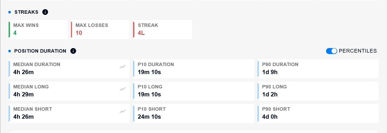
This group shows the longest consecutive winning streak, the longest consecutive losing streak and the current streak at the end of the sample.
A streak tells you what sequence of results has already occurred in your own sample. It is a fact about your trades, not a universal benchmark and not a forecast.
How to use these figures:
Compare the longest losing streak with your risk per trade. If your sample contains five losses in a row and you risk 2% of your balance on each trade, that sequence costs roughly 10% of the balance. If that is more than you are prepared to lose, reduce the risk per trade.
Look at what happened after the streak. Find those trades in your history and check whether your position size, stops or exit behaviour changed afterwards.
Consider the sample size. The longest streak in a 20-trade sample is not an upper limit. A longer history may contain a longer streak.
Do not treat the current streak as a signal. It describes the latest trades and says nothing about the next one.
Trade duration
This group shows how much time passes between entry and exit, both for all trades and separately for Long and Short. The group header includes a switch between two modes.
Percentiles (default). The median (p50) and the boundaries of the typical range (p10 and p90). Half of the trades are shorter than the median and half are longer. Ten per cent of trades are shorter than p10, while 10% are longer than p90.
Average. Minimum, average and maximum.
The median is more useful than the average when the sample contains outliers. Suppose nine trades lasted 30 minutes each and one remained open for three days. The average duration would be around 7 hours and 40 minutes, even though no trade actually lasted that long. The median would remain 30 minutes and better represent the typical trade duration.
Compare trade duration with how you intended the strategy to work. If you planned intraday trades but the median duration is two days, actual execution has diverged from the plan. Also compare Long and Short: a noticeable difference means you are holding positions differently depending on direction.
Histogram / result curve
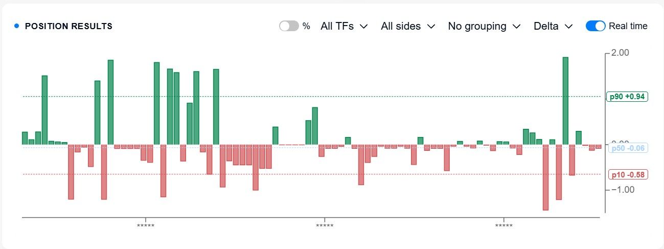
The bar chart below the metric cards shows information that averages cannot: how results are distributed across trades and over time. Each mode answers a different question.
| Mode | What it does | What question it answers |
|---|---|---|
| Delta | Shows the result of each trade as a separate bar | Are the results similar in size, or are there individual large gains or losses? |
| Cumulative | Shows the running total — effectively an equity curve | Does the result grow steadily or in jumps? Where did drawdowns occur? |
| Grouping | Groups trades by hour, 12 hours, day, week or month | Which periods were profitable and which were losing? |
| Time axis: Real time | Places trades according to the real time in which you completed the simulations | How did the result change from one training session to the next? |
| Time axis: Trade time | Places trades according to the entry time within the historical data | In which market periods did you make or lose money? |
| Direction and timeframe filters | Narrows the chart to Long, Short or a specific timeframe | Where does the result come from: longs or shorts, and which timeframe? |
| p10 / p50 / p90 lines | Show the 10th, 50th and 90th percentiles of the result. p50 is the median: half of the results are below it and half are above it. Available only in Delta mode | Is the distribution of results symmetrical? |
You can compare percentiles by their distance from the median. If the distance from p50 to p10 is greater than the distance from p50 to p90, the lower side of the distribution is wider. If the distance from p50 to p90 is greater, the upper side is wider. This helps you identify asymmetry in the results without relying only on the average.
Start with Cumulative mode: it gives you the quickest view of the overall shape of the result. A sharp drawdown in the curve points to a period worth reviewing in the trade history. Then switch to Delta and look at how many trades are actually contributing to the final result.
Monte Carlo / projected results
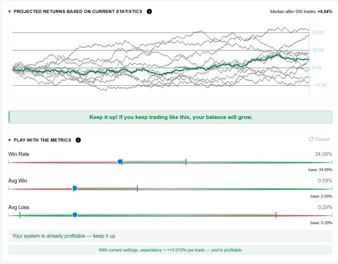
This section is a scenario model based on your current statistics, not a market forecast. Simulator takes your current Win Rate, Avg Win and Avg Loss and models 500 hypothetical future trades. The result shows where those statistics could lead if nothing changed.
The section appears once at least 10 trades have been closed.
It includes:
Chart. Around ten random balance trajectories plus a median line. The spread between the trajectories shows how different the path can be even with the same underlying statistics.
Verdict. Positive if the median result is positive, and negative if it is negative.
What-if sliders. Change Win Rate, Avg Win and Avg Loss and immediately rebuild the scenario.
Hint. If Expectancy is negative, it shows how much one of the three parameters would need to improve to move the result into positive territory.
The sliders are most useful when you change one parameter at a time. First look at the current verdict, then change only Avg Loss and see how much the result moves. Reset it and repeat the same process with Avg Win and Win Rate. This shows which parameter your result is most sensitive to.
The model has limitations. Its inputs come from your own sample, and with a small sample, Win Rate and average values may change noticeably after each new trade, which means the scenarios will also be unstable. The model also does not account for changes in the market or in your own behaviour. Treat it as a way to see the implications of your current decisions, not as a promise of future results.
Do not draw conclusions from a single trade. One trade tells you nothing about a system. The more comparable trades you have in the sample, the more stable the statistical metrics become.
Do not judge a system by Win Rate alone. It tells you how often trades are profitable, but says nothing about the amount of money made or lost.
Look at the size of profits and losses. Avg Win, Avg Loss, Profit Factor and Expectancy should be read together with Win Rate.
Separate Long and Short. One combined figure may hide a direction that is dragging the overall result down.
Analyse streaks. Compare the longest losing streak with your risk per trade.
Compare the plan with actual execution. Planned RR versus Realized RR, Plan Adherence and exit reasons show whether you are trading the way you intended.
Promo code TOPBLOG gives you a 10% discount on any Resonance tariff plan
Follow new insights in our Telegram channel.
There is no need to invent complex schemes or look for the "grail". Use the Resonance platform tools for market analysis and trading practice.
Trading Simulator is a tool for practising trading decisions and analysing simulation results in a simulated trading environment.
Register via the link and explore the Resonance platform:
OKX | BingX | KuCoin.
Recommended articles