Cryptocurrency Cluster Chart — Your Market X-Ray

A deep dive into the topic of cryptocurrency cluster charts: from the principles of construction and data interpretation to understanding market mechanics through volumes. Here, you will learn how an online cluster chart helps traders see the market condition hidden behind candles and bars, identify demand and supply zones, spot reversal points, and make precise trading decisions. We will explore how volume, as the main driver of price, is used in footprint analysis, what data can be seen in clusters, and how combining this tool with other features of the Resonance platform provides professional cryptocurrency analysis and gives a real edge in the market.
Table of contents

INTRO
Everyone who enters the market has one goal — to make money. To earn as much as possible and ensure that invested funds work as efficiently as possible, whether it’s investments or active trading.
Many use candlestick or bar charts to analyze the market. But there’s one catch. A price chart has a significant drawback — it only shows the price change over time. However, the price doesn’t change “on its own” but because market participants execute trades. They influence price movement with their money — more precisely, the volume of capital they place in market and limit orders, buying or selling assets. Read more in the article “What Is the Bid-Ask Spread.”
On a standard price chart, you won’t see information about the volumes behind the price movement. And naturally, catching those perfect entry and exit points — “catching the bottom” and “taking the top” — is quite challenging without understanding the reasons and strength of the price movement. Maximum efficiency can only be achieved by understanding market mechanics. This is why professionals use cryptocurrency footprint crypto charts. This tool reveals the full market picture, showing cluster volumes — the real money that participants use to influence the price by buying or selling assets.
Thanks to this approach, a trader gains the ability to identify key zones from which a price reversal is highly likely to occur. And herein lies the secret to successful trading: an online cluster chart allows you to see what is hidden from most behind candlesticks and bars and turn volume data into specific entry and exit points.
Volume as the Main Price Driver
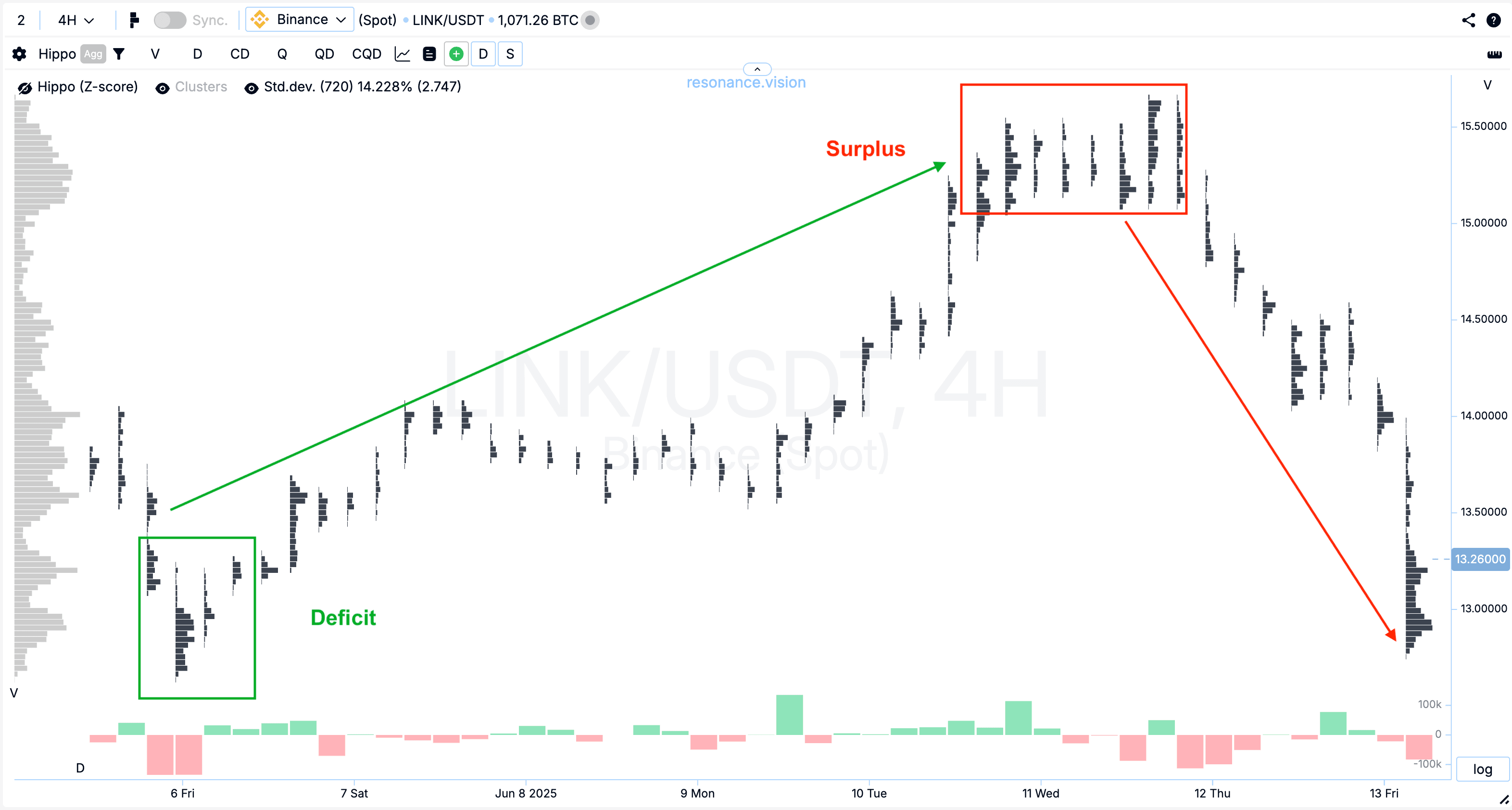
The market “lives” by one universal law — the Law of Supply and Demand. If demand exceeds supply, the price rises. If supply exceeds demand, the price falls.
In trading, volumes play a key role in analyzing supply and demand. There’s a constant active struggle between buyers and sellers for control over the price. Whether the price will maintain its direction or reverse depends on whether a deficit or surplus has formed at current prices at that moment.
Deficit — a market situation where the willingness of buyers to purchase at current prices (and the volume of money) exceeds the willingness of sellers (and the volume of money to sell). The result is a price increase.
The mirror market state is surplus. That is, a situation where the willingness to sell exceeds the willingness to buy.
Why This Is Important for a Trader:
- In a moment of supply deficit, we see participants’ readiness to buy even at a rising price.
- In a moment of surplus, sellers are willing to dump the asset at an increasingly lower price.
A cryptocurrency cluster graph is ideal for identifying these extreme market states. It shows cluster volumes at each price level and allows you to understand who dominates — buyers or sellers. Thanks to this, you can find zones where a deficit or surplus will lead to a price reversal and use them for precise trade entries.
Now let’s dive into what a cluster chart is and what makes it special.
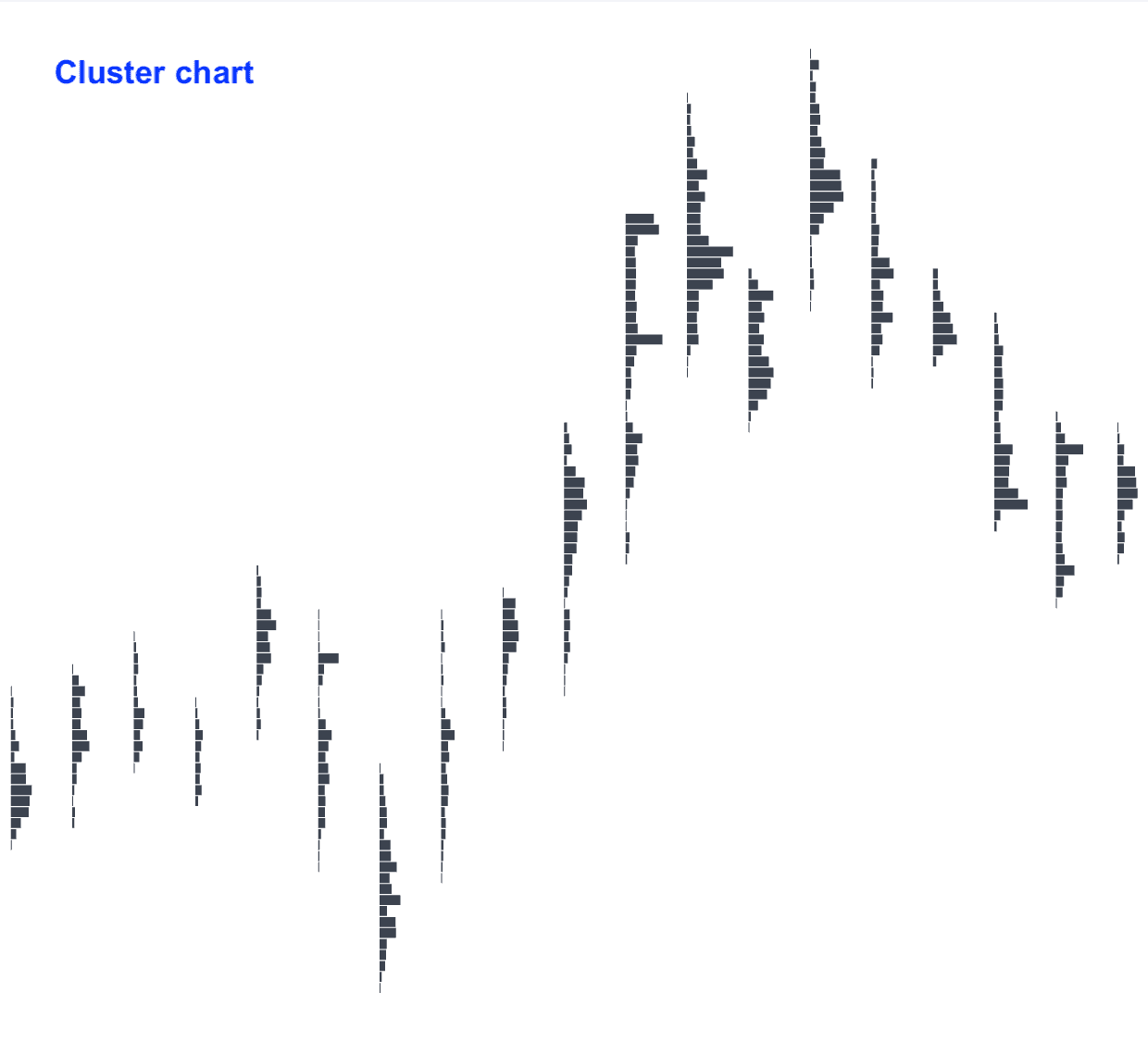
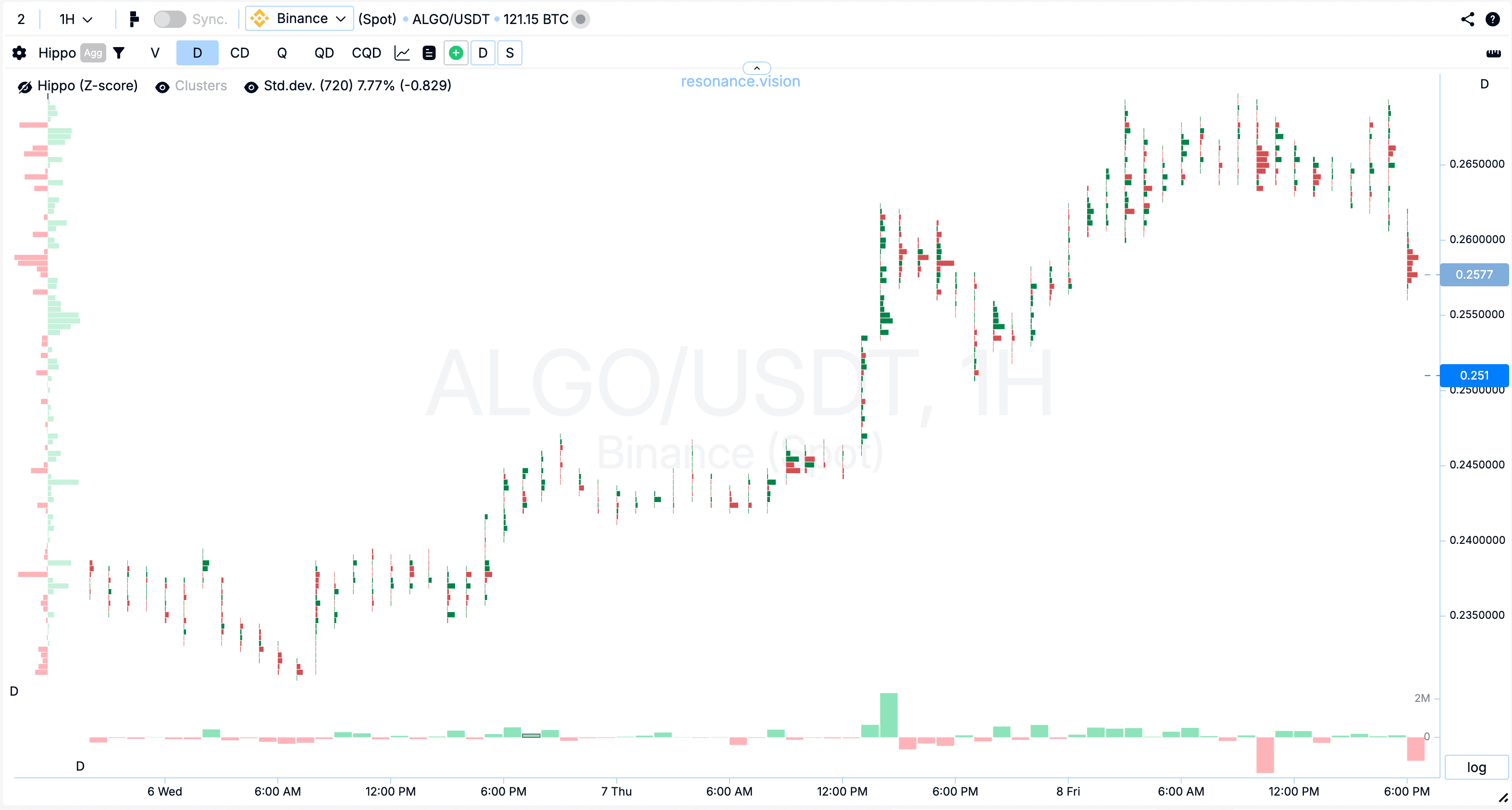
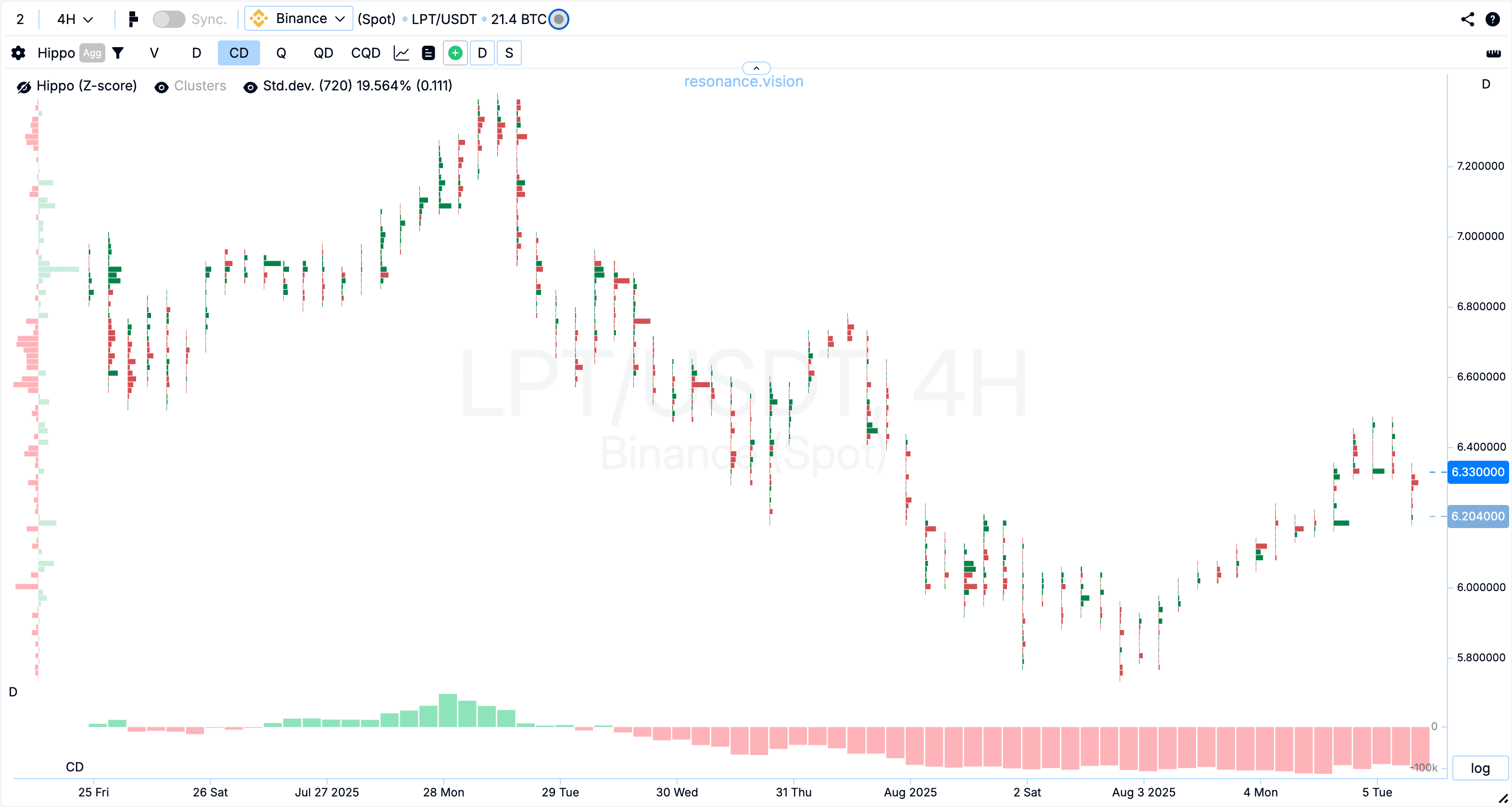
What Is a Cluster Chart
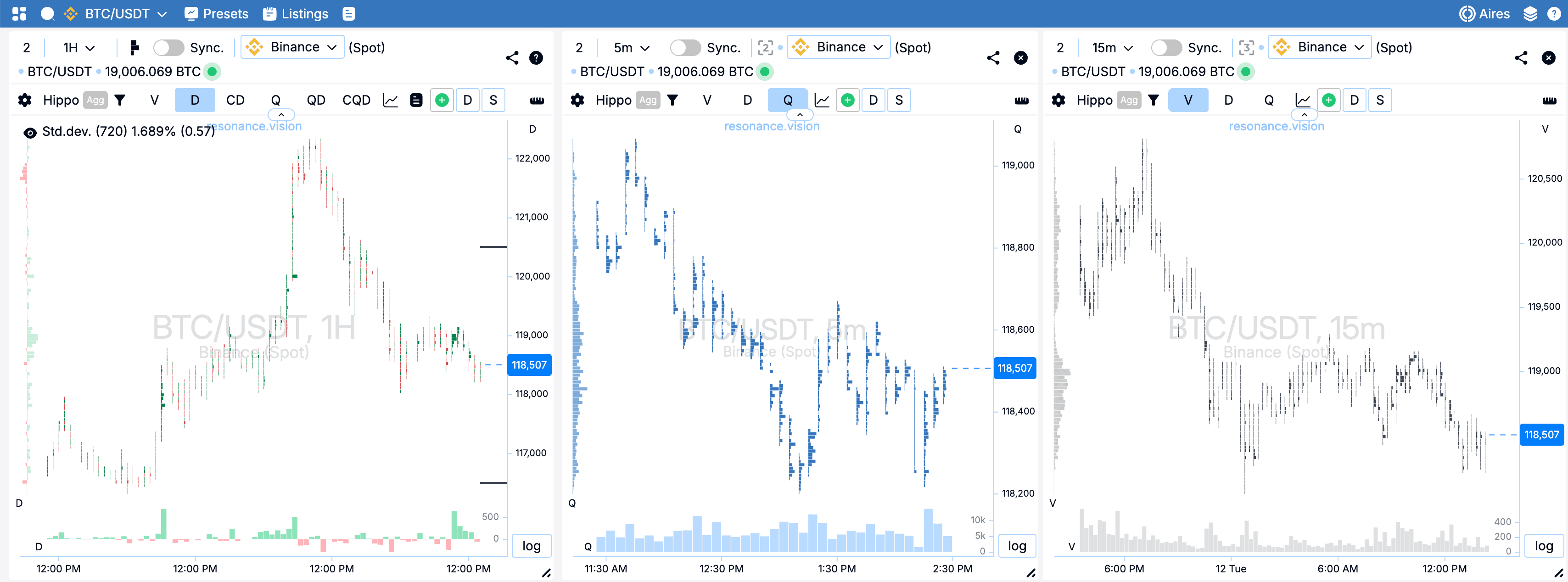
A cluster chart is a way to display the price change of an asset (e.g., Bitcoin) in the format “price + volume + time” in one window.
It is built along 2 axes:
- Price — the vertical scale on the right side of the chart. Each horizontal level corresponds to a specific asset price.
- Time — the horizontal scale at the bottom. Each column (bar) on the chart relates to a specific time interval — from 1 minute to a day, depending on the selected timeframe.
Volume — the amount of asset exchanged between sellers and buyers.
This data is shown as rectangles (clusters) at the intersection of a specific price and time. These clusters record how much was bought and sold at that price at that moment.
Thus, a footprint crypto chart combines three important parameters:
- time (when trades occurred),
- price (at what price trades occurred),
- volume (how much was traded and in what direction).
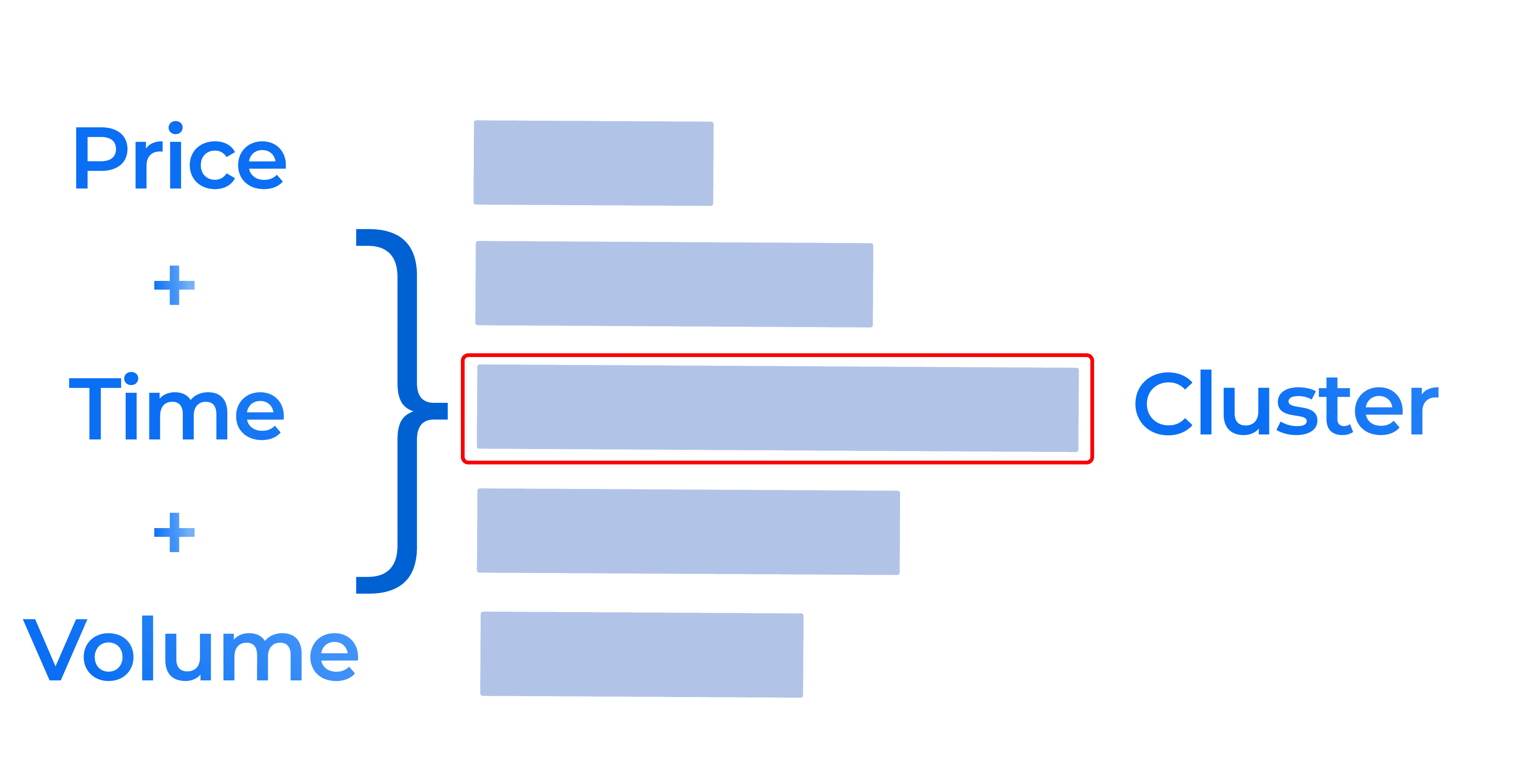
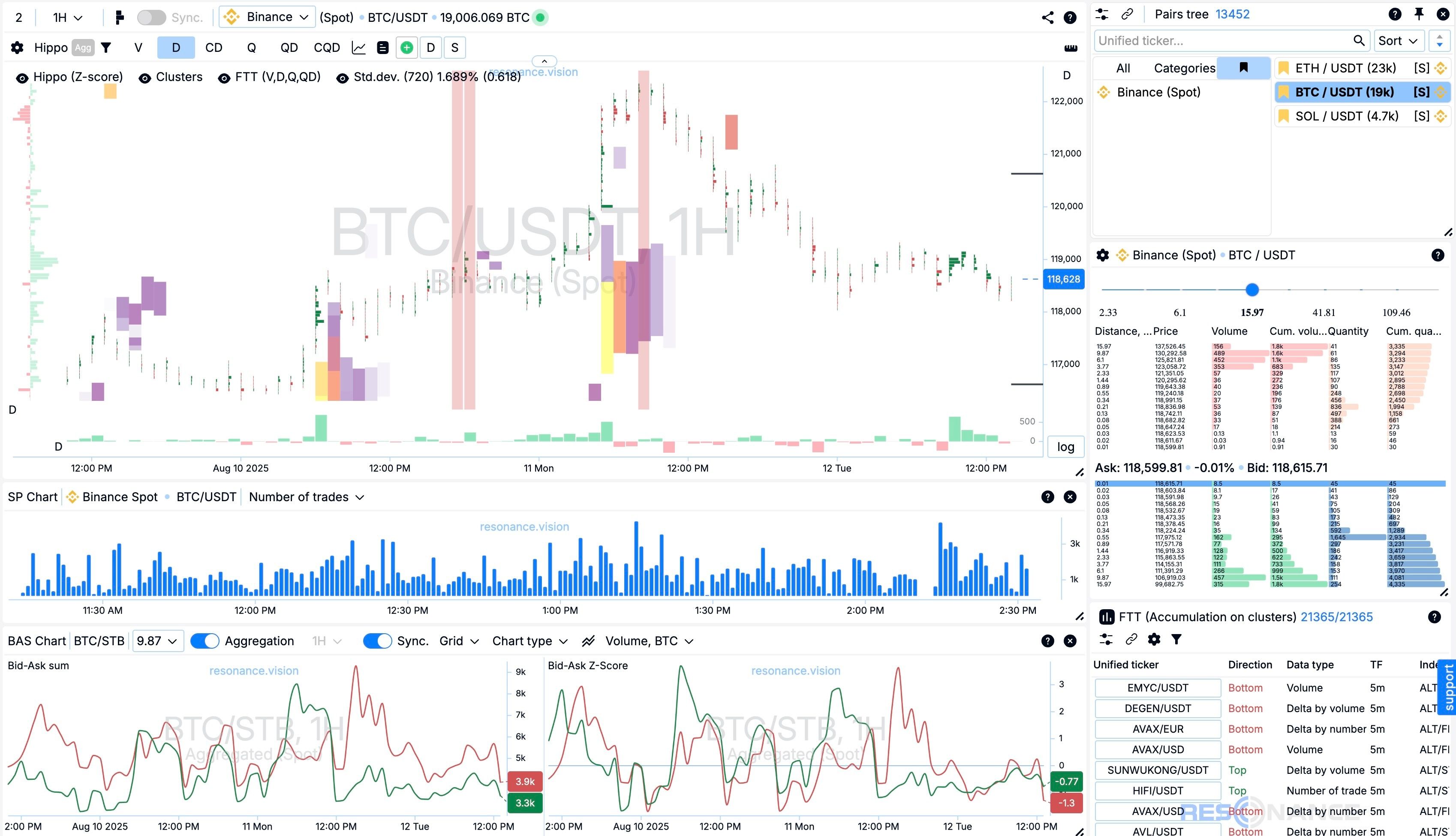
Cluster — is a separate data cell containing detailed information about trades at a specific price level and timeframe.
Timeframe — the type of data grouping by time (e.g., 1 minute, 1 hour, 1 day)
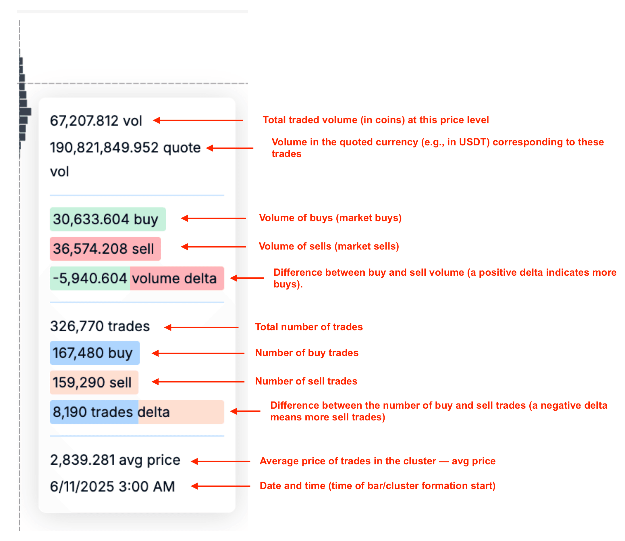
Let’s break it down:
- Total traded volume (in coins) at this price level
- Volume in the quoted currency (e.g., in USDT) corresponding to these trades
- Volume of buys (market buys)
- Volume of sells (market sells)
- Difference between buy and sell volume (a positive delta indicates more buys).
- Total number of trades
- Number of buy trades
- Number of sell trades
- Difference between the number of buy and sell trades (a negative delta means more sell trades)
- Average price of trades in the cluster — avg price
- Date and time (time of bar/cluster formation start)
As you can see, detailed data on executed trades can be viewed in each cluster.
Clusters are then grouped into cluster bars according to the timeframe.
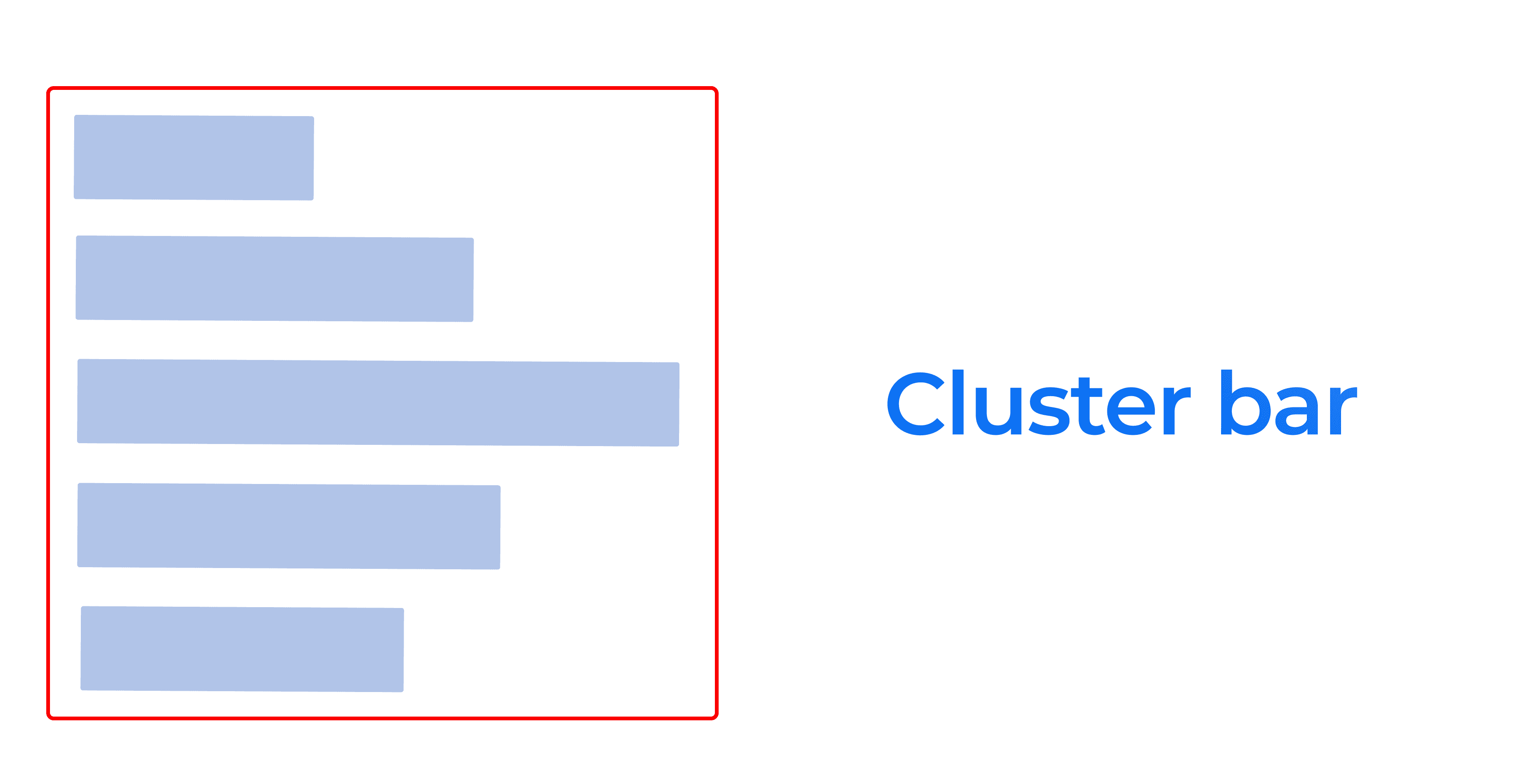
Cluster Bar — is a vertical column of clusters for one time interval. The bar shows at what prices the asset was traded during that time and where large trades occurred.
For example, when grouping market data into 1 hour (timeframe — 1 hour), 50 coins were bought at an average price of $1.05.
Cluster graphs are formed from cluster bars.
Detailed trade data can be viewed both in each cluster and overall in the cluster bar — simply hover the cursor over a cluster or the histogram column under the cluster bar.
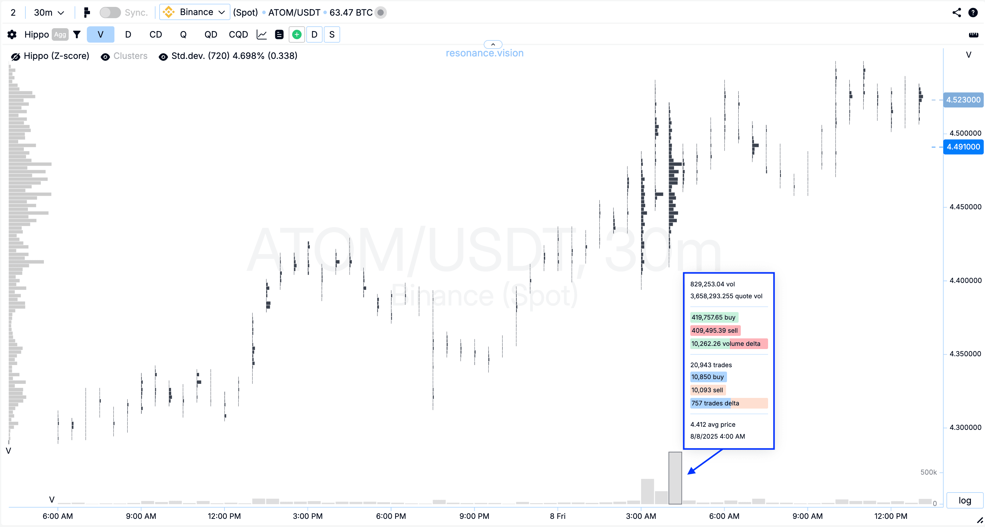
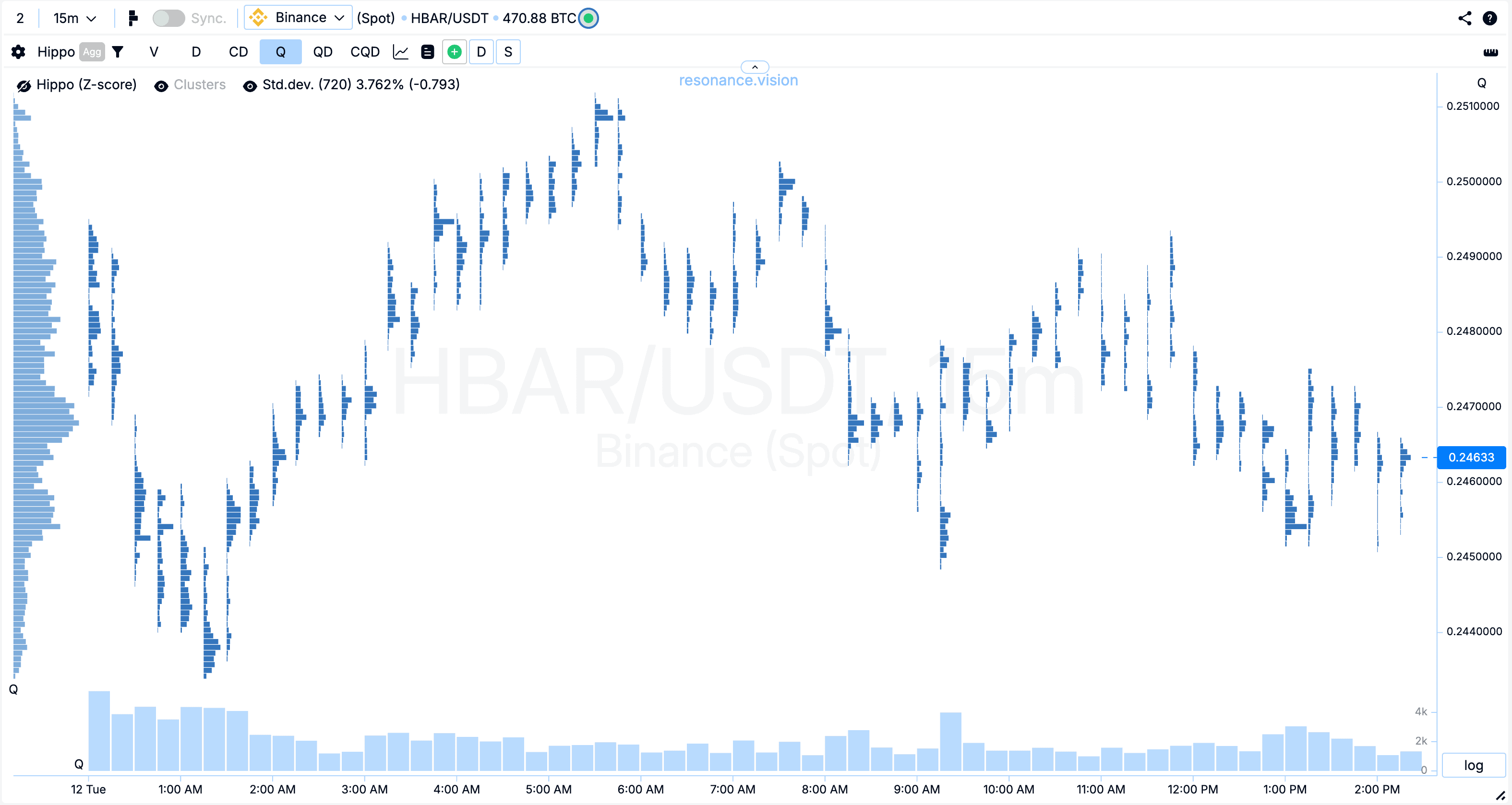
Histogram — a graphical representation of data in the form of columns, where the height of the column reflects the value of metric (e.g., volume, delta, or number).
On an order flow chart, a histogram is a way to visually display the value of a specific metric (volume, delta, number of trades) as colored columns. It helps quickly assess where values are maximal and where they are minimal.
There are two main types:
1. Horizontal Histogram
- Located to the left of the chart
- Shows cumulative values across price levels for the selected time range.
- A horizontal volume histogram shows at which prices the most trades occurred across the visible chart section.
- Used to identify support and resistance zones, as well as zones of interest for major market participants.
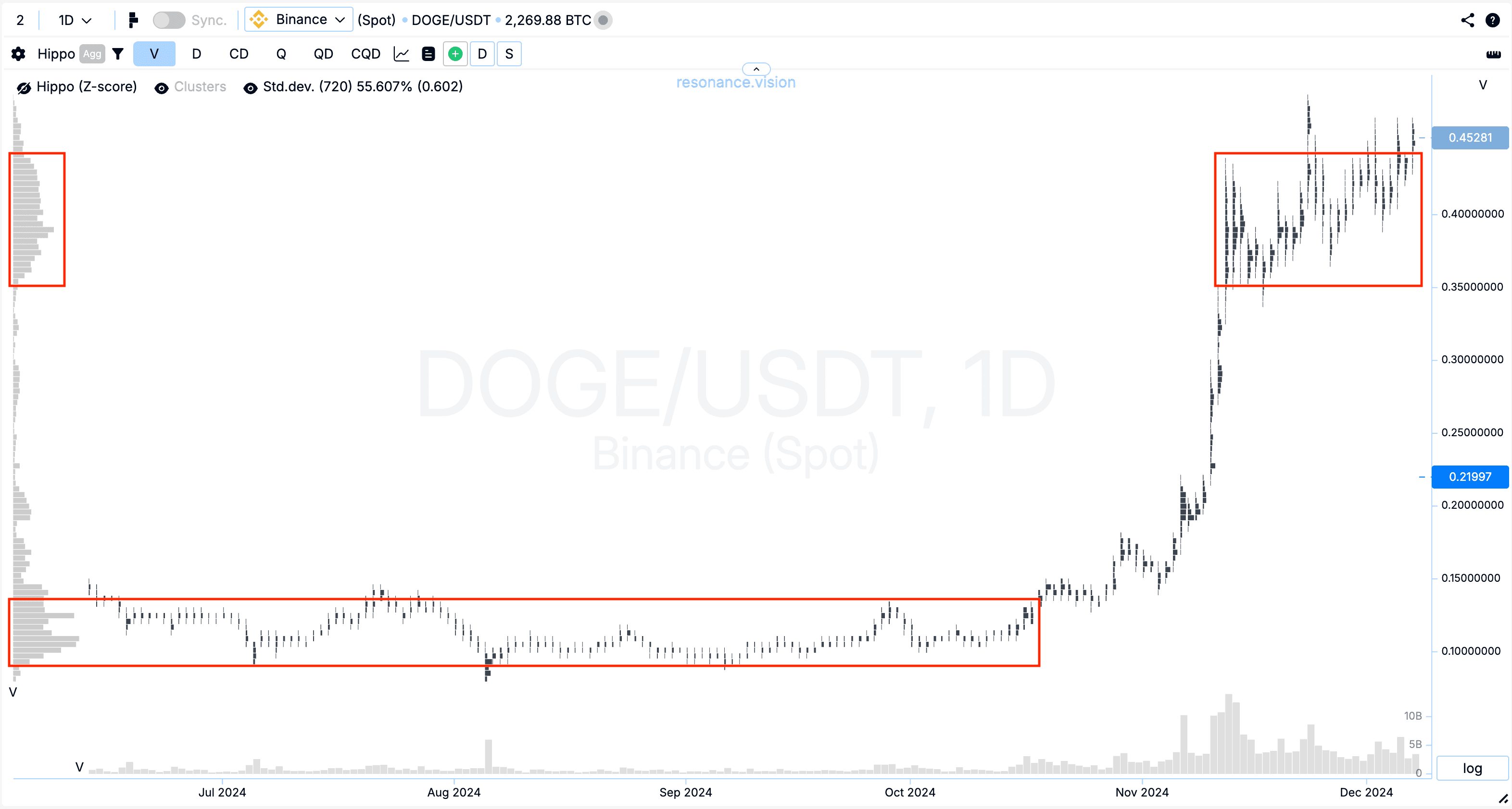
Example: If a peak in the horizontal volume histogram is visible at a price of 0.1089–0.12 USDT on the DOGE/USDT pair, it means maximum trading activity was concentrated there.
2. Vertical Histogram
- Displayed at the bottom of the chart (directly under the bars).
- Shows the distribution of cumulative values over time — e.g., volume in each bar.
- Helps assess activity at different moments and track when market spikes occurred. Helps determine the impact of volume on price.
Example: A sharp spike in the vertical histogram in a specific bar may indicate the entry of a major player or the triggering of a large number of stop orders.
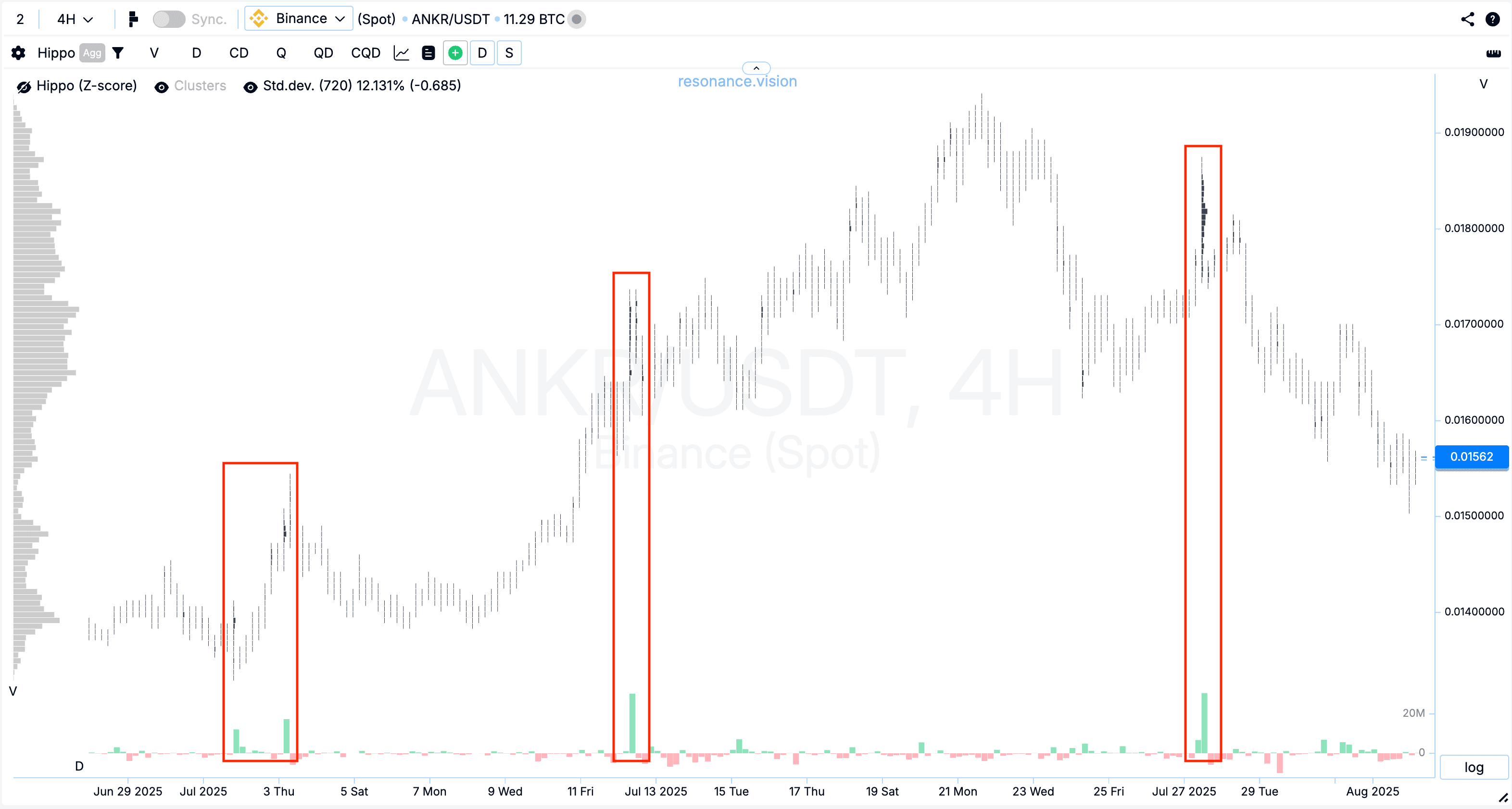
On a cluster chart, the horizontal histogram provides insight into where the main interest was (by price), while the vertical histogram shows when it was (by time). Together, they allow analysis of the market from both price level and activity moment perspectives.
Essentially, a cluster chart quickly and visually displays the situation within the selected price range. It helps a trader with:
- liquidity analysis
- determining the balance between buyers and sellers
- finding entry and exit points in trades.
So, you already know that
a cluster chart is a type of market chart that shows at what price and at what moment a specific volume of the selected asset was traded. It allows you to see zones of concentrated large buy and sell volumes and helps determine states of deficit and surplus.
Thus, a cryptocurrency order flow chart allows you to assess market sentiment and quickly understand the balance of power of the participants on the selected asset.
This makes it a “market X-ray”: you see not only that the price went up or down but also who was behind it — buyers or sellers — and with what force.
To understand how to analyze a cluster chart and volumes, you need to take the free mini-training from Aires, which covers the basics of the Resonance directional strategy in detail.
Types of Data on a Cluster Chart
A cluster chart can display several types of information, allowing a trader to flexibly customize visualization for their tasks.
On the Resonance platform, different data display modes are available:
Total Traded Volume — displays the sum of all buy and sell trades at each price.
Features:
- Clusters and histograms in gray color
- Shows the total trading volume at different prices
- Useful for quickly identifying price levels with the highest traded volume.
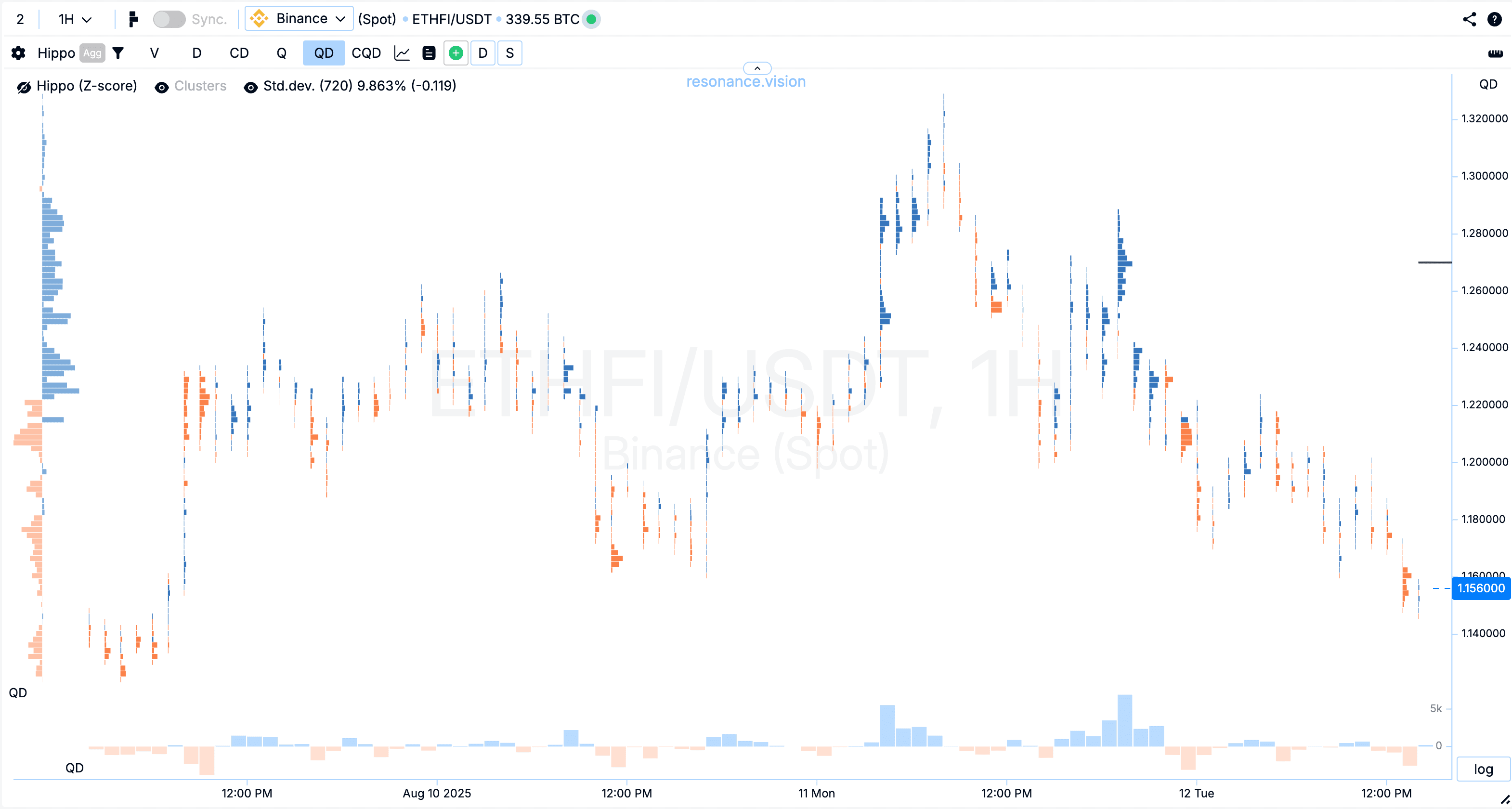
Delta by Volume — shows the difference between buy and sell volumes.
Features:
- Clusters and histograms in green and red colors
- Buy dominance is highlighted in green, while sell dominance is in red.
- This type of cluster chart helps determine who dominates the market (buyers or sellers) and assess market sentiment.
By the way, the delta histogram can be made cumulative (accumulative). It will account for previous delta values when forming current indicators. This helps evaluate the total amount bought or sold over a period of time.
Number of Trades — displays the total number of buy and sell trades, without considering their volume.
Features:
- Clusters and histograms in blue color
- This type of data shows the number of trades executed at each price level
- Used to analyze price zones with high activity.
Delta by Number of Trades — helps see the difference in the number of trades: shows the difference between the number of buy and sell trades
Features:
- Clusters in blue and orange colors: blue clusters indicate more buys, orange clusters indicate more sells
- The histogram and clusters display the difference in the number of buy and sell orders over a period of time (timeframe).
- Helps determine who was more active in terms of trade count, even if the trade volume was small, and identify where significant changes in demand and supply occurred, which may indicate potential market reversal points.
The delta by number of trades chart can also be made cumulative.
Advantages of Using Cluster Charts
Working with cluster volumes provides a trader with significant advantages:
- identification of zones of interest for major players
- deep analysis of demand and supply on the market
- detection of real support and resistance zones
- the ability to find market reversal points.
This is why many professionals use cluster charts instead of standard candlestick or bar charts.
The Resonance platform allows you to open a cluster chart online in real time. This means a trader sees up-to-date market data without delays. There’s a timeframe switching function — from minute charts for scalping to daily charts for investing.
You can customize:
- type of cryptocurrency cluster chart (by volume, delta, number of trades)
- level of detail
- add standard price deviation to highlight statistical anomalies
- type of price scale: standard or logarithmic
Additionally, you can connect multiple additional charts and synchronize them — for example, to analyze volume and delta on the same asset simultaneously.
How Work With Other Analysis Tools
A cryptocurrency order flow chart is perfectly combined with other analytical tools on the platform:
- Depth of Market (market depth) for analyzing limit orders
- Speed Print for detecting anomalous accelerations in the trade tape
- Heatmap and BAS for visualizing the density and dynamics of limit order volume changes
- FTT for identifying abnormally high trading volumes and accumulations on the cluster graph.
By combining these tools, a trader gains a multi-layered analysis — from order distribution to the dynamics of demand and supply changes.
In combination with cluster volumes, market analysis turns into a complete system of effective trading solutions.
Even a beginner trader, after mastering the cluster chart, can better understand market mechanics and make more balanced trading decisions online.
Conclusion
A cluster chart is not just a good visualization but a tool that provides a competitive advantage. It allows you to see hidden patterns in volume distribution, understand the actions of major players, and react to the market faster.
The use of cluster volumes and footprint analysis in crypto trading has already become a standard for professionals. If you want your analysis to be truly deep and precise, start using a cryptocurrency cluster chart today.
Especially when understanding what’s happening is so simple and accessible, even from a mobile phone.
Follow new insights in our telegram channel.
No need to invent complex schemes and look for the "grail". Use the Resonance platform tools.
Register via the link — get a bonus and start earning:
OKX | BingX | KuCoin.
Promo code TOPBLOG gives you a 10% discount on any Resonance tariff plan.
Recommended articles


