Trading by Levels: How to Build Support and Resistance Manually

Why do classic support and resistance lines often fail for beginners? In this article, we’ll explore why levels aren’t “reinforced concrete walls” on the chart, but rather dynamic zones of supply and demand. You’ll learn how to manually identify strong price ranges using cluster analysis, volume, and the Hippo heat map, and explore the three main scenarios for level execution (hold, breakout, and false breakout) without relying blindly on standard indicators.
Table of contents
- 01Support and Resistance Levels or Zones?
- 02What Is Support?
- 03What Is Resistance?
- 04How to Find Support and Resistance Level Manually
- 05Trading with Support and Resistance Levels: 3 Scenarios
- 06Holding the Level
- 07Level Breakout
- 08False Level Breakout
- 09Support and Resistance Indicator
- 10Common Mistakes When Identifying Levels
- 11Conclusion

Support and Resistance Levels or Zones?
When people talk about classic technical analysis, trading with support and resistance levels is usually one of the first topics that comes up. This approach remains popular because it looks visually simple. Any beginner can open a chart and draw a horizontal line through a couple of highs or lows. But that is exactly where the trap begins: many people treat a support and resistance level on a chart as a solid wall that the price must bounce from.
A level in technical analysis is not just a mark on a chart. It is a zone where price movement can slow down, stop, or reverse because the balance between demand and supply changes.
Entering a position just because the chart touched a line is one of the main mistakes beginners make. Such levels are not signals by themselves and do not guarantee a reversal. A line on a chart does not show what participants are doing here and now, or what their intention is. In trading, the line is only a starting point.
For trading to become a controlled process, a trader needs to check volume and the reaction to that volume, no matter what originally drew attention to the setup.
What Is Support?
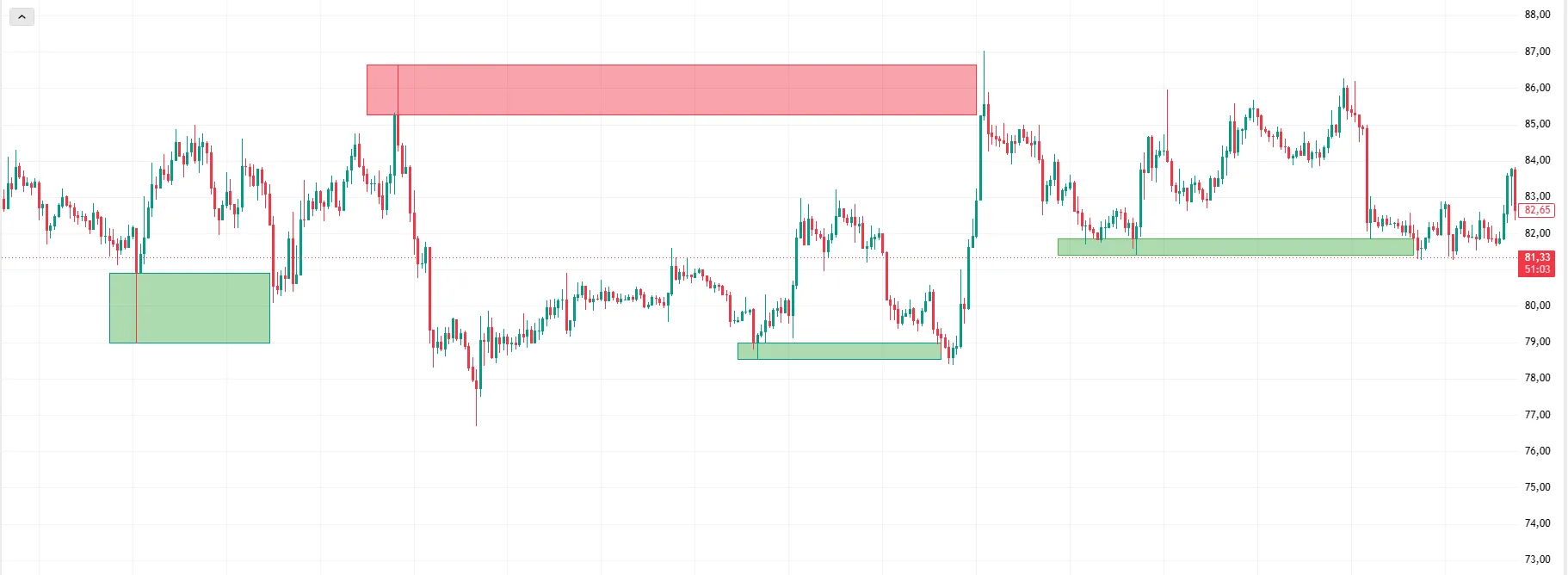
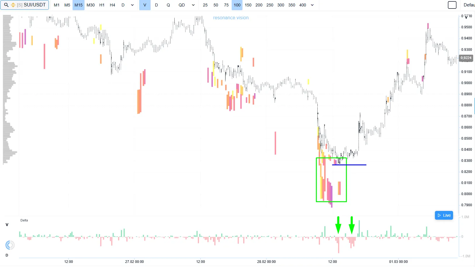
For crypto assets, support is a zone where increased demand appears and the buyer starts holding the asset from further decline.
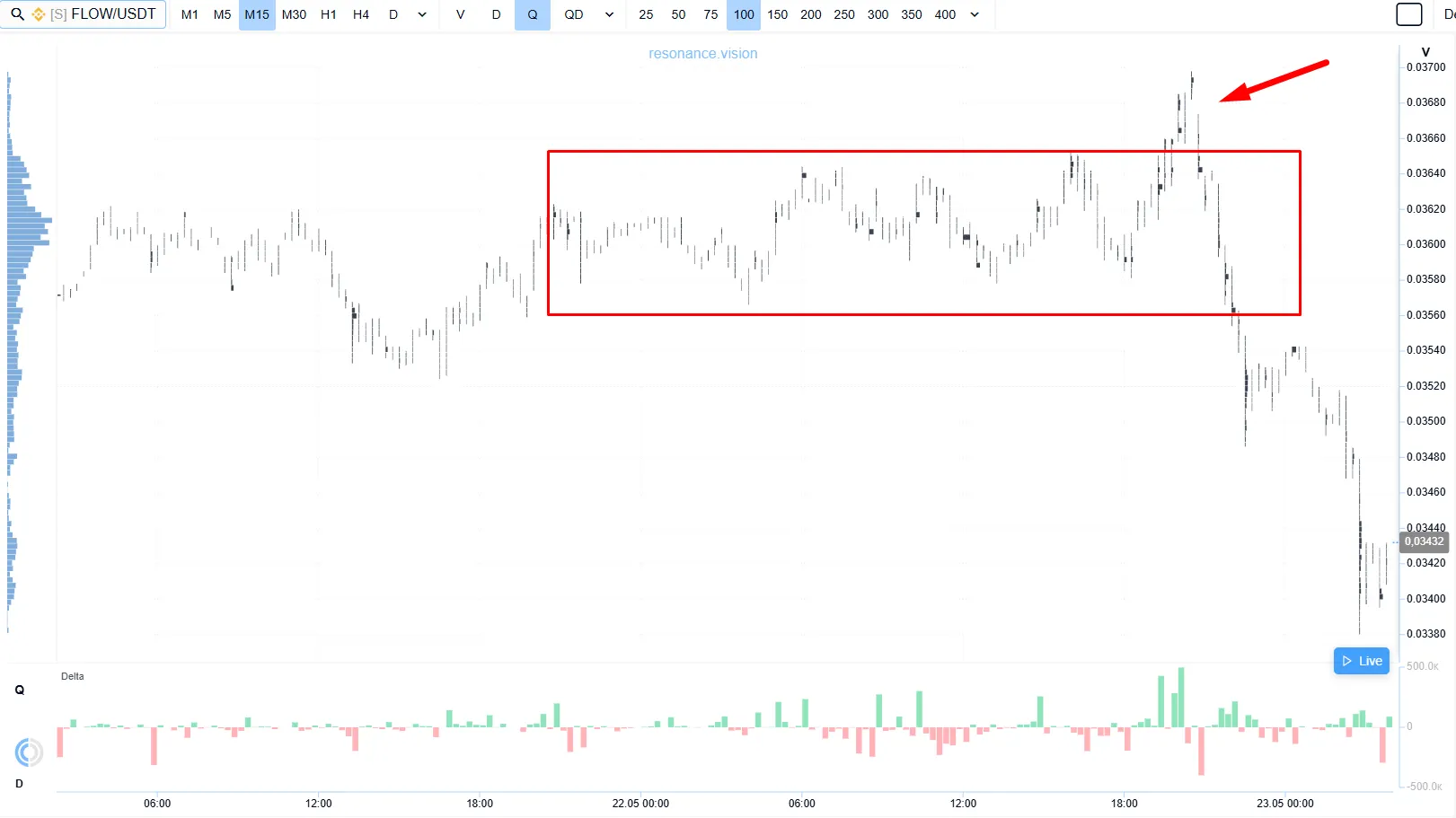
Let’s look at a cluster chart and see how support is formed.
After a decline (red arrow), the asset started moving into a sideways range (blue rectangle) — the movement began to slow down. Despite selling pressure (green rectangles), the asset does not update the local low significantly, or does not update it at all. This indicates that a limit buyer is holding the zone.
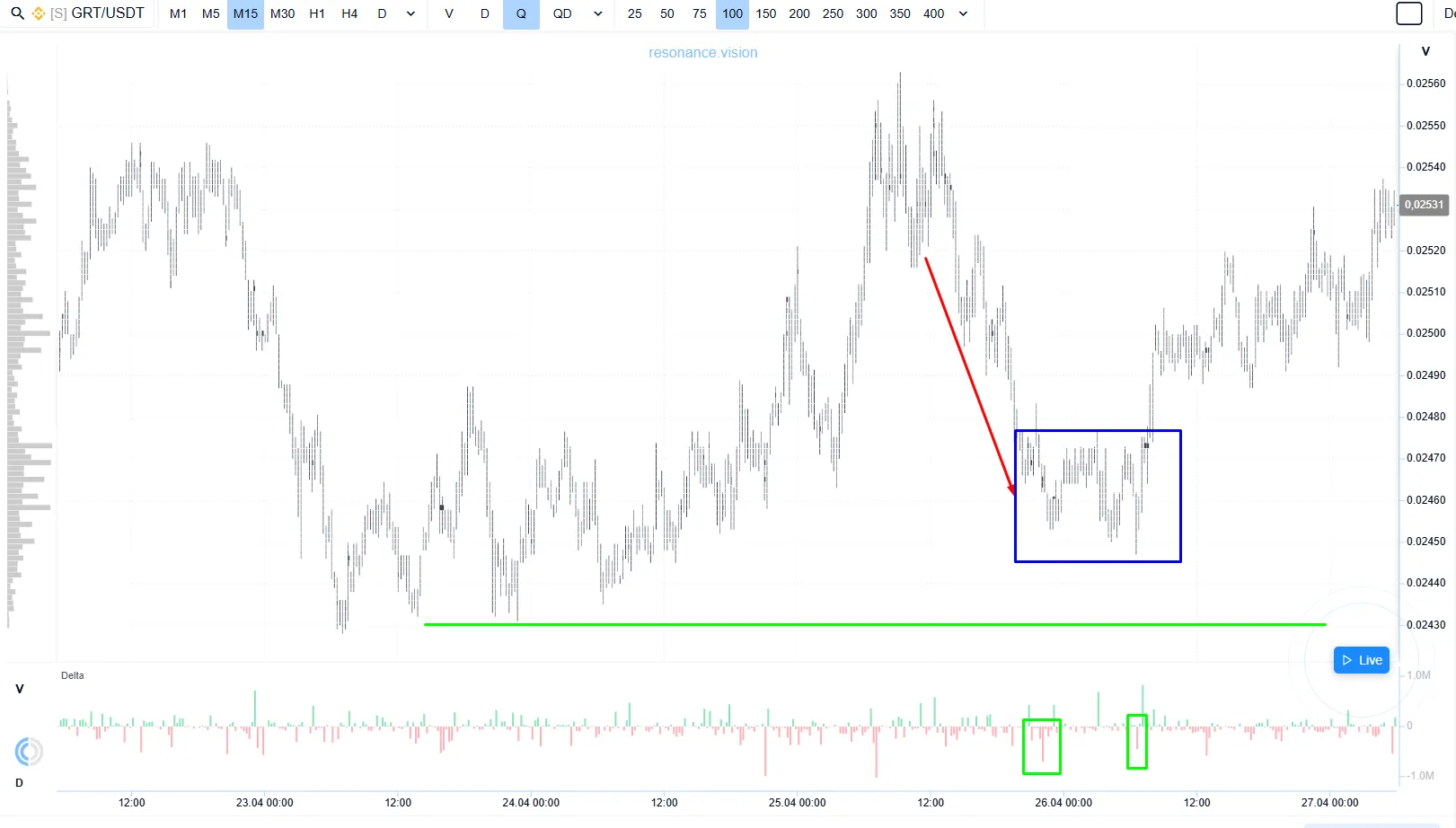
When we turn on Hippo, a heatmap that shows the density of limit orders, we see a large cluster of buy limit orders (green rectangle) below the local extreme. This confirms buyer interest and readiness to absorb selling, which increases the probability of a reversal.
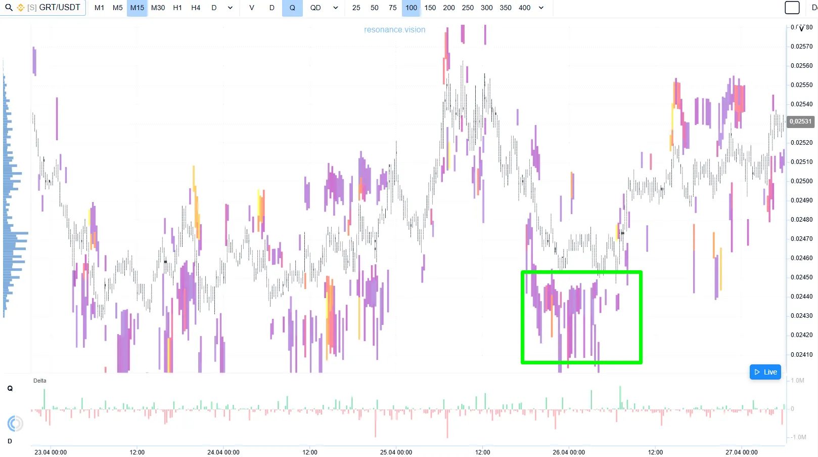
Such support zones are often characterized by:
- a pause in the decline
- lower volatility
- absorption of aggressive sells
- dense volumes of buy limit orders (green rectangle)
It is important to understand that support is not an exact line. A deficit can form inside a whole area.
The best way to analyze crypto effectively is to use online tools that show what is happening inside the movement: where volume is passing, how buyers and sellers behave, and whether their actions influence the price. If you are just starting to understand trading or want to bring your knowledge into a system, start with Resonance online mini-training. In it, we consistently explain the basic principles of the market, volume, demand and supply, and show how to move from chaotic chart markup to conscious analysis of situations in crypto.
What Is Resistance?
Resistance is a zone where supply appears and the seller starts holding back further growth.
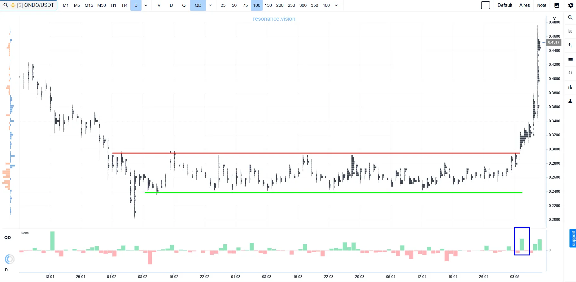
Let’s look not at drawing, but at identifying a resistance zone using ONDO as an example.
The Hippo heatmap shows a cluster of sell limit orders (red rectangles). After a strong rise, the seller places large orders, forming limit supply. These sell orders create an obstacle for the buyer.
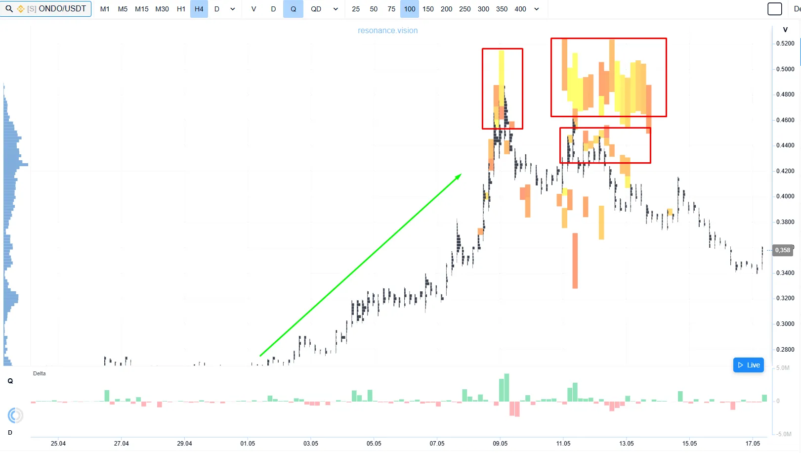
On the cluster chart, dense clusters start forming near the extremes (blue rectangles). A large volume passes there — this is a struggle between participants: aggressive buyers meet limit resistance from sellers.
The delta histogram shows large aggressive buys (red rectangles), yet the asset cannot update the local high (red line).
All of this shows that supply is too strong and the buyer does not have enough resources to push the price higher. At this stage, a surplus forms and the probability of a correction increases.
A resistance zone on the chart often looks like:
- growth slowing down
- increased volatility
- no continuation after an impulse move
- increased volumes of sell limit orders
- active aggressive sells and inefficient buys
Such zones are especially typical after a strong upward move, when some participants who bought earlier at lower values start taking profit.
Large participants do not build a position with one trade at one value. That is why strong levels almost always look like a range where large volume passes, large limit orders appear, the movement stops, and the reaction to volume changes.
How to Find Support and Resistance Level Manually
To understand how to identify support and resistance levels from the perspective of mechanics, pay attention to these markers:
Repeated stops of the chart: areas where the chart tests the same range several times.
Limit support and resistance: dense clusters of limit orders, which the Hippo heatmap highlights well online.
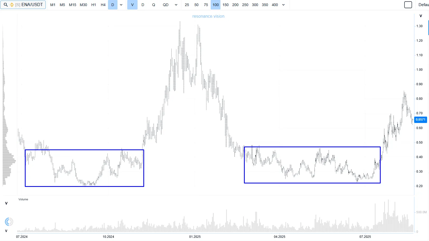
Consolidations before movement: long sideways ranges where accumulation was formed. The Resonance online Screener is useful for finding such zones.
High-volume zones: cluster accumulations that show where the largest number of coins was traded.
Trend exhaustion areas: zones where high participant activity and huge volumes of aggressive orders still failed to continue the trend, which is a sign of limit absorption.
This is clearly visible on the cluster chart in Delta mode.
A support or resistance level is meaningful only when the volumes in that zone had a noticeable effect on the following movement. That is why the key is not the method of drawing levels according to technical analysis rules, but the mechanics and balance of the market.
Trading with Support and Resistance Levels: 3 Scenarios
Effective work with support and resistance levels is always built on strong confirmations from volume analysis. Depending on that, the tactic is chosen. Let’s look at three main scenarios.
Holding the Level
The asset comes into a zone of interest for large participants and starts slowing down.
Next, it is important to determine:
- whether there is volume
- whether selling or buying is being absorbed (green arrows)
- how the asset reacts
If pressure exists but there is no further movement, a deficit or surplus forms and the probability of a pause or reversal increases. Sometimes this is the best moment to open a position.
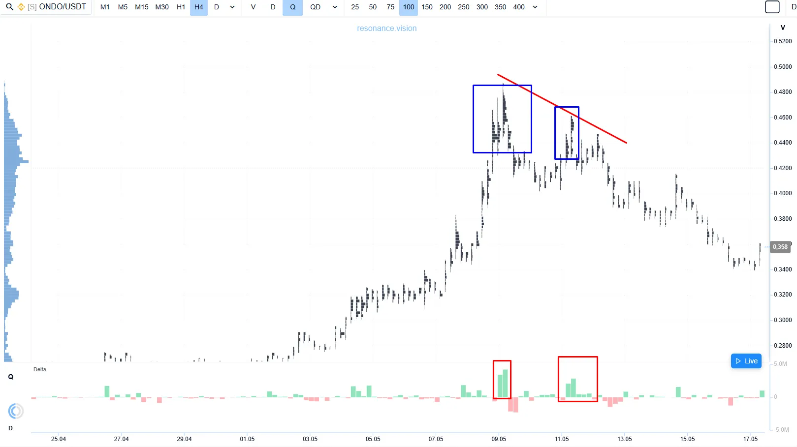
Let’s look at the formation of a support zone. After the asset declines, large buy limit orders appear (green rectangle), and the movement starts slowing down. Large cluster accumulations form near local lows. Here we can see how a large participant begins to show interest.
On the delta histogram, we see active selling by participants (green arrows). Their actions do not lead to an update of the local low (blue line). If pressure exists but there is no decline, selling is being absorbed, a local deficit forms, and the probability of a reversal increases. This is what eventually happened.
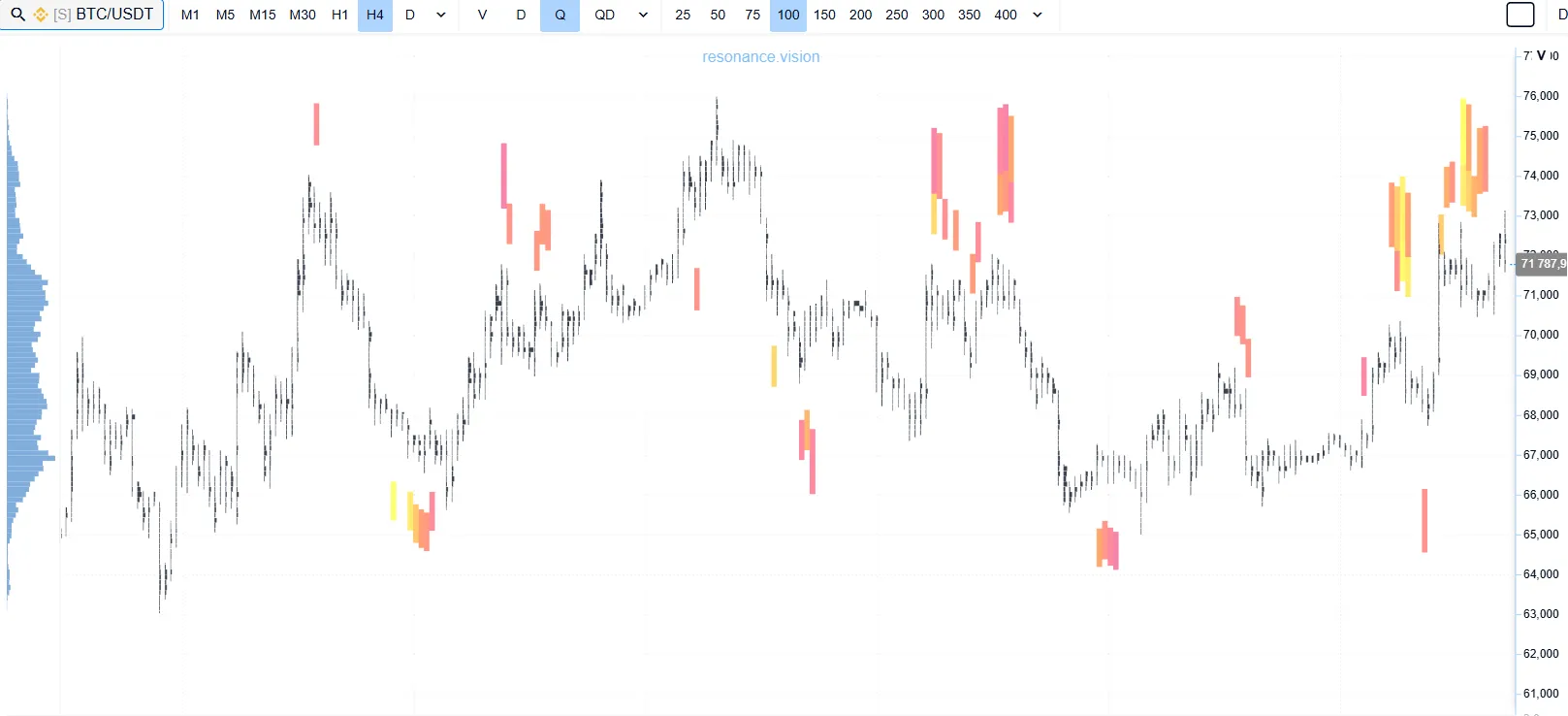
Level Breakout
A breakout is not just a candle closing beyond a level. It is important to evaluate:
- whether there is active volume (blue rectangle)
- whether the asset holds beyond the zone
- whether continuation appears
If the asset quickly returns back, the breakout is false. That is why this approach requires careful analysis of movement together with volume after exiting the range. In such moments, your strategy plays a crucial role. Many believe that fear or greed destroys a deposit. But the issue is often deeper — the absence of a clear system. In the article “Fear and Greed Are Only Symptoms. Where Is the Real Risk Hidden?” we explain why emotional decisions appear when there is no clear strategy: from choosing an asset and entry point to risk management and exiting a position.
False Level Breakout
Sometimes the asset breaks out of a sideways range and quickly returns back. The key point here is the lack of result after the breakout. If there was volume, but the movement could not continue, this often indicates absorption of aggressive volume and weakness of the impulse.
We discussed the mechanics of this movement in more detail in the article about false breakouts.

Support and Resistance Indicator
To optimize the search for levels in technical analysis, traders often use different support and resistance indicators.
Any such algorithm is based only on historical chart movement and does not take into account the current context from the perspective of demand and supply. Such algorithms often create a chaotic abundance of lines, so a trading strategy based on support and resistance levels does not give the trader an advantage.
Indicators cannot be used as a ready-made system. The best way to evaluate crypto price movements in the crypto market is through analysis of demand and supply; otherwise, losses are almost inevitable.
Common Mistakes When Identifying Levels
- Building support and resistance levels from every local extreme.
- Treating a level as a mandatory place for placing limit orders.
- Ignoring the market phase, for example trying to trade a bounce from support when an impulse move is developing.
- Entering a position before the asset has shown any reaction to the zone.
Conclusion
A support and resistance level on a chart is not a ready-made signal for entry, but a zone where the balance between demand and supply may have changed earlier. That is why drawing lines alone does not create an advantage if the trader does not understand what is happening inside the movement: where volume passes, how price reacts, who is active, and whether participants get a result from their actions.
A support and resistance indicator can help mark reference points faster, but it cannot replace context analysis. The best approach is to treat levels as working zones for observation, not as exact lines that the asset is “supposed” to bounce from.
The task is not to guess where the reaction will happen, but to determine why it may happen. When a trader combines levels, volume, liquidity, and the logic of demand and supply, every action becomes more systematic, and the chart stops being just a set of lines. This makes trading in crypto more structured, especially where liquidity, volatility, and participant behavior can change very quickly.
Follow new insights in our telegram channel.
No need to invent complex schemes and look for the "grail". Use the Resonance platform tools.
Register via the link — get a bonus and start earning:
OKX | BingX | KuCoin.
Promo code TOPBLOG gives you a 10% discount on any Resonance tariff plan.
Recommended articles


