The “Flag” Pattern in Trading: Trend Continuation or a False Signal?

This article examines why the popular “Flag” trading pattern often generates false signals. Using examples from SOL and XRP, it demonstrates how visually “perfect” patterns fail without analyzing volumes, limit liquidity, and order efficiency. The article clearly explains why technical analysis fails to reflect the true balance of supply and demand and how a cluster approach can help make informed trading decisions.
Table of contents

Technical analysis has long become the most popular method of assessing market conditions. Books, blogs, YouTube channels — everywhere the same approach: look for shapes, patterns, and formations. It is not surprising that traders widely believe graphical models help to “predict” price movement.
One such model is the Flag pattern in trading, which is believed to signal trend continuation. However, a key problem arises: neither patterns nor technical analysis models are based on objective data. These are merely visual templates that do not consider the market as a living system of supply and demand.
In consistent trading, such methods fail to deliver stable results. Traders repeatedly fall into traps of false signals and lose capital. A trader’s task is to work with what can be verified, measured, and scaled.
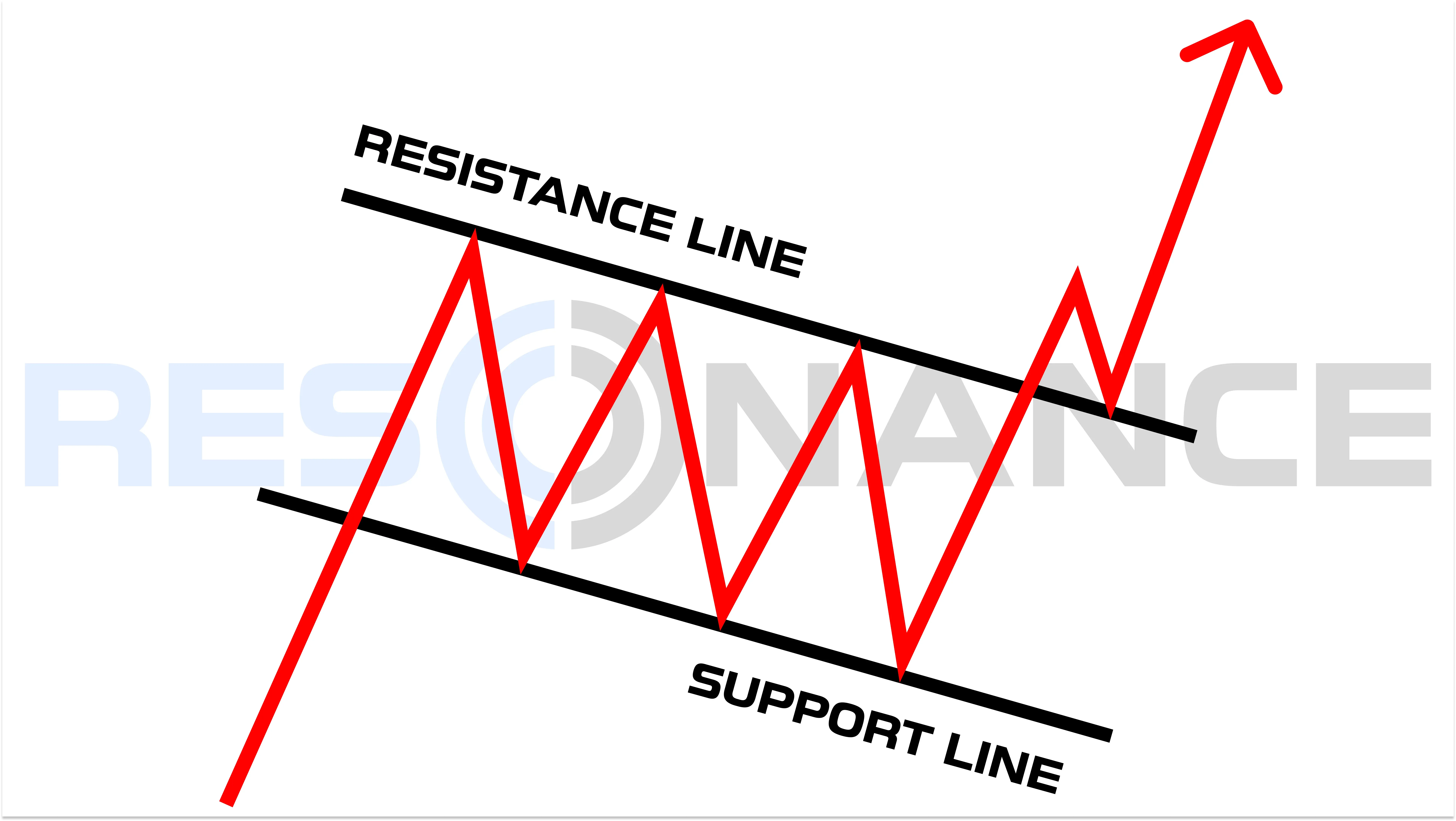
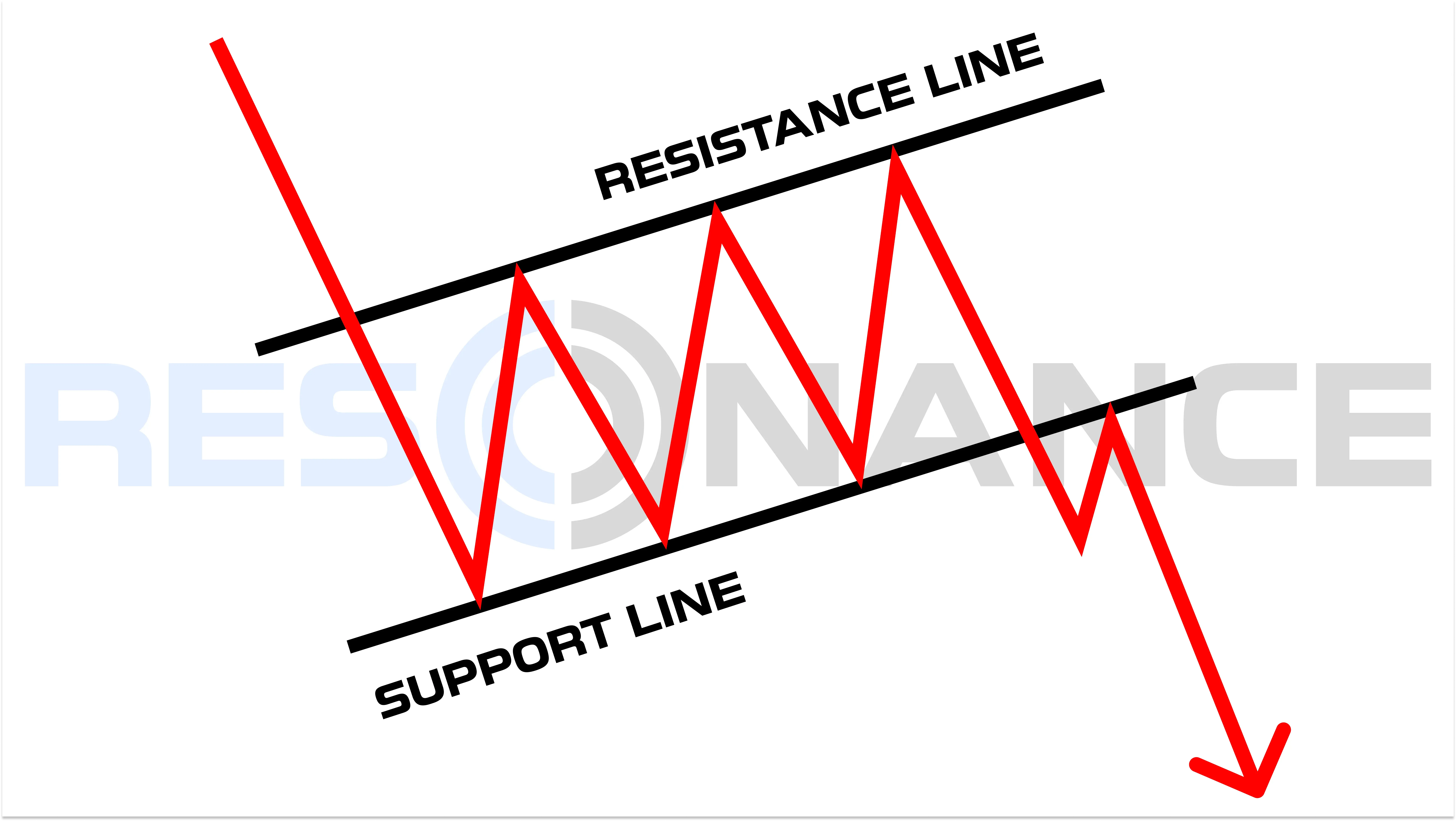
The Flag Pattern in Trading
A Flag is a trend continuation pattern that includes:
- Flagpole: a strong impulsive price movement (up or down)
- Flag: consolidation in a narrow channel against the main price direction
There are two types:
Bull flag pattern (Classic Definition)
- Forms during an uptrend
- After strong growth, a small downward or sideways channel appears
- A breakout upward from the channel signals trend continuation
Bear flag pattern (Inverted)
- Forms during a downtrend
- After a decline, a small upward or sideways channel appears
- A breakout downward signals continuation of the decline
Everything looks simple — just trade it… until you test it under real market conditions. Traders often assume that a continuation pattern guarantees further movement, ignoring the fact that price can pause, fail, or reverse when market conditions change.
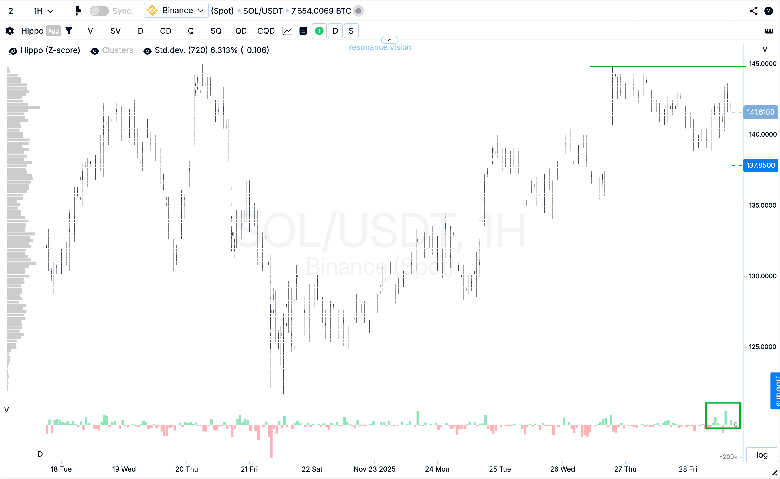
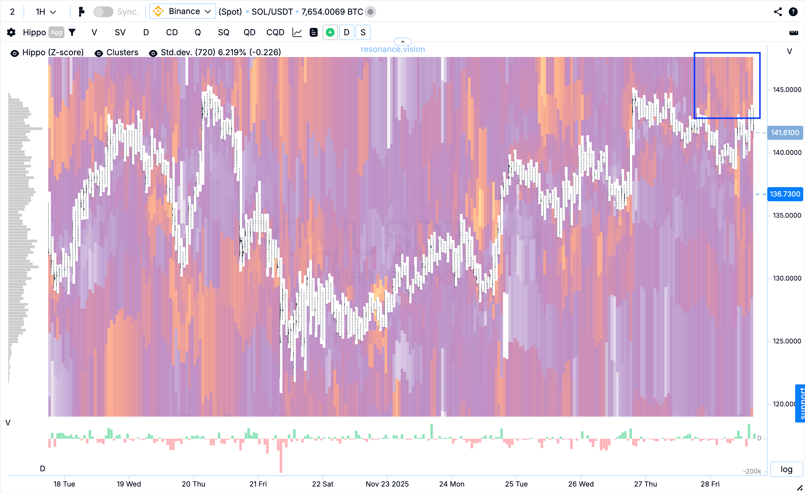
Bullish Flag: Example on SOL
The flag pattern did visually form on the chart. However, blindly opening positions based solely on a graphical pattern is illogical at best. Therefore, let’s look at the facts.

1. Market Buys Are Ineffective — Signs of Surplus
On the cluster chart, it was visible that the flow of market buys increased compared to earlier, but the price no longer grew as before.
This is a clear sign of surplus: more buying, no result.
Under surplus conditions, price typically declines.
2. Limit Resistance on the Heatmap
In Z-Score mode, a dense cluster of limit orders appeared above the current price.
Market buys ran into these limits and failed to break through them.
This means sell limit orders were holding the price.
3. Dashboard: Aggregated Data Confirms Weak Growth
According to aggregated SOL/USDT data across all exchanges:
- there was a surge of market buys (green rectangle) that no longer resulted in a new high;
- simultaneously, limit activity shifted toward sell orders, which clearly dominated in volume (red rectangle).
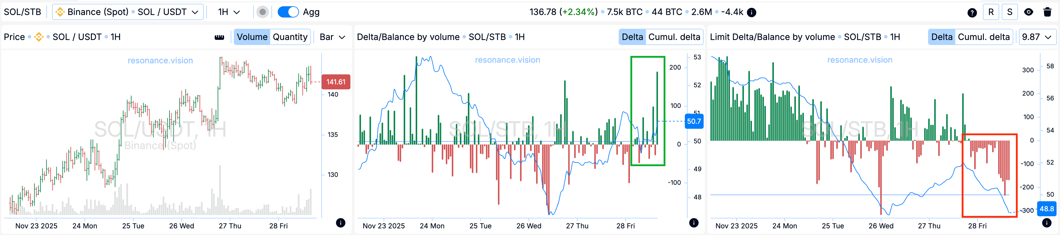
All sources point to the same conclusion: entering long positions is unjustified and risky. Market participants do not support further growth. In such conditions, instead of continuation, the market often prepares for a downside reverse, despite the bullish appearance on the chart.
Result
The price fell by more than 14%, confirming that the Flag pattern produced a false signal, despite its perfect visual shape.

This makes it obvious: technical analysis does not provide an objective view of the market.
Bearish Flag: Example on XRP
Visually, a bearish (inverted) flag formed on the chart. As before, we move to an objective market assessment.

1. Buys Are Ineffective: Surplus and Limit Resistance
The cluster chart and heatmap show:
- market buys do not have the expected impact on price;
- buying pressure continues, but price does not rise — sellers remain in control, indicating surplus.

Above the price, there is an abnormal concentration of limit orders.
This cluster of sell orders holds the price and acts as local limit resistance.
2. Aggregated Data Confirms Weakness
Dashboard data shows:
- overall dominance of selling activity, both market and limit orders;
- order distribution structure indicates sellers maintain control.
Interestingly, the bear flag pattern technically aligned with the price direction, but the decline was driven by real selling pressure — not by the pattern itself or a mechanical reverse signal.

Result
The price dropped nearly 17%, fully reflecting real market signals rather than a graphical technical pattern.

The Problem with Patterns
What happens when traders blindly follow technical analysis?
A trader finds a bull flag pattern, opens a long position, and waits for continuation…
But instead, price drops 10–15% and stops the trade out.
Why?
Because no graphical pattern accounts for the real driver of price movement — supply and demand, expressed through:
- market orders
- limit orders
- traded volume
- efficiency of volume’s impact on price
The transition to an objective approach lies in cluster analysis.
Learn more about supply and demand tools in the article “RTT: The Core Tool for Crypto Market Analysis and Trading.”
Conclusion
The market is not a collection of shapes.
The Flag pattern in trading — bullish or bearish — is essentially just a picture.
To stay profitable over time, a trader needs precise market data, not assumptions.
What truly provides value:
- Volume analysis via cluster charts
- Evaluating how efficiently volume affects price
- Limit activity on the Resonance heatmap
- Aggregated Dashboard data confirming the overall market picture
This is the foundation of a logical and scalable crypto trading approach.
Final Thoughts
Trading is not a guessing game or a search for beautiful chart patterns.
It is work with the objective logic of the market.
Only understanding how buyer and seller volumes affect price allows traders to make informed decisions, minimize risk, and trade consistently over time.
Data-driven tools — cluster charts, heatmaps, and aggregated Resonance metrics — provide what patterns never can: facts, not assumptions.
If you want to trade professionally rather than intuitively in trading, start relying on data — not chart drawings.
Follow new insights in our telegram channel.
No need to invent complex schemes and look for the "grail". Use the Resonance platform tools.
Register via the link — get a bonus and start earning:
OKX | BingX | KuCoin.
Promo code TOPBLOG gives you a 10% discount on any Resonance tariff plan.
Recommended articles


