Double top and double bottom: classic technical analysis in crypto

The figures “double top” and “double bottom” are some of the most famous patterns in technical analysis. But do they work as flawlessly as they seem on the charts? In this article, we will break down classic technical analysis patterns through the prism of market mechanics: cluster charts, delta, and limit orders. You will learn how to distinguish real signs of reversal from illusions of a sideways movement and what volume signals confirm the reality of a reversal figure.
Table of contents

Intro
In trading, it’s hard to find a person who hasn’t heard of and studied the basics of classic technical analysis. Essentially, it’s a method of graphical analysis of price charts, where patterns are ready-made hints. The double top trading pattern and the double bottom trading pattern are among the most popular indicators in technical analysis. They form the basis of many strategy approaches that traders use when they trade major market reversals. Recognized the formation — and immediately calmer: it seems that everything will follow the textbook from now on, because in front of your eyes is a clear figure with precise rules for entry and setting targets. No need to dig into order flows and numbers. In this article, we will look “under the hood” of the classics of technical analysis through the prism of cluster analysis, delta, and limit orders.
What is a double top and double bottom: briefly about the patterns
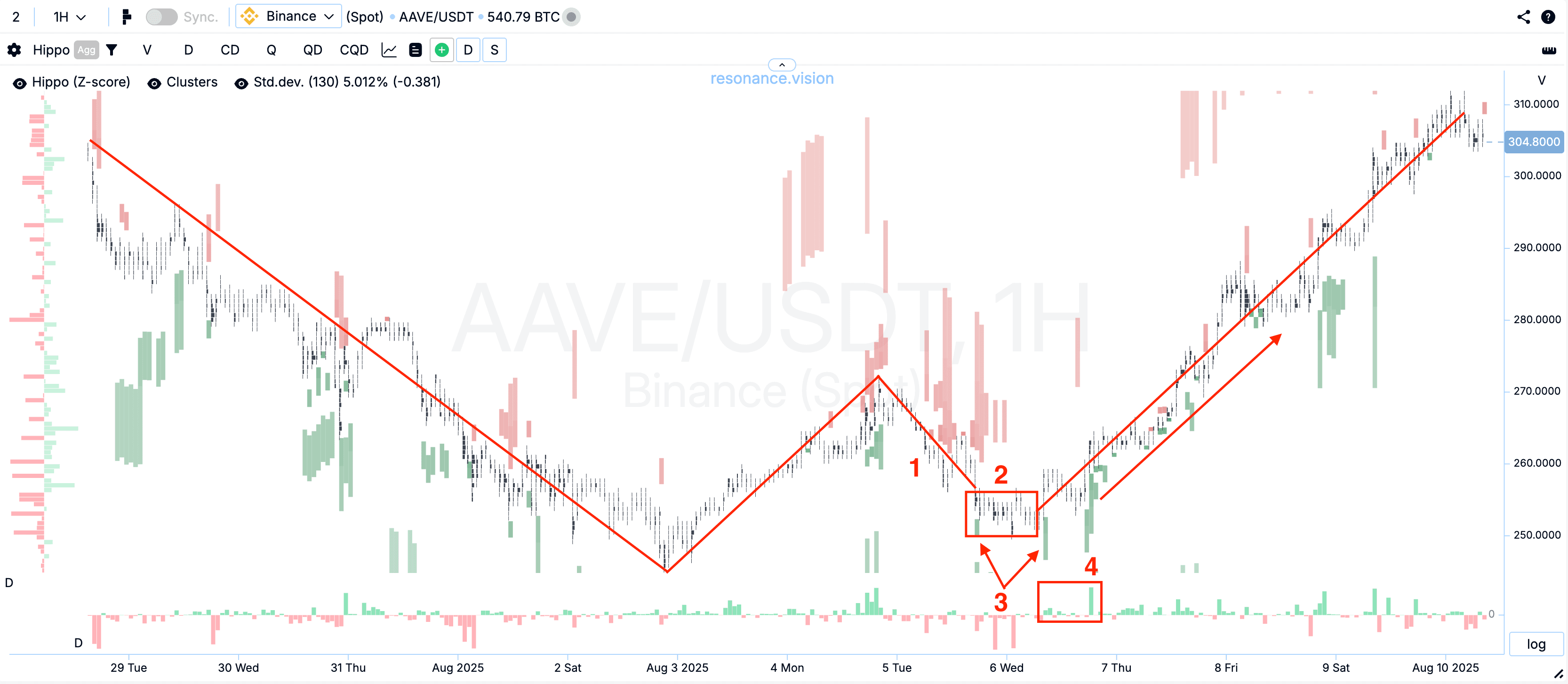
Double top in trading is two peaks at close price values after a strong upward movement; between them, a local trough forms.
Double bottom in trading is a mirror case after a decline: two similar troughs and a “bridge” between them.
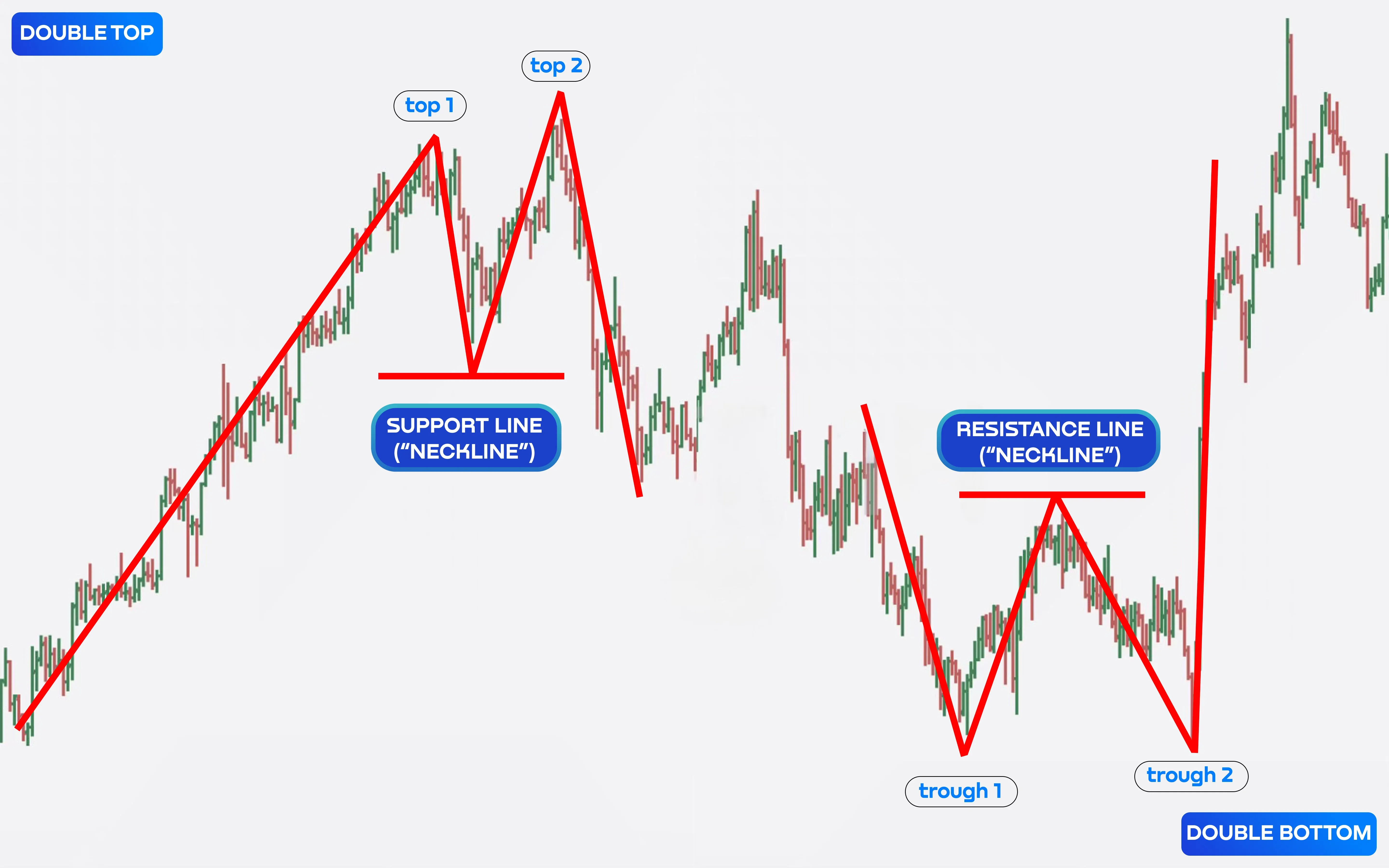
The neckline is the basic reference point of the form:
- for the top — a horizontal through the minimum between the two peaks;
- for the bottom — a horizontal through the maximum between the two troughs.
Confirmation of these figures is usually considered the breakout of the neckline.
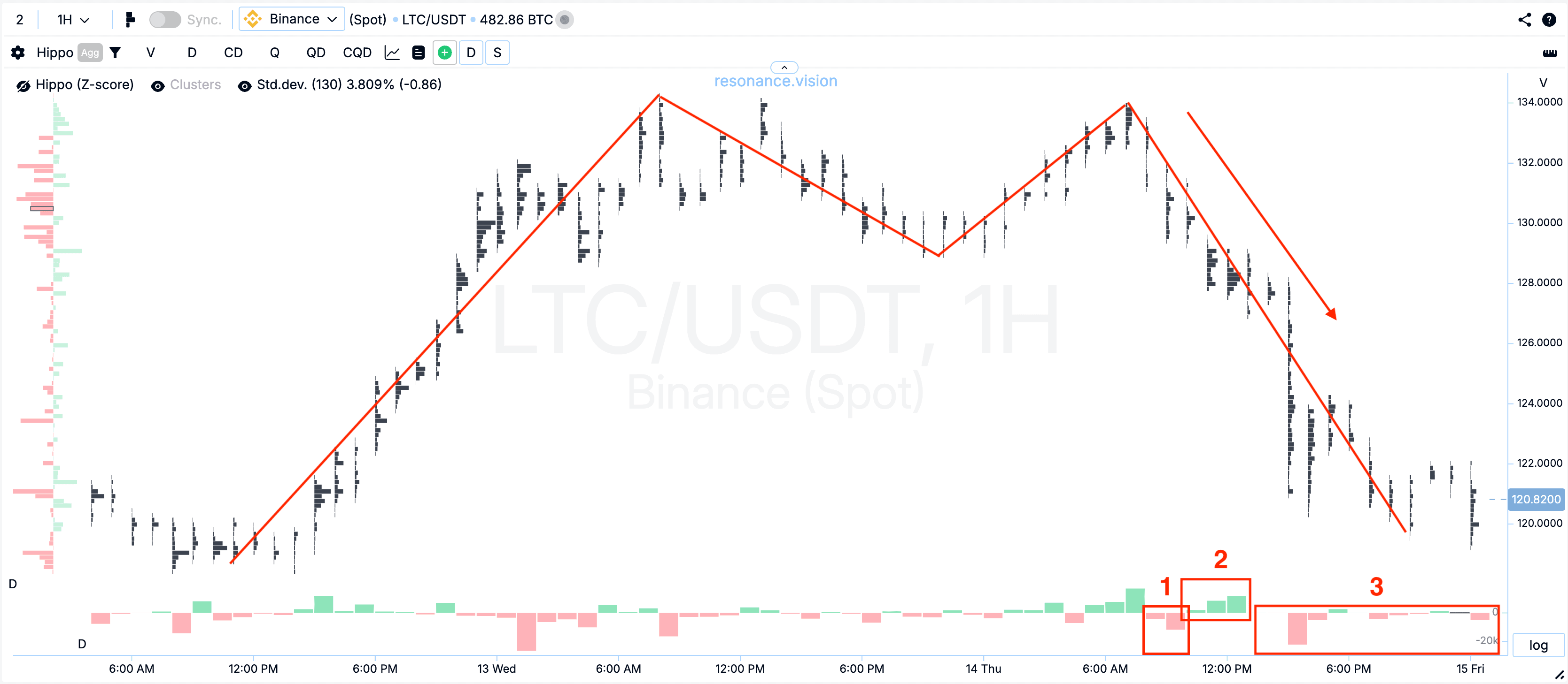
But here it’s important to maintain sobriety. What looks like a double top or double bottom pattern often turns out to be an ordinary sideways: the price is simply trading in a corridor. Entry “at the neckline” in such a phase is a frequent cause of quick money loss. The double top pattern is not magic, but a template of price behavior that still needs to be checked with volume and market reaction.
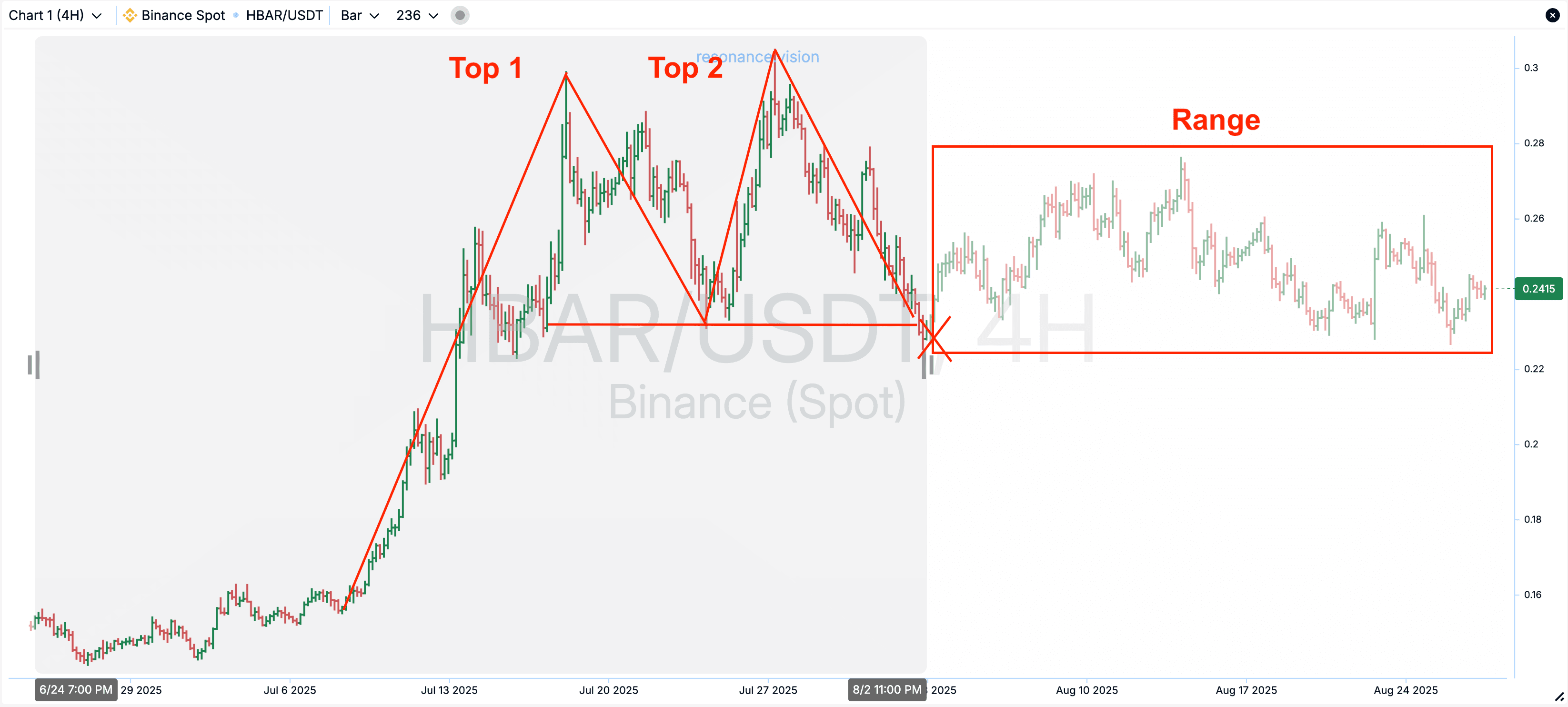
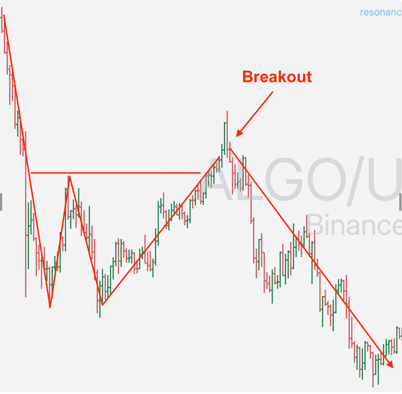
Any technical analysis figure gives shape, but does not show the causes of movement and whether this impulse has enough “fuel”. In the example below, there was a breakout of the “neck”, but if you had entered a position, it would have turned out to be unprofitable. But how is that? The figure was formed, but it didn’t work out.
There is one nuance here. Simply looking at a candlestick or bar chart, it’s quite difficult to understand the reasons for this or that movement. The chart itself does not tell the reasons why the price rose, on what volumes, and whether the market participants have enough money for the movement to continue or for a price reversal. Without volumes, it’s just lines on top of the price chart.
But, as they say, there’s no smoke without fire. If these patterns exist, it means they appeared on the market often and even worked out. But what does it look like from the point of view of market mechanics. In short, understanding comes not from contemplating familiar lines, but from analyzing the influence of volumes on price.

When the double top trading pattern works: signs of a real reversal
A working figure appears when, on a repeated attempt to update the maximum, buyers do not have enough resources to push the price higher. How can we understand that buyers have “stalled”? For this, a cluster chart will be needed. We will analyze volumes, delta, limits.
So, we have an upward movement on the LTC coin. Market buys (green delta) successfully raise the price, updating highs. After a pullback, buyers again try to push the price higher. Pay attention to the delta: how much larger it is than on the entire movement before that. This means that buyers applied a lot of effort to succeed. But they still failed to update the maximum.
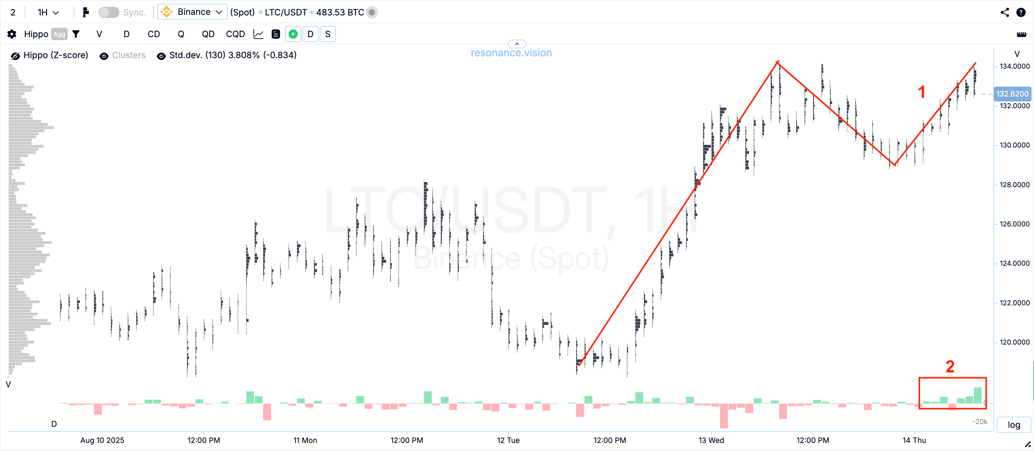
We wrote in detail about the cluster chart in the article “Cluster chart - your market x-ray”. There we give all the concepts and definitions that you will need further.
Adding a heat map that shows anomalous limit orders. In this case, we see a stable presence of limit sellers. Read more in the article “Hippo: trading strategy with limits”
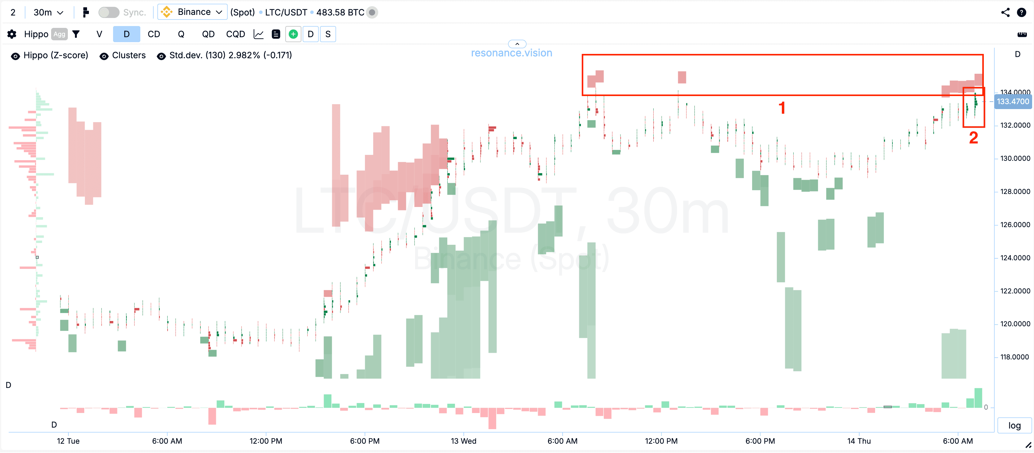
From the clusters, absorption of market buys by limits is visible. This is the exhaustion of the buyer’s resource — the money to push the price higher has run out.
This market situation is a perfect example of the formation of a surplus - a form of market imbalance that leads to a price decrease. Actually, the result is predictable:
- market sales started, which effectively lowered the price
- buyers’ attempts to raise the price gave absolutely no result
- a new wave of sales continued the price drop.
But we have left unanswered the question of when to open a trade? Did we really have to wait for the price to reach that very “neck” to enter short? While you wait for this conditional line, you will lose a significant part of the profit (in this case, a third of the downward price movement) and miss a good entry point. Therefore, it would be optimal to wait for the first effective sales and open a trade, placing a stop behind the limit resistance above the second top. This way, you have a good entry point and a logical stop.
Note: trading double tops and bottoms without checking volume as indicator can lead to mistakes.
What a double top looks like in practice in trading:
- On the second top, aggressive buys do not give the proper effect
- Large clusters with accumulations appear
- Market buys meet dense limit orders
- Market sales effectively influence the price decrease.
It is this set of signs that says not “looks like a double top”, but “a reversal is underway”. We fix not the silhouette on the chart, but facts. We trade not the picture — we trade the market mechanics.
When the double bottom trading pattern works: supply deficit as a signal
Double bottom is a mirror situation to the double top: the market is falling, the delta is red and large, but lows are stubbornly not updated. At the bottom, it is visible how limit buyers “catch” the price — clusters are large, by delta it is noticeable that very large sales compared to previous ones do not lead to updating the low. Aggressive sellers are there, but there is no downward progress.
This is where the double bottom in trading begins to turn from a beautiful picture into a working figure, a working pattern: the seller has run out of resources, and the chances of a reversal grow significantly. The reason is simple - supply deficit. And as a result - growth:
What a double bottom looks like in practice in trading:
- On the repeated decline, aggressive sales do not give the proper effect — the low is not updated, or the price decrease is quickly bought out.
- Large clusters appear (accumulations)
- Support by limit buy orders is visible
- Market sales meet limit buy orders
- Market buys effectively move the price up
Not every downward move is a continuation of the trend. If the seller is not effective, and limit orders from below hold the price, the technical analysis figure double bottom gets a logical justification — it is supported by money and volume behavior.
The main thing — to remember that we trade not the picture, but the imbalance of demand and supply.
Cluster analysis provides deeper confirmation for trading double tops and bottoms effectively.
Illusion of control: how not to fall into the trap
Many traders rely on trading double tops and bottoms as a core technical strategy. When the gaze clings to a familiar form, tension really subsides — the brain is glad for any order in the market noise. But the market is not obliged to follow our expectations: it moves where participants pay for it with their money. Therefore, instead of calming down with a familiar technical analysis figure, check the correspondence of expectations to reality: open the cluster chart, evaluate volumes and delta — has a deficit/surplus formed. Reinforce the assumption with a heat map — are there counter dense limit orders. and for quick selection of trading ideas, use a screener — to leave only the most promising from hundreds of coins. Yes, technical analysis was, is, and will be. But decisions are made not by lines, but by people. For the double top and double bottom patterns to stop being just lines on top of the price chart, you need to confirm the trading idea. And the best option is to evaluate demand and supply.
Follow new insights in our telegram channel.
No need to invent complex schemes and look for the "grail". Use the Resonance platform tools.
Register via the link — get a bonus and start earning:
OKX | BingX | KuCoin.
Promo code TOPBLOG gives you a 10% discount on any Resonance tariff plan.
Recommended articles


