Chart Patterns vs. Indicators: What Gives the Better Signal?

You can draw chart patterns, watch indicators, and wait for the “perfect entry.” But what if the real market signals aren’t there at all? In this article, we break down what most traders never even notice — and what often determines who profits and who blows up their account. If you want to understand why the usual tools fail to show the true market state, and where the real answer to “buy or sell” is actually hiding — start reading.
Table of contents

Traders have been debating for decades: what’s more important—patterns or indicators in trading? Both approaches seem logical and are widely used.
But here’s the key question:
Do they help you consistently profit—or do they just create an illusion of market control?
Let’s break down why trading based on patterns and indicators often fails to deliver results—and whether there’s a real alternative.
Technical Analysis Patterns: Beautiful, Familiar, but… Subjective
Chart patterns look convincing to many: traders have seen them thousands of times—flags, triangles, “head and shoulders,” double bottoms, etc.
On paper, everything looks logical:
- visual formation;
- forecast of continuation or reversal;
- clear entry point;
- obvious target.
But the problem lies elsewhere: the market doesn’t draw patterns for the trader.
A formation is just a familiar geometric shape drawn over historical price movement—not what’s happening right now in the order book.
The main weakness of patterns is subjectivity.
One trader sees a triangle.
Another sees a descending channel.
A third sees noise.
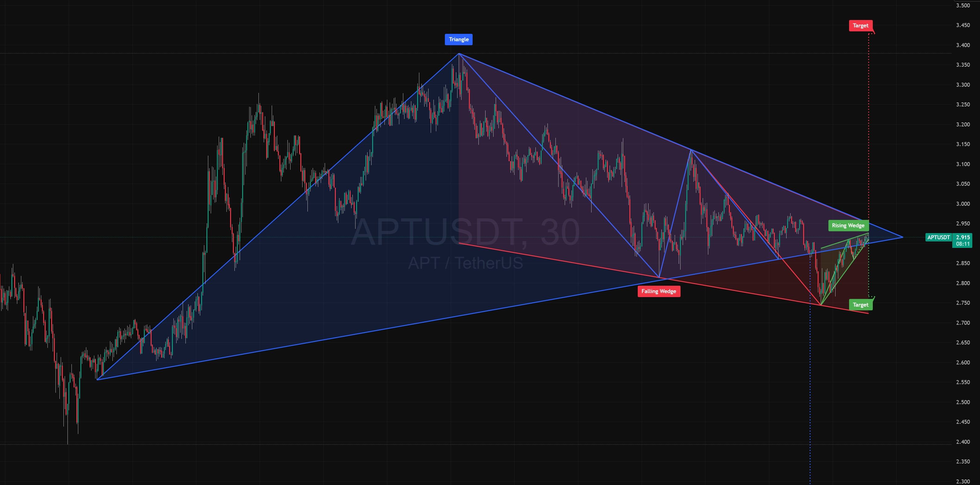
And each is wrong in their own way—because the pattern isn’t based on objective data about supply and demand. It’s just a visualization of history that’s already passed.
Behind every price change are real forces:
- market buys,
- market sells,
- limit orders,
- absorption of market volumes,
- stop-loss triggers, etc.
No pattern shows any of this in principle.
Technical analysis patterns don’t answer the main question: “Who controls the market right now?”
Yet that’s all anyone on the market wants to know—the simple answer to: “Buy or sell?”
Indicators: Useful, Convenient, but…
Indicators give a sense of precision.
There are formulas, clear signals: “overbought,” “oversold,” “line crossovers.”
But there are nuances here too.
Indicators always work with statistics: price changes over time through the lens of a formula.
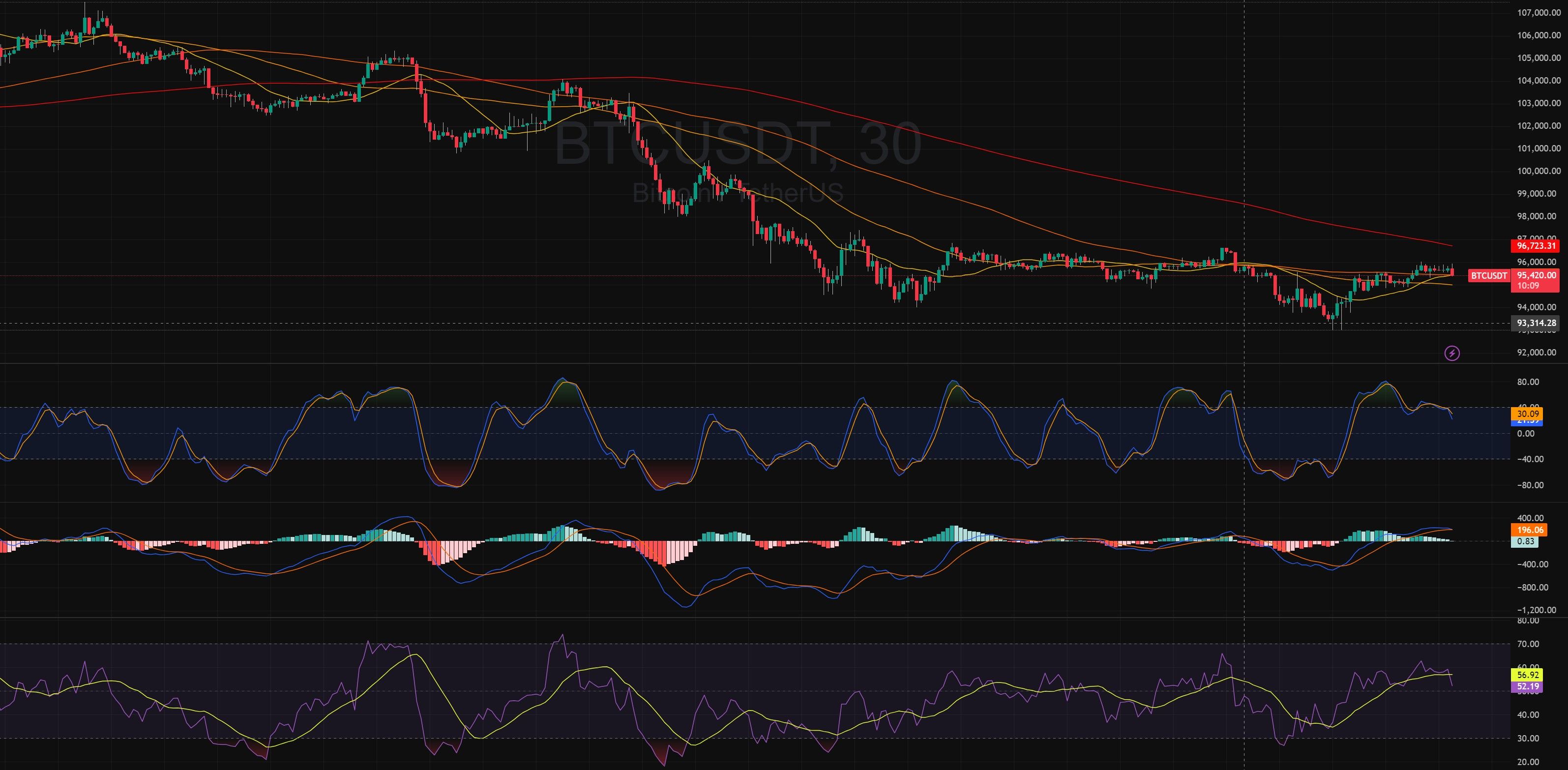
RSI, MA, MACD, Stochastic—all are calculated from price data that’s already happened.
They don’t account for what’s happening right now, like:
- a market buyer eating through a limit wall;
- a large seller appearing on spot;
- a market maker absorbing massive liquidation volume;
- demand so strong that no limit sell can stop it.
Indicators give signals and confidence to enter a trade. But they don’t help objectively assess the market situation.
Especially in crypto, where moves are fast.
An indicator is just math. The market is live people—making decisions and moving price with the volume of their money.
So Which Approach Gives the Better Signal?
The answer isn’t about choosing between patterns or indicators in trading.
The answer lies in what data your decision is based on.
Technical patterns = familiar visualization.
Indicators = dry statistics.
Real market volumes = causal—they determine price movement itself.
Because trading is about working with cause, not effect.
So patterns vs. indicators isn’t about “who wins”—it’s proof that both are incomplete without volume analysis.
What Makes the Resonance Approach Different?
Millions of traders worldwide sit at screens doing the same thing: drawing lines and patterns, calculating formulas.
They make predictions and assumptions based on price movement, look at a chart, and claim to know what’s happening in the world.
Many self-proclaimed experts use historical data to conclude that “big capital took someone’s money” or “the crowd is moving here.”
How can you understand any of this by looking only at a price chart?
The causes of price movement are always in volumes.
More on this in the article: “The Essence of Trading in 7 Minutes.”
If you don’t see this data—you’re analyzing just a shadow of the real process. That’s why trading on patterns and indicators often leads to draining your account.
Let’s think globally.
All those traders predicting “bulls” and “bears” are just trying to figure out: Who’s stronger right now—buyers or sellers (demand or supply)?
And what are demand and supply? Simply volumes of trades—either buys or sells.
To simplify further: every trader wants to know how volume of demand (or supply) affects price. Who has more influence right now?
If demand dominates → buy.
If supply dominates → sell.
Because demand creates scarcity—and scarcity drives price up.
So millions of traders worldwide stare at price, build theories, hypotheses, formulas, drawings—just to figure out: Whose side is the ball on—demand or supply?
When all you need to do is look at buy and sell volumes.
That means all those drawn lines and indicators make no sense—because they ignore trade volumes.
How can a drawn line or math formula show the state of supply and demand?
Only volume data can do that.
Price doesn’t move because of patterns or indicators.
Price is moved by market participants placing:
- market orders (those “pressing the gas”);
- limit orders (those holding the price).
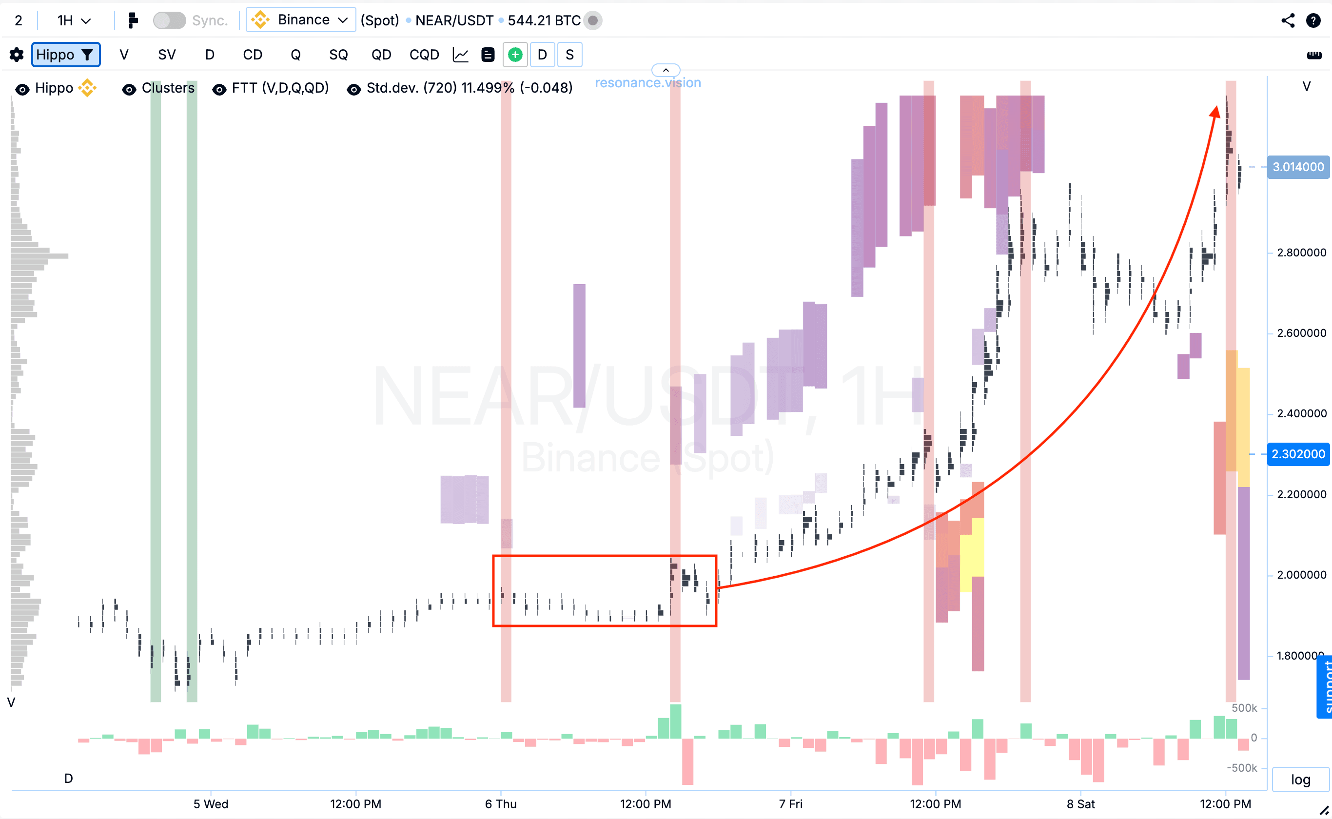
And you can see this on cluster charts and heatmaps:
- Cluster accumulations and delta show at which price levels buyers and sellers fought—and who dominated in market volume.
- Heatmaps reveal anomalous limit support and resistance.
And the most interesting part?
No one hides supply and demand data.
On the Resonance platform, this information is available to everyone.
The platform’s tools were built not for “guessing,” but for objective assessment of what’s really happening in the market—right here, right now.
Resonance doesn’t draw patterns or “invent” signals.
It shows what money actually did:
- where large volume entered;
- where the battle took place;
- where trade acceleration occurred;
- where big capital has interest zones.
This isn’t forecasting from pictures—it’s analysis of real market participant behavior.
So the answer to “What gives the better signal?” is simple:
“Analysis that shows the real actions of ‘big money.’”

Conclusion
If you rely only on patterns—you’re analyzing a drawing over the chart.
If you rely only on indicators—you’re analyzing the past, which doesn’t define the future.
But if you rely on volume, delta, clusters, limit liquidity, and market anomalies—you’re relying on facts.
It’s better to use verifiable market data than to indulge in illusions.
That’s why a reliable trading signal isn’t a candle combination, a line crossover, or even a “miracle indicator.”
It’s understanding:
- who’s moving the price (buyers or sellers),
- with what volume,
- and how it affects price.
And that’s exactly what Resonance tools provide—aggregated across the market and detailed for each coin.
All of this is combined into a complete analysis and trading strategy, available to you via the link.
Follow new insights in our telegram channel.
No need to invent complex schemes and look for the "grail". Use the Resonance platform tools.
Register via the link — get a bonus and start earning:
OKX | BingX | KuCoin.
Promo code TOPBLOG gives you a 10% discount on any Resonance tariff plan.
Recommended articles


